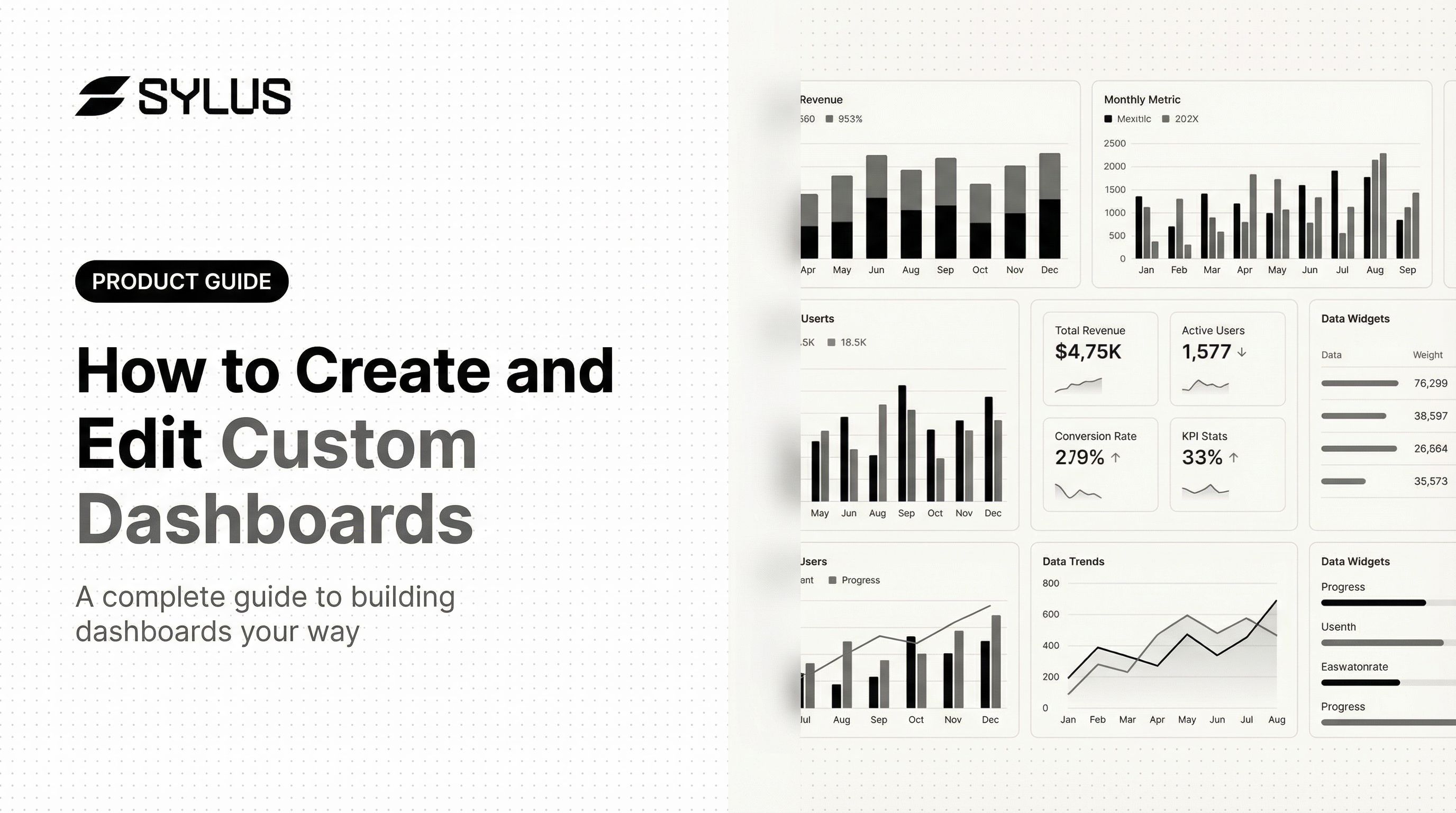
Introduction
Having access to data and actually understanding it are two different problems. Most teams can pull up a dashboard filled with metrics — but fewer than a third of those dashboards get used consistently, because they don't reflect the specific KPIs that drive real decisions. A sales team shouldn't be wading through website traffic charts. A finance lead doesn't need a social engagement widget front and center. The result? Dashboards get ignored, and teams fall back on manual reports.
This guide covers how to build a custom dashboard from scratch, choose the right visualizations for your data, configure filters and layout, and keep dashboards relevant as your business evolves. It also covers the most common design mistakes that cause dashboards to fail — and how to avoid them.
Key Takeaways
- Custom dashboards display only the metrics relevant to your goals, cutting through the noise of generic reports
- Planning is essential: define your audience, KPIs, and data sources before opening any dashboard tool
- Building a dashboard means connecting your data, choosing the right visualizations, and setting filters that keep views focused
- Dashboards require ongoing editing as business goals, team structures, and data sources change
- Apply the 5-second rule: if a viewer can't grasp the key insight immediately, the layout needs work
What to Plan Before You Build Your Custom Dashboard
Skipping the planning phase is the most common reason dashboards get abandoned. Without a defined purpose and audience, teams tend to over-build or track the wrong metrics. Research shows that 60% of BI initiatives fail to deliver business value, and 40% of users rate their dashboards 3/5 or lower. These failures are not technical—they stem from unclear goals and poor planning.
Define Your Dashboard's Purpose and Audience
Start by identifying who will use the dashboard and what decisions it needs to support. Each factor changes what to include and how to display it:
- Executive users need a 30-second snapshot with top KPIs prominently displayed
- Analysts require drill-down capability and detailed data tables
- Operations teams need real-time metrics for monitoring active workflows
Ask yourself: What questions does this dashboard need to answer? How frequently will it be viewed? If the dashboard takes longer to use than the current manual workflow, users will abandon it.
Identify Your KPIs and Data Sources
Once you know your audience, narrow down what to measure. Human working memory can hold only 3-4 chunks of information at a time, so list the 5-8 most important metrics before opening any tool. Tracking more than that dilutes focus and causes users to miss the signals that matter.
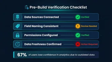
Before you build, confirm:
- Data sources powering those metrics are connected and accurate
- Field naming is consistent across sources
- Permissions are properly configured
- Data freshness meets your reporting needs
Mismatched or stale data cascades into every visualization built on top of it — and 67% of users lose confidence in analytics because of outdated data.
How to Create a Custom Dashboard: Step by Step
The exact UI varies by platform, but the creation workflow follows the same logical sequence across most modern tools. These five steps apply whether you're building in Power BI, Looker, Tableau, or a more AI-native platform like Sylus.
Step 1: Name and Initialize the Dashboard
Choose a descriptive, team-specific name tied to function—for example, "Marketing Funnel – Q3" rather than "Dashboard 1." Clear naming helps teams locate the right dashboard quickly and prevents confusion when multiple versions exist.
Navigate to the dashboard creation area within your analytics tool (typically labeled "Create Dashboard," "New Dashboard," or a "+" icon).
Step 2: Connect Your Data Sources
Data connectors work through APIs, native integrations, or direct database connections. Before proceeding, verify:
- Confirm how often the source refreshes and whether that cadence fits your reporting needs
- Check that column names match what your team expects — mismatched field names are a common silent failure
- Verify your account has access to the required tables before connecting
| Platform | Cached/Import Mode | Live/Direct Mode | Documented Refresh Limits |
|---|---|---|---|
| Power BI | Import Mode | DirectQuery / Direct Lake | 8/day (Shared), 48/day (Premium) |
| Tableau | Extracts (.hyper) | Live Connection | Suspends after 5 consecutive failures |
| Looker | Persistent Derived Tables (PDTs) | Direct SQL Queries | Controlled by max_cache_age or triggers |
| Metabase | Cached Query Results | Live Queries | Hourly sync, daily scan defaults |
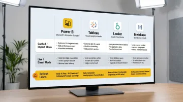
Use scheduled extracts or imports for standard reporting to ensure fast load times. Reserve live connections for operational dashboards that need minute-by-minute monitoring.
Accelerated Alternative: Sylus lets you generate a complete dashboard from a plain English prompt. It selects components, connects your data, and arranges the layout — skipping the manual steps entirely.
Step 3: Add and Configure Visualization Components
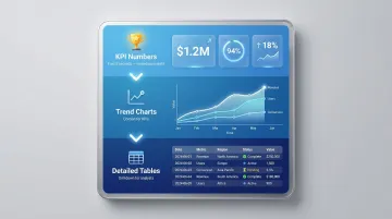
Choose the right component type for each metric:
- KPI scorecards for single-number metrics (revenue, conversion rate)
- Line/timeseries charts for trends over time
- Bar charts for category comparisons
- Tables/lists for ranking top performers or detailed breakdowns
Most platforms enforce a practical limit of 5-10 components per dashboard. Tableau recommends just 2-3 views, and Power BI suggests 5-10 data-driven visuals. Staying within that range keeps dashboards readable and reduces cognitive load for the people using them.
Step 4: Apply Dashboard-Level and Component-Level Filters
Understand the difference between filter types:
- Dashboard-level filters apply to all components (e.g., date range, region, product category)
- Component-level filters apply to individual charts (e.g., filtering one chart to show only top 10 customers)
Use dashboard-level filters for broad controls that should affect the entire view; use component-level filters when a specific chart needs its own data slice. Warning: Conflicting filters between levels can cause components to return no data.
Step 5: Configure Time Periods and Comparison Intervals
Set default time ranges that match your audience's needs, and enable date pickers when users need flexibility to explore beyond the default view.
Comparison intervals add the context that raw numbers lack:
- Week-over-week for operational monitoring
- Month-over-month for executive reporting
- Year-over-year for strategic planning
Choosing too wide a default time range can slow dashboard load times. Start narrow and let users expand as needed.
How to Edit and Customize an Existing Dashboard
Editing a live dashboard is different from building from scratch—the risk is disrupting reports that teammates or stakeholders already rely on. Getting the sequence right prevents broken views for active users.
Editing Layout and Resizing Components
Enter edit mode (usually via an edit icon or toggle). From there:
- Drag-and-drop components to reorder them
- Resize charts for emphasis (larger charts draw more attention)
- Exit edit mode without accidentally publishing broken changes
Some platforms prevent duplication while in edit mode, so plan accordingly. Once layout changes are locked in, the next step is updating what each component actually shows.
Modifying Individual Charts and Metrics
To change an existing component:
- Update the metric being tracked (e.g., switching from total revenue to average revenue per customer)
- Change the visualization type (e.g., switching from bar to line chart)
- Adjust component-level filters without affecting the rest of the dashboard
Updating Data Sources and Filters
Re-map a component to a different data source or updated field when schema changes occur. In Power BI, data refresh will fail if a source column or table is renamed or removed, requiring a manual schema refresh before republishing.
Update dashboard-level filters when business segments or tracking parameters change.
Managing Permissions and Access After Edits
Most platforms enforce a clear permission hierarchy for shared dashboards:
- Owners can edit, delete, and manage access
- Viewers can duplicate the dashboard to create their own editable copy
- Admins have override access across all dashboards in the workspace
When you need to grant someone edit rights, update their role directly rather than sharing your own login credentials.
Saving, Duplicating, and Version Control
Best practices:
- Duplicate before making significant changes to preserve a working fallback
- Save named copies before major revisions rather than editing in place
- Delete outdated dashboards cleanly to avoid confusion across teams
Key Parameters That Determine Dashboard Quality
Two dashboards tracking the same metrics can deliver completely different value depending on how they're designed. Layout, chart choice, refresh rate, and color all shape whether a dashboard drives action — or gets ignored.
Visual Hierarchy and the 5-Second Rule
The 5-second rule means a viewer should be able to identify the dashboard's key insight within 5 seconds of looking at it. This matters especially for executive and operations dashboards where quick comprehension drives action.
Apply it by:
- Placing KPI numbers at the top (the first thing viewers see)
- Positioning trends in the middle (context for those KPIs)
- Putting detailed tables at the bottom (for users who need to drill down)
Breaking visual hierarchy — such as putting a large detailed table above a KPI summary — makes the dashboard harder to use and undermines its practical value.
Chart Type Selection
Choosing the wrong chart type for a metric is one of the most common design errors. Use this framework:
| Data Relationship | Recommended Chart Type | Charts to Avoid |
|---|---|---|
| Time Series / Trends | Line Graph, Bar Graph | Radar Chart |
| Categorical Comparison | Horizontal/Vertical Bar Graph | Pie Chart, Donut Chart |
| Correlation | Scatter Plot | Bubble Chart (Area-based) |
| Single Value / KPI | Scorecard / KPI Card with Target Gap | Complex Gauges / Speedometers |
Human perception struggles to accurately compare two-dimensional areas or angles, making circular graphs like pie charts highly inefficient for quantitative comparison. Rely on linear charts (bars and lines) that use length and 2D position to communicate information quickly.
With the right chart types locked in, the next variable to configure is how often your data updates.
Data Refresh Rate and Latency
Refresh frequency affects both dashboard usefulness and infrastructure load:
- Real-time is necessary for operational monitoring and live campaigns
- Hourly works for active project tracking
- Daily is sufficient for executive reporting and finance reviews
Live connections place heavy compute loads on data warehouses. Default to scheduled extracts for standard reporting.
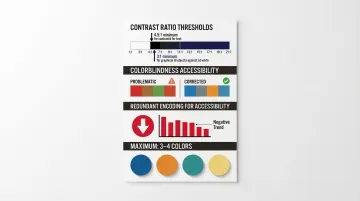
Color, Contrast, and Accessibility
Color should encode meaning (e.g., red for underperforming, green for on-track) rather than just aesthetics. Follow these guidelines:
- Maintain contrast ratios of at least 4.5:1 for text and 3:1 for graphical objects
- Avoid red-green-only schemes — users with color-blindness may see both as similar shades of yellow or orange
- Use redundant encodings (e.g., pairing red with a downward-pointing arrow) — WCAG 1.4.1 prohibits color as the sole means of conveying information
- Keep the palette to 3-4 colors maximum
Common Mistakes to Avoid When Creating Custom Dashboards
Most dashboard failures are not technical—they come from unclear goals, poor planning, or overloading the view. Most dashboard failures are not technical—they stem from unclear goals, poor planning, or overloading the view. Avoiding these three patterns will save hours of rework.
Tracking Too Many Metrics at Once
Loading a dashboard with 20+ metrics creates noise rather than insight. This is the vanity metric trap—numbers that look impressive but don't inform future actions. A number without context (for example, "518M Total Orders") forces the reader to guess whether performance is good or bad.
Audit your dashboard for redundant or low-signal metrics and trim to only the KPIs that drive action. Each metric should show the actual value, the target, and the gap between them.
Ignoring the End User's Context
Building a dashboard for your own analytical preferences rather than the actual end user's workflow leads to low adoption. Design for different user types:
- Executives need a 30-second snapshot
- Analysts need drill-down capability
- Operations teams need real-time monitoring
These different needs produce different dashboard layouts. If pulling a report from your new dashboard takes longer than the user's current manual workflow, they will abandon it.
Skipping Filter Logic Validation
Even a well-designed dashboard fails if the underlying filters are broken. Conflicting filters—dashboard-level versus component-level—or date ranges that exclude the most relevant data are silent errors that return empty or misleading results. Before sharing a dashboard with a team:
- Test all filter combinations to ensure they return expected data
- Verify that component-level filters don't contradict dashboard-level filters
- Confirm that default date ranges include the most relevant time periods
How to Share, Manage, and Maintain Your Dashboard
Creating the dashboard is only half the job—how it's shared, maintained, and kept accurate over time determines its long-term value.
Sharing Options: Links, Embeds, and Scheduled Reports
Most platforms offer three main sharing mechanisms:
- Shareable links for internal users with environment access
- Embedded dashboards for external-facing products or client portals
- Scheduled email or Slack reports for stakeholders who won't log in to view live data
Sylus supports all three. Link sharing, embedding into websites or products, and scheduled AI-generated summaries to email or Slack mean you can reach every type of stakeholder without manual exports.
Keeping Dashboards Accurate Over Time
Dashboards require active governance to remain reliable sources of truth. Maintenance tasks include:
- Periodically auditing data source connections for schema changes
- Removing components tied to deprecated metrics
- Verifying that filters still align with current team structures
- Establishing a dashboard ownership model so someone is accountable for accuracy
Skipping these steps has real consequences. When scheduled data refreshes fail repeatedly due to credential expirations or schema changes, you're left with a dashboard no one trusts. Tableau Server will automatically suspend an extract refresh schedule if it fails five consecutive times, preventing wasted compute resources on broken connections.
Frequently Asked Questions
How much does a custom dashboard cost?
Free tiers exist in tools like Metabase (open source) or Looker Studio (free for creators/viewers). Mid-market platforms typically charge per seat or per feature tier: Power BI Pro costs $14/user/month, while Tableau Creator runs $75/user/month. Enterprise BI tools can run into thousands per month.
What is the 5-second rule for dashboards?
The 5-second rule means a viewer should be able to identify the dashboard's most important insight within five seconds. Achieve this by placing top KPIs prominently at the top, using clear labels, and avoiding visual clutter.
What is the difference between a custom dashboard and a standard dashboard?
Standard dashboards are pre-built with fixed metrics and layouts, while custom dashboards let users choose which metrics to track, how to visualize them, and who can see them—making them far more relevant to specific team goals.
How many charts or widgets should a custom dashboard have?
Most best-practice guidelines recommend 5-10 components maximum per dashboard—enough to provide meaningful context without overwhelming the viewer or slowing load times. Tableau explicitly advises limiting a dashboard to just 2-3 views.
Can I share a custom dashboard with external users?
Most platforms allow sharing via a link or embedded view, but access controls vary. Some platforms restrict sharing to users within the same environment, while others support public links or embeddable iframes for external sharing. Look specifically for "public link," "embed," or "guest access" options in your sharing or permissions menu.
How do I edit an existing dashboard without disrupting live reports?
Duplicate the dashboard before making significant changes, edit the copy first, validate that all filters and data connections work correctly, and then replace the original. This preserves the working version while changes are tested.