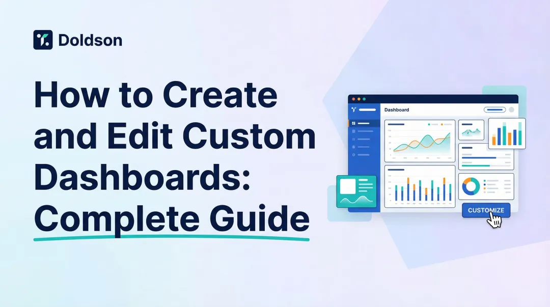
Interactive dashboards change this dynamic by letting users filter, drill down, and explore data in real time. But results vary widely. A poorly designed interactive dashboard can be just as useless as a static PDF—cluttered with irrelevant metrics, disconnected from live data, or shared without proper access controls.
This guide walks through every step of creating an interactive dashboard that people actually use: defining clear goals and metrics, connecting live data sources, designing for visual hierarchy, adding meaningful interactivity, and sharing securely with the right stakeholders.
Key Takeaways
- Build an interactive dashboard in five steps: define metrics, connect live data, design layout, add filters and drill-downs, then test before publishing
- Share via link, email, or embed — and always set permissions and configure alerts before going live
- Real interactivity depends on cross-filtering, drill-down capabilities, live data connections, and thoughtful visual design
- Avoid common pitfalls: building before defining the goal, using static data instead of live connections, and sharing without access controls
Step-by-Step: How to Create an Interactive Dashboard
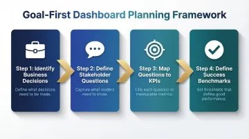
Step 1: Define Your Goal and Identify Key Metrics
The most common reason dashboards fail is that they're built before the question is defined. Only 22% of organizations have clearly defined, tracked, and shared business impact metrics for their data and analytics projects, and 95% of AI and analytics projects fail to deliver measurable returns because teams skip defining the target problem upfront.
Work backwards from the decision:
- Identify the specific business decisions this dashboard needs to support
- List 3-5 key questions stakeholders need answered (e.g., "Where did revenue drop this quarter?" or "Which customer segments are churning?")
- Map these questions to measurable KPIs with clear action owners
- Define what "good" looks like for each metric
Match interactivity to your audience:
- Executives may need high-level drill-downs to investigate trends
- Operations teams may need granular filter controls by region, product, or time period
- Marketing teams may need cross-filtering to explore campaign performance across channels
Skip this step and you'll likely end up with a dashboard that gets opened once, then abandoned.
Step 2: Connect Your Data Source
Your dashboard is only as useful as the data feeding it. Connecting to a live source versus importing a static file is the difference between seeing what's happening now and what happened last week.
Live connections vs. static extracts:
| Feature | Static/Extract Mode | Live/DirectQuery Mode |
|---|---|---|
| Data Freshness | Stale until next scheduled refresh | Real-time or near-real-time visibility |
| Performance | Fast (in-memory) | Dependent on warehouse speed |
| Source Load | Low impact on source systems | Every interaction queries the source |
| Best Use Case | Historical analysis | Operational monitoring, massive datasets |
What connecting a data source involves:
- Authenticate to your data warehouse or database (Snowflake, BigQuery, Redshift, etc.)
- Select relevant tables or data models
- Verify data freshness and accuracy before building
Modern AI-powered platforms like Sylus let you connect your data sources and ask questions in plain English—the AI explores your data, validates assumptions against your dbt models and documentation, and can generate an entire dashboard without manual chart configuration.
Step 3: Design the Layout and Choose Your Visualizations
Layout determines whether your data gets read or ignored. Stephen Few's foundational work establishes the core principle: a dashboard must fit on a single screen, organized so the eye moves naturally from most to least important information.
Visual hierarchy principles:
- Place the most important KPIs (summary numbers, trend lines) at the top
- Position supporting breakdowns in the middle
- Put granular tables or filters at the bottom or in sidebars
Chart type decision framework:
- Bar/column charts: Comparisons across categories
- Line charts: Trends over time
- Scatter plots: Correlations between variables
- Maps: Geographic data distribution
Few explicitly warns against pie charts, noting that humans cannot accurately compare two-dimensional areas or angles—bar graphs are vastly superior for quantitative data.
Less is more: Dashboards with too many charts force viewers to decide what matters. A focused layout of 5-8 well-chosen visualizations communicates faster than 15 competing metrics.
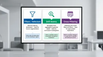
Step 4: Add Interactivity — Filters, Drill-Downs, and Cross-Filters
A static dashboard shows users what you decided to show them. An interactive one lets them answer their own follow-up questions. Three mechanisms make this possible:
1. Filters/Selectors
- Let users narrow by dimension (region, date, product)
- Best for known segmentation needs
- Example: A date range picker that updates all charts
2. Drill-Downs
- Let users click from aggregate to granular detail
- Power BI defines drillthrough as navigation from summary to detailed report filtered to specific context
- Best for root-cause investigation
- Example: Click "Q3 Revenue" to see breakdown by month, then by product line, then by SKU
3. Cross-Filtering
- Selecting a value in one visual acts as a filter in other visuals
- Best for open-ended exploration
- Example: Click "Northeast Region" on a map, and every chart (revenue, product mix, churn) instantly scopes to that region
How to configure these interactions:
- Connect elements through shared data fields
- Define which elements react to which selectors
- Test each interaction path before publishing
When these mechanisms work together, users stop filing requests for new reports and start finding answers themselves.
Step 5: Test, Refine, and Prepare for Publishing
Before you publish, test every interaction path — not just whether charts load. Dashboard issues that slip through usually aren't broken charts; they're filters that return wrong results or layouts that confuse first-time users.
Verification checklist:
- Every filter, drill-down, and cross-filter produces accurate results
- Dashboard loads correctly on different screen sizes (desktop, tablet, mobile)
- Data freshness matches expectations
- Performance is acceptable (queries complete within 3-5 seconds)
Peer review step: Have someone who wasn't involved in building the dashboard try to answer a key business question using it. Their friction points reveal UX issues you missed.
Ask them directly: Is it clear what each metric means? Can they find the filters they need? This one conversation surfaces more usability problems than any internal review — and it's the difference between a dashboard that gets used and one that gets ignored.
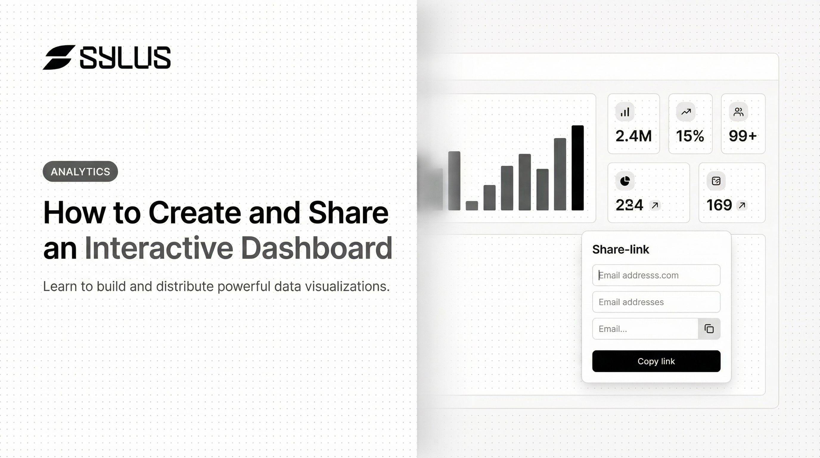
How to Share Your Interactive Dashboard
Choosing Your Sharing Method: Link, Email, or Embed
The three main sharing methods serve different use cases:
1. Shareable Link
- Quick internal distribution where all viewers have account access
- Best for: Ad-hoc sharing within teams
- Considerations: Anyone with the link can access (unless you add authentication)
2. Email Invitation
- Controlled sharing with specific individuals or groups
- Best for: Tracking who has access, assigning different permission levels
- Considerations: Requires managing individual access rights
3. Embed
- Expose the dashboard within an internal tool, product, or website
- Best for: Surfacing analytics where users already work
- Considerations: Requires technical implementation and authentication planning
Key decision factors:
- Audience size and technical sophistication
- Whether viewers need edit vs. view-only access
- Sensitivity of the data (public, internal, or restricted)
Setting Permissions and Access Control
Sharing without permissions management creates data security and compliance risks. Misconfigured databases are enduring causes of data breaches, frequently exposed without proper controls.
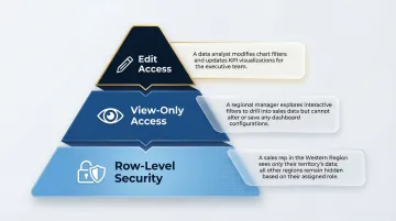
Permission levels:
- View-only: Users can see the dashboard and interact with filters but cannot modify
- Edit access: Users can change visualizations, add filters, and reconfigure the dashboard
Row-level security (RLS): Restricts what data different viewer groups can see. For example, a regional manager only sees their region's data, even though the underlying dataset contains all regions. RLS must be enforced at the data model level to ensure users only view data they have privileges to access.
Compliance considerations: Permissions control who sees a dashboard — but compliance certifications determine whether your sharing practices meet regulatory standards. For enterprise and healthcare use cases, SOC 2 Type II demonstrates consistent security practices over time, while HIPAA compliance ensures Protected Health Information is appropriately safeguarded. Sylus holds both certifications and offers self-hosted deployment for teams with strict data residency requirements.
Embedding Dashboards in Websites and Products
Product teams and data teams often need to surface analytics directly inside a SaaS product or internal portal rather than directing users to a separate BI tool. The embedded analytics market is projected to grow from $78.53 billion in 2025 to $169.18 billion by 2031.
How embedding works:
- Iframe embedding: Basic HTML iframe tag for simple display
- SDK/API embedding: Advanced integrations that enable Single Sign-On (SSO), customize controls, and enforce RLS dynamically
Access and authentication considerations:
- Ensure only authorized users see the embedded dashboard
- Pass user context (user ID or tenant ID) to filter the embedded view automatically
- Avoid public iframe URLs that never expire, as anyone with the link can access the data
Done right, embedding means users get the data they need without leaving the tools they already use — no separate login, no context switch, no friction.
Keeping Shared Dashboards Useful Over Time: Alerts and Scheduled Reports
A shared dashboard becomes a one-time artifact without ongoing communication. Self-service BI typically hits a 20% adoption ceiling—to reach the "other 80%" of business users, you must use proactive delivery.
Scheduled reports:
- Automated email or Slack delivery of dashboard snapshots or AI-generated summaries
- Keep stakeholders informed without requiring them to log in proactively
- Configure frequency (daily, weekly, monthly) based on decision cadence
Threshold-based alerts:
- Notify when a metric crosses a defined value (e.g., churn rate exceeds 5%)
- Transform the dashboard from a static view into a monitoring tool
- A Forrester study found that automation and alerting contributed to $620,000 in revenue gains over three years by accelerating critical event discovery
Proactive delivery is what separates a dashboard people check once from one that drives decisions week after week.
What Makes an Interactive Dashboard Genuinely Interactive
"Interactive" is often used loosely—a dashboard with a single date filter is technically interactive, but it's the combination of several features that makes a dashboard truly self-service and exploratory.
Three capabilities define the difference: cross-filtering, drill-down, and live data connections.
Cross-Filtering and Highlight Patterns
Cross-filtering means selecting a data point in one visualization automatically highlights or filters all other charts on the dashboard. This allows users to investigate data across multiple dimensions simultaneously without manually adjusting each chart.
Practical example: A user clicks "Northeast Region" in a map widget, and every other chart (revenue breakdown, product mix, churn rate) instantly scopes to that region. This eliminates the need for 4-5 separate regional reports—one interactive dashboard serves all regions.
Drill-Down Capabilities
Drill-down lets users click from a high-level aggregate to a granular breakdown—"Q3 Revenue" → by month → by product line → by individual SKU—without leaving the dashboard or waiting for a new report.
The depth available depends on how the underlying data model is structured. Grounding dashboards in documented data models (like dbt) improves the reliability of drill-down paths and ensures users can explore confidently.
Live Data Connections vs. Scheduled Extracts
Live connections query the warehouse directly on every load or refresh, while scheduled extracts show a snapshot from the last export. Live connections are essential for operational dashboards where decisions depend on what's happening now, not yesterday.
Concrete example of stale data risk: A marketing team optimizing ad spend based on a dashboard that's 24 hours behind may shift budget away from a campaign that actually recovered by morning. By the time they realize the error, they've lost a day of high-performing ad delivery.
For teams making time-sensitive calls—budget shifts, incident response, inventory moves—the freshness of the underlying data is as important as the dashboard design itself.
When Should You Build an Interactive Dashboard?
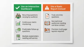
Not every reporting need requires a full interactive dashboard. A PDF summary or a simple table may be the right tool when questions are fixed, audiences are small, or data changes infrequently.
Interactive dashboards are the right choice when:
- Recurring business questions vary by audience (each team wants to filter to their segment)
- Metrics need continuous monitoring rather than periodic review
- Follow-up questions are predictable (if users always ask "why did X happen?" after seeing X, drill-down navigation answers faster than a static report)
- Multiple stakeholders need self-service access without requesting new reports
That said, the format works against you in certain situations.
Interactive dashboards become inefficient when:
- The question is truly one-time and building the dashboard takes longer than answering directly
- The target audience isn't comfortable with self-service tools and would benefit more from narrative reports with written interpretation
- Precision layout and dynamic expansion across multiple pages are required (use paginated reports instead)
Once you've confirmed a dashboard is the right format, the next question is what kind. The Nielsen Norman Group distinguishes between operational dashboards (for time-sensitive tasks) and analytical dashboards (for identifying areas needing further investigation) — and the distinction shapes every design decision that follows.
Common Mistakes When Creating and Sharing Dashboards
Building Before Defining the Goal
The most common dashboard mistake is starting with the data and charts rather than the business question. This results in dashboards that display information but don't drive decisions, because no one knows which number to act on or what "good" looks like.
60% of BI projects fail to deliver business value, largely due to poor alignment on business goals. Always start with the decision, then work backwards to the metrics and data.
Connecting to Stale or Unvalidated Data
Using exported CSVs or unvalidated tables as data sources creates trust problems. When numbers look wrong, users stop using the dashboard entirely. Poor data quality costs businesses an average of $12.9 million each year.
Connect to a governed, documented data source and verify key metrics before sharing. Dashboards built on validated data models give users a reason to keep coming back to them.
Sharing Without Context or Permissions
Sending a dashboard link without explaining what it answers, who it's for, and what permissions viewers have leads to:
- Misuse (editing when they should be viewing)
- Confusion (wrong audience receives it)
- Security risks (sensitive data exposed to unintended recipients)
When sharing, include three things: the business question it answers, the intended audience, and the action they should take based on the data.
Frequently Asked Questions
What is the difference between a dashboard and an interactive dashboard?
A standard dashboard displays a fixed snapshot of metrics while an interactive dashboard lets users filter, drill down, and explore data in real time. The key distinction is whether viewers can ask follow-up questions without requesting a new report.
What is the best tool for interactive dashboards?
The best tool depends on your technical setup, audience, and data stack. AI-powered platforms like Sylus let teams generate dashboards from plain English, while traditional BI tools require manual chart configuration. Key criteria: live data connectivity, sharing flexibility, and self-service capability.
How do you share an interactive dashboard securely?
Use role-based access controls and row-level security to restrict what different viewers see, choose a SOC 2 or HIPAA-compliant platform for sensitive data, and prefer authenticated sharing (email invite or embedded with user context) over open public links.
Can I embed an interactive dashboard in my website or product?
Most modern BI platforms support embedding via iframe or SDK. Properly embedded dashboards can pass user context to automatically filter the view for each authenticated user, making analytics look and feel like part of your own product.
How do I control who can see my shared dashboard?
Most platforms give you three layers of control:
- Set view vs. edit permissions at the individual or group level
- Apply row-level security so each user sees only their relevant data
- Monitor access logs to audit who has viewed or changed the dashboard
Do I need coding skills to create an interactive dashboard?
Most modern BI platforms offer no-code or low-code interfaces with drag-and-drop chart builders. AI-powered tools like Sylus allow users to describe what they want in plain English and have the dashboard generated automatically—no SQL or scripting required.