Introduction
Most organizations collect more data than they can act on. Sales figures, customer interactions, operational metrics, financial results—the numbers exist, but turning them into clear answers is a different problem entirely.
Without a unified view of performance, teams make reactive decisions based on instinct rather than evidence. Departments track different numbers, miss critical targets, and end up working against each other without realizing it.
Performance dashboards solve this by consolidating the metrics that matter most into a single visual interface anyone on the team can read and act on. This guide covers what performance dashboards are, how they're built, which metrics to track, and how to avoid the common pitfalls that make dashboards useless in practice.
TLDR:
- Performance dashboards consolidate KPIs into one visual interface for real-time monitoring and decision-making
- They enable monitoring critical processes, analyzing root causes, and managing performance proactively
- Core components: relevant metrics, visualizations, benchmarks, historical trends, and subunit breakdowns
- Effective dashboards start with clear goals, then the right metrics, the right tools, and iteration
- Best practices include keeping dashboards focused (5-10 metrics), ensuring data accuracy, and aligning metrics with evolving business priorities
What Is a Performance Dashboard?
A performance dashboard is a data visualization tool that consolidates key performance indicators (KPIs) and business metrics into a single view—enabling organizations to measure, monitor, and manage critical activities in real time. Rather than digging through spreadsheets or waiting for weekly reports, teams can see at a glance whether they're on track, falling behind, or exceeding expectations.
What separates a performance dashboard from a standard report or spreadsheet is that it's dynamic, visual, and designed for ongoing decision-making. A spreadsheet stores what happened; a dashboard shows what's happening now and flags what needs attention.
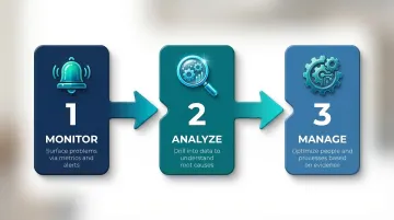
Wayne Eckerson's foundational framework identifies three core functions that performance dashboards serve:
- Monitoring critical processes via metrics and alerts that surface problems immediately
- Analyzing root causes by drilling into relevant data to understand why performance changed
- Managing people and processes to optimize performance based on evidence
Organizational Benefits of Performance Dashboards
Performance dashboards replace gut-feel decisions with concrete, evidence-backed insights. When every team sees the same numbers in real time, performance becomes transparent — and accountability follows.
Beyond individual teams, dashboards deliver three organization-wide advantages:
- Shared source of truth — Finance, sales, and operations work from the same data instead of reconciling conflicting reports
- Cross-team alignment — Everyone sees organizational progress against the same goals, reducing information silos
- Early warning system — KPI monitoring surfaces problems before they escalate, shifting teams from reactive firefighting to proactive management
The business case is well-documented: according to a McKinsey Global Institute study on data-driven organizations, companies that use data effectively are 23 times more likely to acquire customers and 19 times more likely to be profitable than their peers.
Key Components of a Performance Dashboard
Effective performance dashboards are built from specific design elements—not just charts and numbers—and what's included determines whether a dashboard drives action or just displays data.
Five core components separate dashboards that inform decisions from those that just occupy screen space.
Metrics and KPIs
KPIs are the foundation of any performance dashboard. They typically fall into three categories:
- Financial metrics — revenue, profit margin, cash flow
- Operational metrics — cycle time, throughput, defect rates
- Customer metrics — Net Promoter Score (NPS), retention rate, satisfaction scores
Only metrics tied to strategic goals belong here. A cluttered dashboard with 30 metrics causes decision fatigue; a focused set of 5–10 critical KPIs gives teams something to act on.
Data Visualizations
Charts and graphs make data interpretable at a glance, but the visualization type matters. Using the wrong chart obscures insight rather than revealing it:
- Line charts show trends over time
- Bar charts compare values across categories
- Bullet graphs track performance against targets in a compact format
Research shows that humans process line length more accurately than angles or areas, which is why pie charts should be avoided for part-to-whole comparisons in favor of bar graphs.
Context, Trends, and Subunit Breakdowns
The final three components provide the interpretive layer that turns raw numbers into real understanding.
Benchmark and target lines give every metric a reference point. A number like "$500K in monthly revenue" tells you nothing in isolation. Set against a target of $450K, it tells you performance is 11% ahead of plan.
Long time horizon trends — spanning at least 12–24 months at monthly or quarterly intervals — help leaders distinguish anomalies from patterns. A single down month might be noise. Twelve consecutive months of the same trend is a signal worth acting on.
Disaggregated subunit views break data down by team, department, region, or provider. If overall sales are down 10%, a subunit breakdown might show one region dropped 40% while others held steady. That narrows the problem from company-wide to localized, which changes the response entirely.
Types of Performance Dashboards
Organizations choose different dashboard types based on the audience and purpose. Most businesses use a combination of these three types:
| Dashboard Type | Primary Users | Update Frequency | Focus |
|---|---|---|---|
| Strategic | Executives, leadership | Monthly / Quarterly | Long-term goals, enterprise KPIs |
| Operational | Frontline workers, supervisors | Real-time / Daily | Day-to-day efficiency, throughput |
| Financial | CFOs, finance teams | Weekly / Monthly | Fiscal health, budgets, forecasts |
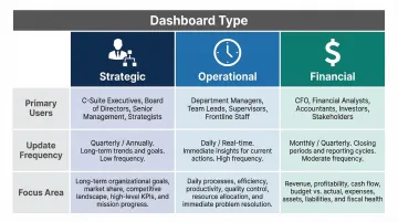
Strategic Dashboards
Strategic dashboards provide high-level visibility into whether an organization is progressing toward its long-term goals. Typically used by executives, they monitor enterprise-wide KPIs tied to mission and vision — think market share, customer lifetime value, or annual recurring revenue. Updated monthly or quarterly, they focus on the big picture rather than day-to-day operations.
Operational Dashboards
Operational dashboards are real-time monitoring tools focused on day-to-day efficiency. They track metrics like production output, customer support response times, or task completion rates to keep teams running smoothly. Frontline workers and supervisors use these dashboards to identify bottlenecks and respond to issues immediately before they compound.
Financial Dashboards
CFOs and finance teams rely on financial dashboards to stay on top of the numbers that matter most:
- Revenue and profit margins — track actuals against targets in real time
- Cash flow and burn rate — flag liquidity risks before they become urgent
- ROI and budget adherence — identify where spend is delivering and where it isn't
These dashboards double as forecasting tools, helping controllers model cash needs and surface cost-saving opportunities before quarter-end.
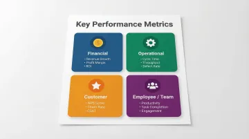
Key Performance Metrics to Track on Your Dashboard
Picking the right metrics is harder than it looks. The most reliable approach: work backward from business goals to determine what data matters.
Financial Metrics
Financial metrics reveal whether the business model is working and sustainable:
- Revenue growth — tracks top-line expansion
- Gross profit margin — measures profitability after direct production costs (calculated as Gross Profit / Total Revenue)
- Operating costs — monitors expense control
- Return on investment (ROI) — evaluates capital efficiency
Operational Metrics
Operational metrics show the efficiency and reliability of internal processes:
- Cycle time — the time required to complete one operation cycle
- Throughput — the rate at which the system generates output
- Defect/error rate — measures quality and consistency
- Capacity utilization — tracks how fully resources are being used
Customer Metrics
Customer metrics tie operational performance to the customer experience:
- Net Promoter Score (NPS) — likelihood customers will recommend your product (calculated as % Promoters minus % Detractors)
- Customer satisfaction score (CSAT) — direct feedback on experience
- Churn rate — percentage of customers lost over time
- Average response time — speed of customer support
Employee/Team Metrics
Employee metrics help managers identify bottlenecks, burnout risk, and development opportunities:
- Productivity levels — output per person or team over a set period
- Task completion rates — percentage of assigned work finished on time
- Attendance patterns — flags absenteeism trends before they compound
- Engagement scores — survey-based measure of motivation and morale
Leading vs. Lagging Indicators
A strong dashboard includes both leading and lagging indicators. Each type serves a different purpose:
| Type | What It Measures | Example |
|---|---|---|
| Leading | Predicts future performance | Sales pipeline volume |
| Lagging | Confirms what already happened | Closed revenue |
Tracking both tells you where performance is heading before results are locked in — not just after.
How to Build a Performance Dashboard
Building an effective performance dashboard follows a clear four-step process:
Step 1 — Define Your Goals and Audience
Before selecting any tool or metric, clarify what decisions this dashboard needs to support and who will use it. A dashboard for a VP of Sales looks very different from one designed for a customer support team. Start by answering:
- What questions do users need answered?
- What actions will they take based on this data?
Step 2 — Select Your Metrics and Data Sources
Based on your goals, identify 5–10 core KPIs and confirm where that data lives — whether in a CRM, ERP, data warehouse, or another system. Connecting multiple data sources is where many manual approaches break down. Finance teams spend 40+ hours per month manually reconciling data across systems, leading to budgets that miss reality by 15–20%.
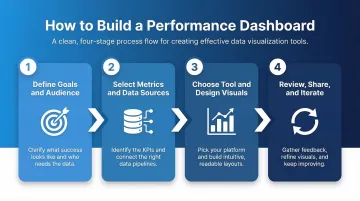
Step 3 — Choose the Right Tool and Design Visuals
Options range from Excel (lightweight but manual) to BI tools like Power BI and Tableau (interactive and automated). AI-powered platforms like Sylus go further: connect your data sources, ask questions in plain English, and get a full dashboard back. Charts are customizable through natural language commands, and dashboards can be shared via links, email, or embedded views — no SQL or BI expertise required.
Step 4 — Review, Share, and Iterate
A dashboard is only valuable if it's reviewed regularly and updated as business goals evolve. Share dashboards with relevant stakeholders via links, embedded views, or scheduled reports to keep everyone aligned. Set a regular cadence — quarterly works well — to audit which metrics still matter and remove those that don't.
Best Practices for Managing Dashboard Performance
Keep It Focused
Resist the temptation to track every available metric. A cluttered dashboard leads to decision fatigue. Limit each dashboard to the metrics that directly inform specific decisions, and audit the dashboard periodically to remove noise. Research on decision fatigue shows that the active self has limited resources for decision-making—overloading users with metrics exhausts their cognitive capacity.
Ensure Data Accuracy and Consistency
A dashboard is only as reliable as its data inputs. Poor data quality costs organizations an average of $12.9 million annually, according to Gartner. To keep data trustworthy:
- Validate data sources before connecting them to the dashboard
- Establish consistent definitions for each metric across teams
- Set up alerts or review checkpoints to catch anomalies early
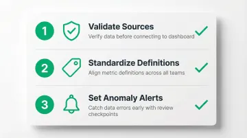
When inaccurate data underpins dashboards, leaders misjudge performance and pursue initiatives based on flawed assumptions.
Align Metrics to Current Business Priorities
Business goals shift over quarters, and dashboards that aren't updated become misleading . Review your dashboard on a set cadence — quarterly works for most teams — to confirm tracked metrics still reflect current goals. Metrics that mattered last quarter may be irrelevant now—keeping them on the dashboard creates distraction rather than clarity.
Frequently Asked Questions
What is a performance dashboard?
A performance dashboard is a data visualization tool that consolidates KPIs and metrics into one view, enabling organizations to monitor performance, identify problems, and make data-driven decisions in real time.
What are the 5 key performance metrics?
Five commonly tracked metric categories are:
- Financial — revenue, profit margin
- Operational — cycle time, throughput
- Customer — NPS, churn rate
- Employee/team — productivity, task completion
- Strategic — goal attainment, market share
What are the 5 components of performance management?
The five core components are setting clear goals and expectations, monitoring performance through data, providing ongoing feedback, conducting formal reviews, and implementing development or corrective actions based on findings.
How to manage dashboard performance?
Keep the dashboard focused on decision-relevant metrics, ensure data accuracy through regular audits, align tracked KPIs with evolving business goals, and review the dashboard consistently with the right stakeholders.
What is the difference between a KPI dashboard and a performance dashboard?
The terms are often used interchangeably, but there is a distinction. KPI dashboards focus on tracking specific quantitative targets, while performance dashboards go broader — incorporating trends, benchmarks, and contextual analysis to support strategic decision-making.