Introduction
Data teams and business users lose 10-15 hours weekly—40-70% of their time—to manual reporting tasks: pulling data from multiple systems, reformatting spreadsheets, and emailing static files. This time drain costs US businesses an average of $28,500 per employee annually, and the insights produced are already stale by the time they reach stakeholders. Gartner research shows that 58% of organizations report outdated data causing 20% of their decision errors, while IBM found that delayed data leads to 22% missed opportunities.
The fix is automation—but results vary widely depending on execution. How data sources connect, which metrics get tracked, how delivery is configured, and whether underlying data is clean all determine whether you save hours or just shift the manual work elsewhere. This guide covers what report automation is, how to set it up step by step, what variables affect outcomes, and the most common mistakes to avoid.
Key Takeaways
- Report automation uses software to collect, format, and distribute reports on a schedule—eliminating manual data pulls and static file sharing
- The core steps are: define your metrics → connect data sources → build your report template → schedule automated delivery
- The biggest failure points are poorly defined metrics and unreliable data sources—fix those first, before touching any tooling
- For recurring, standardized reports, automation delivers the most value—one-off or exploratory analysis still needs a human in the loop
- Modern AI-powered tools can reduce setup time by letting you query data and generate reports in plain English
What Is Report Automation (and Why It Matters)?
Report automation is software that collects data from one or more sources, formats it into a report or dashboard, and distributes it on a schedule — no manual work required each time.
Instead of spending hours pulling data from databases, reformatting spreadsheets, and emailing files, automated systems handle the full workflow from data extraction through final delivery.
The core problem it solves: Manual reporting is time-consuming, error-prone, and produces insights that are already stale by the time they're shared. Alteryx research reveals that 45% of data professionals spend over six hours per week on data cleansing and preparation tasks alone. For a typical 100-employee SaaS company with 5-8 finance staff, manual reporting translates to $180,000-$560,000 in total annual labor costs tied to repetitive report mechanics.
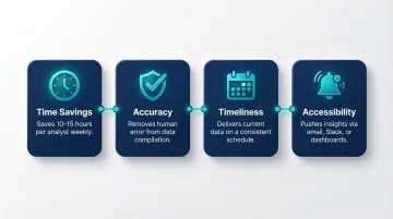
Automating reports delivers four concrete advantages:
- Saves 10-15 hours per analyst each week by eliminating manual data pulls and reformatting
- Removes human error from data compilation, so the numbers stakeholders see are accurate
- Delivers current data on a consistent schedule rather than days or weeks after the fact
- Pushes insights to decision-makers where they already work — email, Slack, or dashboards
When systems are slow or require manual work, people avoid them, leading to a culture of guesswork and shadow spreadsheets. Automation removes that friction, so teams spend time acting on data instead of preparing it.
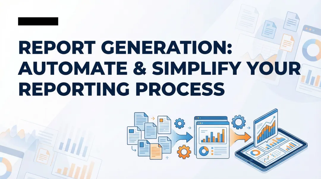
How to Automate Reports: Step-by-Step Guide
Step 1: Define Your Reporting Goals and Key Metrics
Clarify what decision the report is meant to support—without this, automation just accelerates the production of irrelevant data. Identify the audience (executives, operations, sales) and their specific information needs. A report designed for daily operational decisions requires different metrics and granularity than a weekly executive summary.
Specify which metrics to include, at what granularity (daily, weekly, monthly), and what format is most useful (table, chart, summary narrative). Poorly defined metrics are the leading cause of automated reports that nobody reads. Research shows that 40% of users feel dashboards don't help them make better decisions, and 51% cannot interact meaningfully with their data. This disconnect leads to 72% of users abandoning dashboards for spreadsheets.
Why this matters: Despite massive investments, 60% of BI projects fail to deliver business value. Gartner forecasts that by 2027, eight out of ten analytics projects will fail, largely due to poorly defined business objectives and a lack of understanding about which specific decisions analytics should change.
Key questions to answer:
- What specific decision does this report support?
- Who needs this information, and how frequently?
- What metrics matter most to this audience?
- What format makes the data easiest to act on?
Step 2: Connect and Prepare Your Data Sources
Identify all data sources the report will draw from—databases, cloud platforms, spreadsheets, CRMs, ERP systems—and ensure each has a stable, accessible connection method (API, direct query, or file import). Modern platforms support 500+ integrations, but compatibility requirements still matter: the reporting tool must support the data sources in use, and access credentials/permissions must be configured and maintained.
Emphasize data preparation: Raw data must be cleaned, normalized, and structured before automating. Automating on top of messy data produces consistently wrong reports at scale, which is worse than manual reporting. Gartner research reveals that poor data quality costs organizations an average of $12.9 million annually, with 68% of respondents citing inaccuracy as their top issue.
Common data quality problems:
- Inaccuracy – 68% of organizations struggle with incorrect data
- Incompleteness – Poor data completeness affects 60% of BI reports
- Inconsistency – 65% of multi-cloud environments face data consistency issues
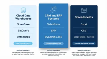
Top data sources to integrate:
| Data Source Category | Common Examples | Strategic Importance |
|---|---|---|
| Cloud Data Warehouses | Snowflake, BigQuery, Databricks | Centralized storage and compute for enterprise analytics |
| CRM & ERP Systems | Salesforce, SAP, Dynamics 365 | Critical for operational reporting; often require integration to avoid siloed metrics |
| Spreadsheets | Excel, CSV files | Ubiquitous but problematic at scale; frequently used as stopgap data source |
For AI-powered platforms like Sylus, connecting data sources is simplified through 500+ pre-built integrations that ground all analysis in governed context using dbt models and documentation. This ensures data consistency and reliability across all automated reports.
Step 3: Build the Report Template or Dashboard
The report template defines what gets generated each time—the layout, visualizations, and calculated fields should be finalized before scheduling. Rebuilding the template mid-automation breaks consistency and confuses recipients who expect standardized formats.
What makes a useful automated report:
- Scannable – Clear headline metrics at the top
- Focused – Includes only the metrics defined in Step 1
- Consistent – Uses the same formatting so recipients can interpret it instantly
- Actionable – Highlights changes, trends, or anomalies that require attention
Traditional dashboard creation is slow: 41% of companies spend over four months building dashboards, and 19% are stuck in projects that never finish. This timeline is a major barrier to automation.
AI-powered tools reduce template-building time dramatically. Companies achieve 18-25% productivity improvements with AI visual implementation, and AI-assisted tools drive a 30% reduction in analysis time for common business questions. For example, T-Mobile achieved an 11x increase in real-time request processing using Power BI's AI visuals.
For platforms like Sylus, users can describe what they want in plain English and generate dashboards automatically—reducing the template-building burden for data teams. The AI reasons through data thoroughly before presenting final dashboards with insights and key findings, eliminating the need for manual dashboard construction.
Step 4: Schedule Automated Refreshes and Delivery
Scheduling has two components: (1) data refresh—how often the underlying data is pulled and updated, and (2) report delivery—how and when the finished report is sent to stakeholders (email, Slack, embedded link, etc.).
Delivery should match the decision cadence of the audience. Daily operational reports need daily refreshes, while executive summaries may only need weekly updates. Mismatching these creates confusion—hourly refreshes on data that updates daily waste resources, while daily refreshes on real-time operational data causes missed signals.
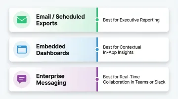
Delivery methods:
| Delivery Method | Best Use Case |
|---|---|
| Email / Scheduled Exports | Standard reporting for executives who prefer reviewing numbers in their inbox |
| Embedded Dashboards | Providing contextual insights within operational applications users already use daily |
| Enterprise Messaging (Teams, Slack) | Real-time notifications and collaborative decision-making |
Meeting users in the workflow is critical. Microsoft Teams reached 320 million monthly active users in 2024, while Slack reported 47.2 million daily active users in 2025. Delivering automated reports directly into these platforms ensures insights reach users in their natural workflow, reducing the friction of logging into separate BI portals.
Tools supporting Slack delivery or alert-based notifications (e.g., flagging anomalies automatically) drive higher engagement—recipients only engage when there's something actionable to review. Sylus, for example, allows users to schedule reports and AI-generated summaries to email or Slack, and even query data directly from Slack using natural language commands.
Key Variables That Affect the Quality of Automated Reports
Automation doesn't guarantee good reporting. The following variables determine whether your automated reports are trusted and acted upon—or ignored.
Refresh Frequency vs. Data Latency
Refresh frequency must align with how quickly the underlying data actually changes. Setting hourly refreshes on a data source that updates daily wastes resources and creates false urgency; setting daily refreshes on real-time operational data causes missed signals.
Impact: Mismatched refresh frequency is one of the most common reasons stakeholders stop trusting automated reports. 77% of IT decision-makers don't trust data in their dashboards, and 67% of organizations don't completely trust their data for decision-making. When a dashboard displays stale data without clear indicators, users lose confidence fast.
That lost confidence has a direct cost: teams revert to manual workarounds, executives build shadow spreadsheets, and suddenly there are multiple conflicting versions of the same metric in circulation.
Data Source Reliability
Broken data pipelines, schema changes, or credential expirations will cause automated reports to fail silently or display outdated/incorrect data. Stable automation requires monitoring the data connections themselves, not just the report output.
Impact: Data downtime nearly doubled year-over-year, with organizations experiencing an average of 1 data quality issue for every 10 tables per year. When incidents occur, the average time to resolution is 15 hours per incident. Alarmingly, 74% of data professionals report that business stakeholders identify data quality issues first, "all or most of the time."
What to check:
- Alerts when data sources become unavailable or connections drop
- Notifications when ETL jobs fail or data quality thresholds are breached
- Scheduled credential rotation before API keys and database passwords expire
Best practices from Gartner and dbt Labs include automated testing for uniqueness, non-null values, and referential integrity to catch issues before they reach production. Use column-level lineage to trace data origins and understand the downstream impact of pipeline failures.
Report Governance and Data Context
Reports are only as trustworthy as the definitions behind them. Without governed context—standardized metric definitions, documented data models, and validated calculations—different reports will show conflicting numbers for the same metric.
Impact: When different teams write different SQL to calculate the same KPI, results inevitably clash. Sales might track bookings differently from finance's revenue definition, turning leadership meetings into reconciliation sessions rather than decision-making ones.
Solution: The dbt Semantic Layer allows organizations to define metrics in code exactly once—every downstream tool (Looker, Tableau, Power BI) queries that single definition, eliminating the drift that comes from ad hoc calculations. Platforms like Sylus take this further by grounding all AI-generated analysis in your dbt models and documentation, so every automated report reflects the same validated, organization-wide definitions.
Distribution and Access Controls
Automated delivery without proper access controls can result in sensitive data being shared with the wrong audience. Report permissions, viewer roles, and data-level filtering (row-level security) must be configured before automation goes live.
Impact: Access control failures are both a compliance risk and a trust issue—stakeholders who receive reports showing data irrelevant to their role quickly disengage. For enterprises handling sensitive data, SOC 2 Type II and HIPAA compliance (like Sylus offers) ensure that scheduled reports meet regulatory requirements for data protection, access controls, and audit trails.
Common Mistakes When Automating Reports
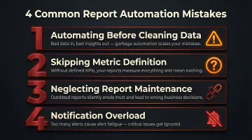
Automating Before Cleaning the Data
Jumping to scheduling before the underlying data is validated means errors are consistently reproduced at scale. The correct order is: clean data first, then automate. Approximately 88% of spreadsheets contain at least one error in their formulas, and automating on top of this creates systematically flawed reports.
Skipping Metric Definition
Teams automate "all available data" into a report without agreeing on what each number means. The result is a bloated report full of metrics no one understands or trusts. Before building templates, document each metric — its formula, data source, and intended audience.
Neglecting Report Maintenance
Automated reports require ongoing maintenance. Data schemas change, business logic evolves, and KPI definitions shift over time. Build a review cadence — quarterly works well — to audit automated reports for continued accuracy. Power BI deactivates the refresh schedule after four consecutive failures, highlighting the need for reliable infrastructure and credential management.
Notification Overload
Over-automating — sending too many reports or too-frequent alerts — leads to stakeholder fatigue where important signals get ignored. Organizations receive an average of 2,992 security/system alerts daily, yet 63% go unaddressed. Alert fatigue is the number one obstacle to faster incident response.
Prioritize fewer, higher-quality automated touchpoints over high volume. Configure alerts with strict thresholds so only actionable notifications reach the right people.
When Should You Automate Reports (and When You Shouldn't)?
Ideal conditions for report automation:
- The report is generated on a recurring schedule
- The metrics are stable and well-defined
- The audience is consistent
- The data sources are reliable
Recurring operational reports, weekly performance summaries, and monthly finance reports are prime candidates.
When automation is the wrong tool:
- One-off analyses
- Exploratory data questions where the right metrics aren't known yet
- Situations where the business logic changes frequently
Automating in these cases wastes setup time and produces misleading outputs.
Automation delivers compounding value as report frequency and audience size grow. A report sent once a month to two people may not justify the setup time; the same report sent weekly to 50 stakeholders does. Tools with usage-based pricing — rather than per-seat licensing — make this easier to scale, since cost grows with actual usage rather than headcount. Sylus, for example, charges based on estimated usage so organizations can distribute reports to hundreds of stakeholders without ballooning license costs.
Frequently Asked Questions
How to automate reporting process?
Automating the reporting process involves four key steps: defining your metrics and audience, connecting and preparing data sources, building a reusable report template, and scheduling automated data refreshes and delivery via email, Slack, or a shared dashboard link.
What is the best way to automate Excel reports?
Start with Excel's built-in Power Query for scheduled data refresh, or connect Excel to a BI tool like Power BI for automated distribution. If your data volume or stakeholder count is pushing limits—Excel caps at 1.04 million rows and has an 88% formula error rate at scale—a dedicated reporting platform is worth considering.
Can ChatGPT automate Excel?
ChatGPT can help write Excel macros (VBA) or Power Query scripts to automate repetitive tasks, but it doesn't natively connect to or refresh live data. AI-native analytics platforms designed specifically for business data—rather than general-purpose LLMs—are better suited for end-to-end report automation.
What are the benefits of automated reporting?
Automated reporting saves analysts 10-15 hours per week by eliminating manual data pulls. It also reduces compilation errors and gets stakeholders access to current insights on a consistent schedule—without waiting on someone to run the numbers.
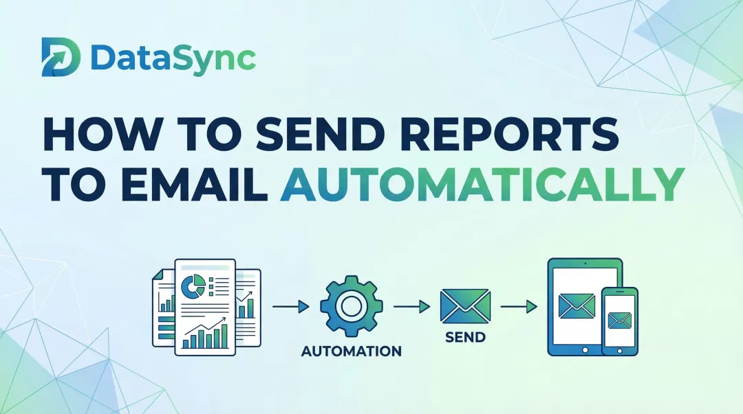
How do you schedule automated reports to email or Slack?
Most BI and analytics platforms (including AI-powered tools like Sylus) include built-in scheduling features where you set a frequency, select recipients or Slack channels, and configure what the report contains—after which delivery happens automatically.
What is the difference between a BI dashboard and an automated report?
A BI dashboard is a live, interactive view users access on demand. An automated report is a formatted snapshot pushed to recipients on a schedule. Most modern tools support both—the dashboard serves as the source, and scheduled reports handle the delivery.