Introduction
Report generation is the process of extracting data from one or more sources, transforming it, and producing a structured document or dashboard that informs decisions. This matters most to data teams, business analysts, and operations leaders—professionals who know that without reliable, timely reports, decisions get made on stale or incomplete information.
Yet most organizations still rely on manual reporting: copy-paste from spreadsheets, ad-hoc SQL queries, emailed files. Even as data volumes grow and sources multiply, teams remain stuck in repetitive cycles that don't scale. Data professionals spend approximately 45% of their time on data preparation and cleansing tasks, leaving little room for strategic analysis.
What follows breaks down how the report generation process works, where it typically breaks down, and what a modern automated pipeline actually looks like in practice.
Key Takeaways
- Report generation covers the full pipeline: sourcing data, applying logic, and delivering a readable output (PDF, dashboard, or scheduled summary)
- Manual reporting is slow and error-prone; automation delivers accurate outputs on demand or on schedule
- The process runs in three phases: connect your data, transform it with logic, then distribute the output
- Quality hinges on data freshness, schema consistency, metric definitions, and governance
What Is Report Generation?
Report generation is a computer-assisted process that takes raw data from a source—database, spreadsheet, API, data warehouse—and produces a formatted, human-readable output. The goal is simple: get the right information to the right person at the right time. Business users need to track metrics, monitor performance, and back decisions with data that's timely, accurate, and relevant.
The process delivers outputs matched to how audiences consume them: tables for analysts, charts for executives, narrative summaries for stakeholders. This isn't the same as data analysis (which discovers insights) or data visualization (which focuses on rendering). Report generation is the full pipeline from source data to finished deliverable—often combining both.
What the process achieves:
- Timely delivery of information when stakeholders need it
- Accuracy through governed metric definitions and validated queries
- Relevance by tailoring structure and format to the audience
- Consistency across teams through centralized data models
Achieving all four consistently is where most teams struggle. Sylus automates this pipeline by grounding every analysis in dbt models and documentation, so metric definitions stay consistent across the organization. Users connect data sources, ask questions in plain English, and receive dashboards or scheduled summaries without writing SQL—removing technical friction without sacrificing accuracy.
Why Manual Reporting Breaks Down in Modern Data Environments
As data sources multiply—databases, SaaS tools, data warehouses, spreadsheets—the manual process of pulling, reconciling, and formatting data becomes increasingly time-consuming and fragile. Enterprises now manage an average of 106 SaaS applications, creating a web of disconnected systems that analysts must reconcile by hand.
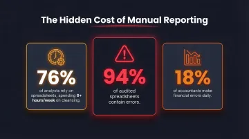
The time cost alone is significant. 76% of analysts still rely on spreadsheets for data preparation, spending over six hours per week on cleansing tasks alone. That leaves little capacity for the analysis that actually informs real decisions.
Accuracy suffers just as much. Manual steps introduce copy-paste errors, formula mistakes, and version conflicts. A Gartner survey found that 18% of accountants make financial errors at least daily due to capacity constraints, while 94% of audited spreadsheets contain errors. When multiple teams maintain separate reports from the same data, metric definitions drift and stakeholders stop trusting the numbers.
Then there's latency. Manual reports are typically weekly or monthly snapshots. By the time one reaches decision-makers, the data may already be outdated — and modern operations rarely have that kind of margin.
These failures point to the same gap. Scaling teams need reporting systems that deliver:
- Consistent metric definitions across teams
- Real-time or near-real-time refresh cycles
- Automated delivery to distributed stakeholders
- Audit trails for reported figures
Manual workflows can't meet these requirements reliably. Automated reporting pipelines replace the guesswork with a single, consistent source of truth every stakeholder can act on.
How the Report Generation Process Works
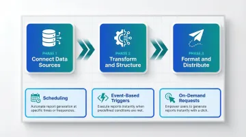
The report generation process follows a three-phase flow: (1) connect and collect data from sources, (2) transform and apply analytical logic, (3) format and distribute the output. Automation compresses or eliminates manual handoffs between these phases.
What goes into the process:
- Data source(s)—warehouse, database, SaaS tool
- Query or data model defining what to retrieve
- Template or layout definition
- Delivery mechanism—email, dashboard link, Slack message, embedded view
How the process is controlled:
- Scheduling: Time-based triggers (daily, weekly, monthly)
- Event-based triggers: Threshold alerts, data refreshes
- On-demand requests: User-initiated queries
Governance layers—such as dbt models or centralized semantic layers—ensure consistency across runs. Looker's semantic layer reduces data errors in generative AI queries by as much as two-thirds by centralizing metric definitions.
Connect Data Sources
Users connect the report generator to one or more data sources—warehouse, database, or SaaS integration. The key requirement is that the connection is live or regularly refreshed, not a manual export. This enables automation downstream.
Sylus supports 500+ pre-built integrations across categories including data warehouses, CRM systems, ERP platforms, accounting tools, e-commerce systems, and spreadsheets. One-click setup and real-time synchronization eliminate the need for manual exports or data uploads.
Transform and Structure the Data
With Sylus, this step starts with a plain-English question—the system writes and validates the query automatically, without requiring SQL. For teams using traditional tools, pre-defined data models pull relevant fields, apply aggregations, calculations, and filters, and structure the output according to the report's purpose.
Sylus grounds all analysis in dbt models and dbt documentation, ensuring that every query references governed metric definitions. This prevents the risk of conflicting numbers across reports.
Format and Distribute the Output
The transformed data is rendered into a human-readable format—table, chart, narrative summary, or full dashboard—and delivered to the intended audience.
Delivery methods include:
- Scheduled email
- Slack message
- Shareable link
- Embedded view inside a product or internal site
Sylus supports all of these with scheduled AI-generated summaries, so stakeholders receive relevant context alongside the data. Users can also export reports as CSVs or PDFs for external distribution.
Full Automation vs. Semi-Automation: Choosing the Right Approach
Full-Automatic Report Generation
The entire pipeline—data pull, transformation, formatting, and delivery—runs without manual intervention, triggered by a schedule or event. Ideal for recurring reports with stable structures: daily KPI summaries, weekly performance digests, monthly financial snapshots.
When to use:
- High-cadence, standardized outputs
- Known metrics and stable audience
- Operational dashboards requiring real-time updates
Semi-Automatic Report Generation
Semi-automatic reporting requires human involvement at one or more stages—typically query design, template customization, or review. It's more flexible for one-off or exploratory reports, but does not eliminate the bottleneck for recurring work.
When to use:
- Ad-hoc analysis
- New report types requiring validation before distribution
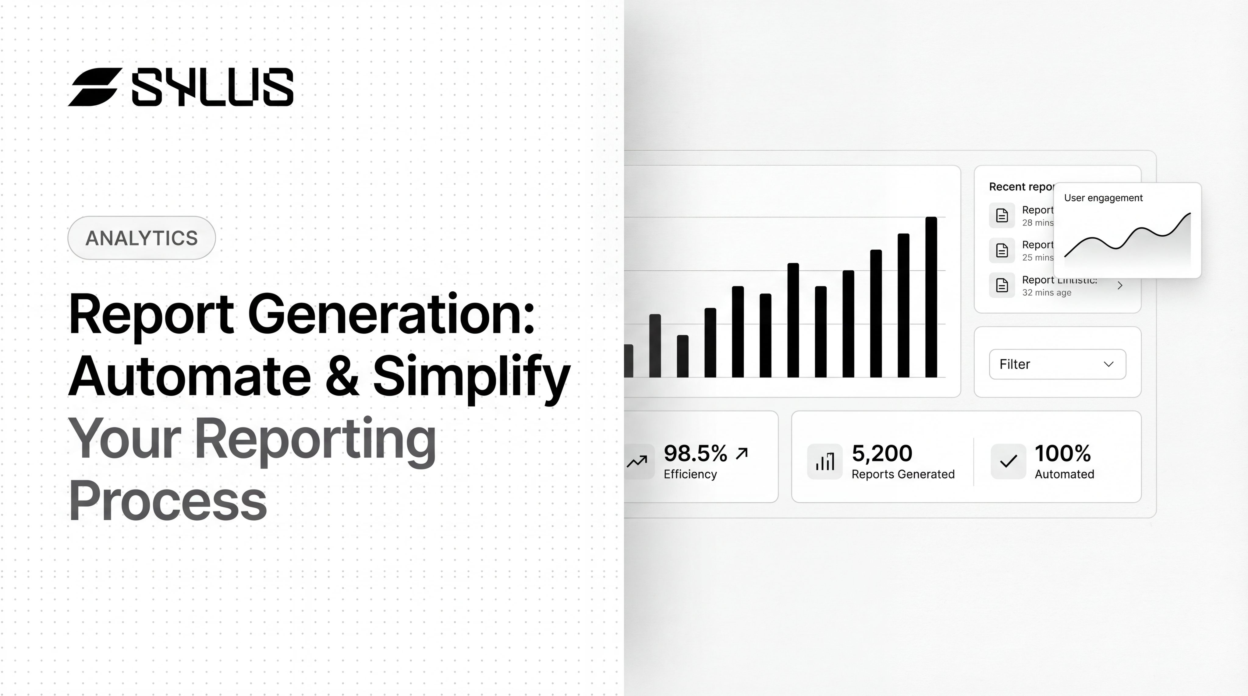
That gap is narrowing. AI-powered platforms now handle query generation and layout dynamically, even for novel questions. Sylus, for instance, lets users ask new questions in plain English and get instant dashboards without pre-built templates — so recurring work runs automatically while ad-hoc analysis stays just as fast.
ROI of Full Automation
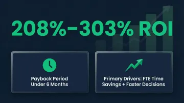
Enterprise reporting automation yields returns ranging from 208% to 303%, with payback periods routinely under six months. The primary drivers are FTE time savings and faster decision-making — two gains that compound quickly at scale.
Key Factors That Affect Report Generation Quality
Data Freshness and Pipeline Reliability
Reports are only as current as the underlying data. A report that runs on stale or incomplete data can be worse than no report at all. Organizations experience an average of one data quality issue for every 10 tables per year, taking an average of 15 hours to resolve each incident. Worse, 74% of data professionals report that business stakeholders identify data quality issues before the data team does — a fast way to erode trust.
Solution: Implement data observability and automated testing to catch pipeline breakages before stakeholders do.
Metric Definition Consistency
When different teams define "revenue" or "active users" differently, automated reports produce conflicting numbers. Governed metric layers—such as dbt models with documented definitions—are the structural fix.
By 2030, universal semantic layers will be treated as critical infrastructure, alongside data platforms and cybersecurity. Sylus grounds all analysis in dbt models, ensuring metric consistency across reports and eliminating definition drift.
Schema Stability
Automated reports break when upstream tables change column names, data types, or grain. Schema drift accounts for 7.8% of data quality incidents, silently breaking downstream pipelines and dashboards.
Solution: Use metadata observability to continuously track schema changes and implement metadata contracts to formalize expectations around schema structure.
Access Control and Security
Report distribution must respect data permissions — not every recipient should see every field. For regulated industries, look for platforms that carry SOC 2 Type II and HIPAA certifications at a minimum.
Sylus meets both standards and supports self-hosted deployment in air-gapped environments (fully isolated networks) for organizations with strict data privacy requirements. Administrators can assign granular permissions — "Full access" or "Can view" — controlling exactly what each recipient sees.
Output Format and Audience Fit
A report optimized for a CFO (high-level narrative + one chart) differs from one for a data analyst (full table + query logic). The format should match how the audience actually uses the information.
Sylus tailors output to the question asked, combining AI-powered summaries with visualizations. Features built for audience fit include:
- Customizable charts using plain English commands
- Collections to organize reports by audience (e.g., "KPIs for the Board" or "Sales Assets for Upper Management")
- Scheduled delivery to email or Slack so each team gets the right view automatically
Common Misconceptions About Automated Report Generation
Misconception 1: "Automated reports are always accurate"
Automation removes manual effort but does not guarantee correctness. If the underlying query logic or metric definition is wrong, the report will be consistently wrong, not occasionally wrong. Validation and governed context matter.
Sylus addresses this by grounding all analysis in dbt models and dbt documentation, ensuring queries reference validated metric definitions. The platform also includes metric verification workflows, allowing teams to request verification of reports with status tracking (Not Requested, In Review, Verified, Backlogged).
Misconception 2: "You need to be technical to set up automated reports"
Modern AI-powered tools have eliminated the requirement for SQL or code. Users can describe what they want in plain English and the system handles query generation, though understanding the data model still adds value.
Sylus enables non-technical users to ask questions like "show me my top customers" directly in Slack or the main interface, receiving instant visualizations without writing queries. Key capabilities that make this possible:
- Explores your data and validates assumptions before returning a result
- Generates charts and dashboards from plain English descriptions
- Connects to your data sources without requiring SQL access
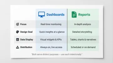
Misconception 3: "A dashboard is the same as a report"
Dashboards provide real-time, interactive monitoring; reports are typically point-in-time, structured summaries designed for a specific audience or decision. Both have their place, and mixing them up leads to using both poorly.
| Feature | Dashboards | Reports |
|---|---|---|
| Focus | High-level view of broad data | Narrow, deep-dive into a data set |
| Design Goal | Pixel-perfect, designed for printing or sharing | Answer a single question at a glance |
| Data Display | Visualizations constrained to a screen | Displays all data in tables, spanning multiple pages |
| Distribution | Interactive exploration | Scheduled and shared with large user communities |
Sylus supports both use cases: automated dashboard generation for real-time monitoring, and scheduled reports with AI-generated summaries for point-in-time distribution.
Frequently Asked Questions
What does report generation mean?
Report generation is the process of extracting data from a source, applying structure or analysis, and producing a formatted document for a specific audience or purpose. It covers everything from the initial data pull to the finished, distributable output.
What is the process of report generation?
The process has three core phases: connecting to a data source, transforming and structuring the data through queries or models, and formatting and distributing the final output via dashboards, emails, or scheduled reports.
What is automated report generation?
Automated report generation uses software to run the entire data-to-output pipeline on a schedule or trigger, without requiring manual steps. It covers data pull, transformation, formatting, and delivery—eliminating repetitive work and ensuring consistent outputs.
Which AI is best for report generation?
The best AI depends on your data infrastructure and use case. Look for natural language querying, connections to existing data sources, governed metric definitions, scheduling features, and security compliance (SOC 2, HIPAA). Sylus covers all of these, grounding analysis in dbt models with plain-English queries.
Is report generation a skill?
Yes—it combines technical knowledge (data sources, query logic, tool configuration) with communication judgment (knowing what an audience needs and how to present it). AI tools are absorbing more of the technical work, but domain expertise still matters.
What are 5 examples of reports?
Five common report types, each serving a different audience:
- Executive KPI dashboards — high-level metrics for leadership
- Financial performance reports — revenue, expenses, and profitability
- Sales pipeline reports — opportunity tracking and forecasting
- Operational status reports — system health and incident tracking
- Product analytics reports — user engagement and feature adoption