Introduction
Dashboards are full of charts, yet stakeholders still ask analysts "so what does this mean?" This tension reveals a fundamental flaw: visualization is only half the story. The narrative layer is where insights become decisions.
Traditional BI creates a massive productivity bottleneck. Analysts spend hours manually writing summaries, annotating screenshots, and building presentation decks to explain what dashboards already show — a cycle that's repetitive, slow, and impossible to scale across teams or business units.
The cost is measurable. Research from Accenture and Qlik shows 74% of employees feel overwhelmed working with data, and 48% frequently defer to gut feeling over data-driven insights — costing the US economy $109.4 billion annually in lost productivity.
This guide covers what AI-generated narratives are, how they work technically, the benefits they unlock, real-world use cases, and best practices for accuracy and governance.
Key Takeaways
- AI-generated narratives automatically translate dashboard metrics into plain-language explanations of what happened, why it happened, and what to do next
- They eliminate manual summary writing, chart annotation, and stakeholder deck-building—reducing hours to minutes
- NLP and LLMs convert query results and trend data into structured, readable text—grounded in your actual business context, not generic summaries
- Narratives can be scheduled and delivered to Slack, email, or embedded into reports—not just generated on demand
- Accuracy requires clean data, governed context, and human validation before narratives reach stakeholders
Why Traditional Dashboards Fail to Tell the Full Story
The cognitive gap between "what" and "why"
Dashboards surface the "what"—revenue dropped 15%, conversion rates spiked 22%, customer churn increased 8%—but require viewers to independently figure out the "why." Was the revenue drop caused by a new competitor launch, ad spend shifting, or a system outage? Busy stakeholders don't have time to close this cognitive gap, and most lack the analytical skills to do so reliably.
The $109B manual reporting tax
Data teams spend enormous amounts of time translating charts into words. According to Forrester Total Economic Impact research on Microsoft Power BI, business users saved an average of 1.25 hours per week after automating analytics tasks, while centralized analytics teams reduced their reporting effort by 42%.
The productivity cost runs deep: data overload exceeds $109.4 billion annually in the US economy alone, with companies losing an average of 43 hours per employee each year to data-induced procrastination and stress.
Dashboards Built for Coverage, Not Decisions
Sophisticated dashboards are often built for comprehensiveness rather than decision speed—covering every metric instead of answering the three questions a VP actually needs answered before a meeting. Gartner's 2024 Chief Data and Analytics Officer Survey ranks poor data literacy among the top five barriers to data and analytics success. Only 25% of employees believe they are fully prepared to use data effectively, and just 21% report confidence in their data literacy skills.
Audience fragmentation challenges
A CFO, a regional sales lead, and an operations manager all need the same underlying data framed differently — yet most dashboards serve a single layout for every audience. The result is inevitable manual re-interpretation at every level of the organization.
The timing problem makes this worse. Forrester notes that IT teams often take months to roll out new reports, meaning the business need has already passed by the time the answer arrives. And trust erodes fast: 54% of employees know where to find data reports, but 41% actively mistrust what they find there.
The compounding effect across multiple data sources, metrics, and stakeholder groups is what turns a manageable communication gap into a full bottleneck for data teams:
- CFOs need trend context and variance explanations, not raw chart data
- Sales leads need regional comparisons and pipeline signals surfaced automatically
- Operations managers need threshold alerts and efficiency ratios, not dashboards built for finance
- Executives need the three key takeaways before a meeting, not a 12-tab workbook

What Are AI-Generated Narratives for Dashboards?
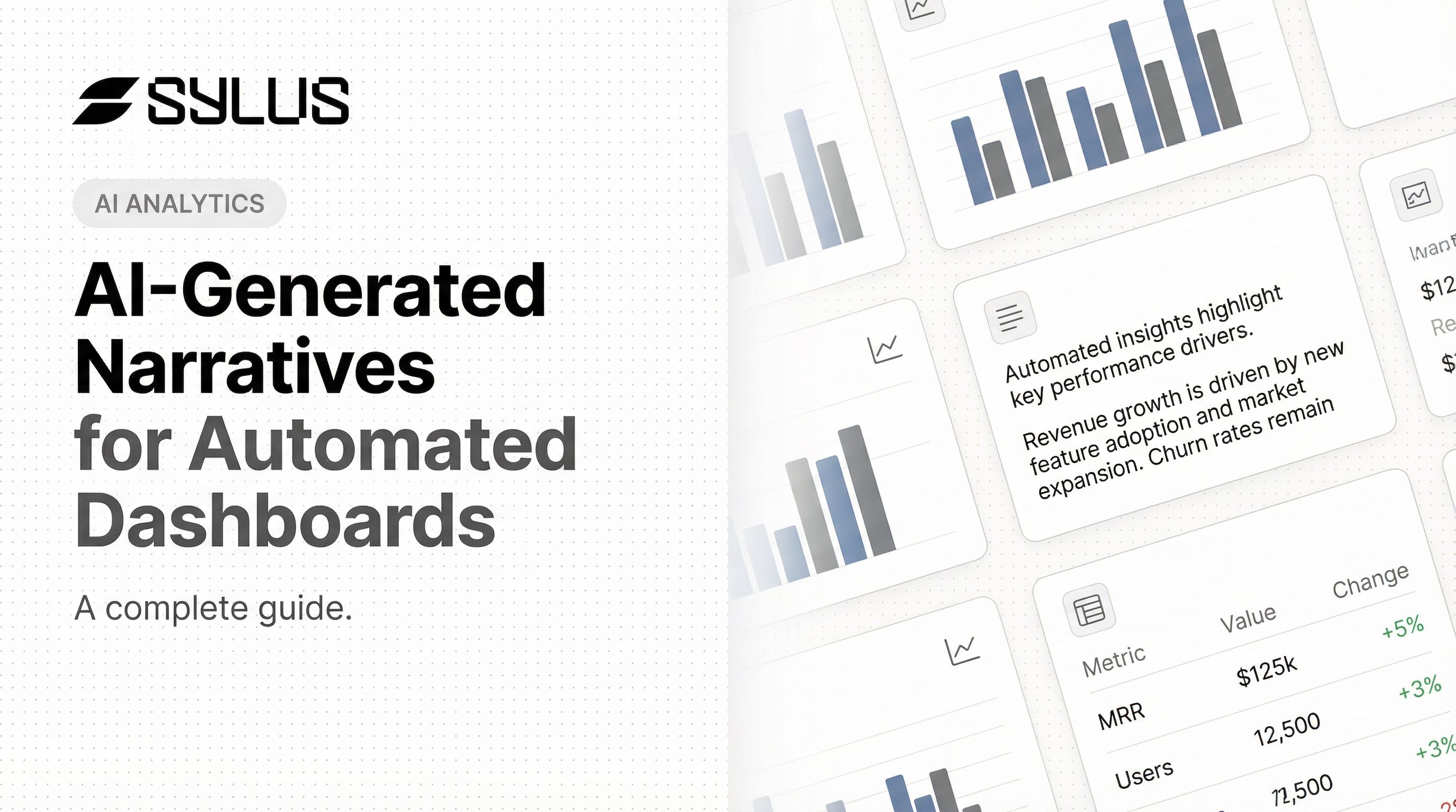
AI-generated narratives are automatically produced text summaries—sentences, paragraphs, and structured insights—that accompany dashboard visualizations and explain what the data means in plain language, without requiring a human analyst to write them.
Beyond Simple Chart Labels
AI narratives go beyond labeling a data point. They contextualize a metric within a trend, identify contributing factors, flag anomalies, and surface recommended actions or next questions to investigate:
- Contextualize a metric against historical trends and benchmarks
- Identify contributing factors driving a change in performance
- Flag anomalies before a human analyst notices them
- Surface next steps — the question worth asking after the data speaks
Gartner defines "augmented analytics" as an approach that automates insights using machine learning and natural language generation (NLG). Their position: data visualization is becoming a commodity, and market differentiation is shifting toward ML-assisted insight generation.
The Spectrum from Static to Interactive
AI narratives range from static auto-generated summaries — a paragraph generated nightly and attached to a scheduled report — to dynamic conversational layers where a stakeholder asks follow-up questions in plain English and gets updated narrative responses in real time.
One distinction worth knowing: Natural Language Query (NLQ) lets users query data using business terms to generate a chart. Natural Language Generation (NLG) automatically writes the story about that chart, surfacing insights like market saturation or emerging trends. They often work together, but they're not the same thing.
What AI Narratives Are (and Aren't)
AI narratives complement charts — they add interpretive depth, not replace the visual. And their quality depends directly on the underlying data quality and the business context they're built on. Strong governance upstream produces reliable narratives; poor data hygiene produces confident-sounding nonsense.
The Role of LLMs in Narrative Generation
Modern AI narrative systems use Large Language Models (LLMs) fine-tuned or prompted with business context: metric definitions, business rules, and historical patterns. That grounding is what separates business-relevant commentary from generic statistical output. All major BI platforms have embedded native NLG capabilities:
| BI Platform | Narrative Feature | Core Capabilities |
|---|---|---|
| Microsoft Power BI | Smart Narrative | Automatically generates customizable text summaries of visuals and reports, highlighting trends and key takeaways |
| Tableau | Explain Data / Data Stories | Builds statistical models to propose explanations for outliers; generates rules-based templated NLG summaries |
| ThoughtSpot | SpotIQ / Sage | AI-powered search experience that generates natural language narratives to summarize change analysis and anomalies |
| Qlik | Insight Advisor / Answers | Auto-generates advanced analyses, narrative interpretations, and conversational analytics across apps |
How AI Generates Narratives: The Technical Workflow
Step 1: Data ingestion and query execution
The system connects to structured data sources (data warehouses, databases, dbt models), executes analytical queries against current data, and retrieves the metric values and trend data that will be the basis for narrative generation. Cloud architectures like Google Cloud's Vertex AI RAG Engine and AWS Amazon Bedrock enable secure ingestion by converting data into high-dimensional embeddings and performing semantic searches in vector stores.
Step 2: Context grounding—the critical difference
Feeding the LLM not just raw numbers but also metric definitions, business rules, historical baselines, and known anomalies is essential. Without this governed context, LLMs will confidently fabricate data. Research shows that while grounded summarization tasks see low hallucination rates (0.7%–1.5%), complex reasoning and open-ended factual recall tasks can trigger hallucination rates exceeding 33% without proper constraints.
Platforms grounded in documented data models—such as dbt documentation—produce more accurate and relevant narratives than those working from raw data alone. Sylus's governed context layer grounds all analysis in dbt models and documentation, ensuring narratives reflect actual business definitions rather than generic interpretations. When an LLM is grounded with a semantic layer, it replaces prompt-only guesses with deterministic, warehouse-specific SQL. Research indicates that using the dbt Semantic Layer improves natural language AI query accuracy to 83%, with several complex questions answered at 100% accuracy.
Architectural Approaches to Narrative Generation:
| Architecture Type | Impact on Hallucination | Best Use Case in BI |
|---|---|---|
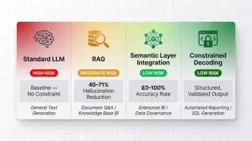
| Standard LLM (Ungrounded) | High risk (33%+ error rates on complex factual recall) | NOT recommended for enterprise BI |
| Retrieval-Augmented Generation (RAG) | Reduces hallucinations by 40-71% | Summarizing unstructured documents or qualitative reports |
| Semantic Layer Integration | Achieves 83-100% accuracy on complex data queries | Generating narratives based on hard financial metrics and KPIs |
| Constrained Decoding | Guarantees precise output structures | Forcing LLMs to output structured data for downstream dashboard rendering |
Step 3: Narrative generation and structure
The LLM constructs narrative output typically organized around a structured format:
- Observation: What changed
- Context: Compared to baseline, benchmark, or prior period
- Interpretation: Likely contributing factors
- Recommendation: Suggested next action or investigation
This structured approach ensures narratives provide actionable intelligence rather than passive data recitation.
Step 4: Audience and tone customization
Effective AI narrative systems allow users to specify the audience (executive, analyst, operations) and tone (formal, concise, exploratory) so the same underlying data produces appropriately tailored language for different stakeholders—without additional manual work. A narrative that is too detailed overwhelms an executive; one that is too high-level frustrates an analyst.
Step 5: Scheduled delivery and distribution
Narratives are not just generated on demand but can be automatically packaged and distributed—sent as email digests, posted to Slack channels, or embedded directly into web products or internal portals on a set schedule. Sylus supports scheduled AI-generated summaries delivered to email or Slack, making narrative delivery an automated part of the reporting workflow. Beyond scheduled delivery, users can also query data directly from Slack and get instant visualizations alongside AI-powered narrative responses—without leaving the chat interface.
Key Benefits for Data Teams and Business Stakeholders
Analyst time reclaimed
Forrester Total Economic Impact data demonstrates substantial productivity gains across platforms:
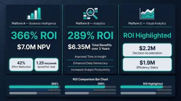
- Microsoft Power BI users saved an average of 1.25 hours per week; democratizing data access reduced centralized analytics team effort by 42%, yielding a 366% ROI, $7.0M net present value, and payback in under 6 months
- ThoughtSpot augmented analytics delivered an average ROI of 289% and $6.35M in business benefits over three years
- Tableau customers reported accelerated decision-making valued at $2.2M and efficiency gains valued at $1.9M
These figures share a common thread: time analysts previously spent explaining data is now spent doing higher-value work.
Faster stakeholder decisions
When the "why" is pre-answered in a narrative summary, executives and business leads spend less time in follow-up meetings asking analysts to explain charts—decisions move faster because interpretation is embedded in the delivery. MIT CISR research found that companies with top-quartile dashboard effectiveness significantly outperform bottom-quartile companies on profit margins and revenue growth.
Schneider Electric introduced a dashboard called the "Digital Flywheel" to measure value creation and help stakeholders understand why certain metrics were important. Revenue generated from this customer engagement platform rose from a very small percentage in 2016 to nearly 50% of the company's €29 billion total revenue in 2021.
Democratized data comprehension
AI narratives lower the barrier for non-technical stakeholders to understand data on their own. A regional manager who can't read a complex trend chart can still act on a plain-English summary: "Northeast conversions dropped 18% this week, likely driven by the pricing update on March 12th."
The skills gap here is real. While 79% of leaders believe they provide essential data skills to their employees, only 40% of employees agree. AI-generated narratives bridge that gap by translating complex visualizations into plain-language summaries anyone can act on.
Consistent, scalable communication
Once the narrative system is configured, it generates consistent, on-message summaries across every report, every region, and every time period—removing the variability that comes from different analysts interpreting the same data differently. This ensures that all stakeholders receive the same foundational interpretation, reducing confusion and misalignment.eliminating the variability that comes when different analysts interpret the same data. This ensures that all stakeholders receive the same foundational interpretation, reducing confusion and misalignment.
Use Cases: Where AI Narratives Add the Most Value
Automated Executive Reporting
AI narratives replace the manual Monday morning summary: the system monitors key KPIs overnight, identifies the most significant movements, and delivers a plain-language executive briefing to leadership's inbox before the standup—covering what changed, what's driving it, and what warrants attention.
Virgin Media O2 deployed Tableau to manage massive amounts of data for fraud prevention. Previously, analysts took one to two weeks to extract and consolidate information via Excel. Using Tableau Pulse, the company can now proactively monitor data. In one instance, Tableau Pulse automatically identified that fraudsters had pivoted from mobile devices to tablets overnight, allowing the company to build new rules immediately—an insight generated by AI rather than manual team analysis.
Marketing and Campaign Performance Reviews
Marketing analysts preparing campaign reports can use AI narratives to auto-generate section summaries for each channel, period, or region—combining dashboard data with external context (e.g., a known PR event, budget shift, or competitive activity) to produce a complete story without manual deck-building.
Act-On Software migrated its data to Snowflake and embedded ThoughtSpot Sage to give its non-technical marketing users direct access to analytics. Natural language search and AI-generated insights were essential for this audience. Within 30 days of launch, Act-On experienced a 60% higher customer report usage compared to their old reporting system, and users spent twice as much time on the page exploring data.
Financial and Operational Monitoring
Finance and operations teams use AI narratives for anomaly explanation: when a financial metric deviates from forecast or an operational KPI spikes unexpectedly, the AI narrative immediately surfaces the most likely contributing factors and quantifies the business impact—replacing the reactive scramble to "figure out what happened."
Allianz Direct put this into practice with an AI-enabled "60-second claim" process—where the narrative layer surfaces relevant claim data instantly rather than requiring analysts to dig. The result: approximately 15% year-over-year revenue growth, a 30–40% reduction in costs, and faster claim resolutions. Mastercard applied the same principle to fraud detection, where AI narratives flagging anomalous transaction patterns helped the company intercept $20 billion in fraudulent activity.

Best Practices for Accurate, Trustworthy AI Narratives
Ground narratives in governed, documented context
The most common failure mode for AI narrative systems is generating plausible-sounding but inaccurate text—caused by feeding the LLM raw numbers without business definitions. Teams should invest in clean metric documentation (e.g., dbt model descriptions, business glossaries) before expecting high-quality narrative output.
A semantic layer defines key metrics and business logic in code, giving the AI a single authoritative source for every calculation. This prevents systems from inadvertently exposing sensitive data or generating insights built on incorrect interpretations.
RAG (Retrieval-Augmented Generation) connects models to external knowledge bases, reducing hallucinations by up to 71% on enterprise tasks. That said, RAG alone isn't enough for complex BI math—a semantic layer like dbt is still required to enforce guardrails on the numbers themselves.
Build in human validation loops
AI narratives should be treated as a first draft, not a final output—particularly for high-stakes communications like board reports or financial disclosures. Recommend review workflows where analysts spot-check narrative accuracy against source data before distribution, especially when a significant anomaly is being explained.
Evaluating hallucination in data-to-text generation requires going beyond traditional overlap metrics (like BLEU or ROUGE), which measure word similarity but miss factual errors. Modern evaluation frameworks use LLM-as-a-judge methodologies with two key metrics:
- Faithfulness: whether every claim in the narrative can be traced back to the source data
- Answer Relevancy: whether the narrative stays on topic, penalizing redundant or off-point content
Responsible AI frameworks—including published standards from major consulting and technology firms—consistently require that teams identify, measure, and mitigate potential harms throughout the development cycle, not just at deployment.
Design for the right audience and delivery cadence
Accuracy matters, but so does fit. The same underlying data story needs to be framed differently depending on who's reading it—an executive needs the headline, while an analyst needs the methodology. Define audience profiles and narrative templates before deployment, then match delivery frequency to each group's decision rhythm:
- Daily: operational teams monitoring live metrics and exceptions
- Weekly: tactical managers reviewing trends and course corrections
- Monthly: strategic stakeholders assessing progress against goals
Frequently Asked Questions
What is an AI-generated narrative in a dashboard?
AI-generated narratives are automatically produced text summaries that explain what metrics mean, why they changed, and what action to consider—appearing alongside charts to replace manual analyst commentary.
Can AI create an interactive digital narrative?
Yes. Modern AI narrative systems support interactive layers where stakeholders can ask follow-up questions in plain English and receive updated narrative responses in real time, rather than waiting on a static report.
Which AI can generate dashboards?
AI-powered BI and analytics platforms can generate dashboards from natural language queries. Platforms like Sylus allow users to connect data sources and generate entire dashboards with AI-written summaries using plain English prompts.
How do AI narratives improve decision-making speed?
AI narratives pre-answer the "why" behind metric changes, eliminating the back-and-forth between stakeholders and analysts—so decisions can be made from the initial report delivery rather than after a follow-up investigation cycle.
How do you ensure AI-generated dashboard narratives are accurate?
Three safeguards keep narratives reliable:
- Ground outputs in governed business context (documented metrics and definitions)
- Validate AI output against source data before distribution
- Build feedback loops that improve narrative quality over time
How are AI-generated summaries delivered to stakeholders?
Common delivery options include:
- Scheduled email digests and Slack channel posts
- Embedded summaries within dashboard views
- Downloadable presentation formats
This lets teams automate narrative distribution on a defined reporting schedule.