Introduction
Most data teams spend the majority of their time wrangling data rather than acting on it. According to IDC research, data workers spend 80% of their time discovering, cleaning, and preparing data—leaving just 20% for actual analysis. Sales figures sit in CRMs, marketing metrics live in ad platforms, and financial data is buried in ERPs, with no single view connecting them. Dashboard reporting solves exactly this problem.
This guide explains what dashboard reporting is, how it differs from standard reports, the four main types of dashboards, real-world departmental examples, key business benefits, and a practical step-by-step process for building one.
Key Takeaways
- Dashboard reporting transforms raw business data into interactive visual displays that update dynamically
- Unlike static reports, dashboards provide real-time monitoring through charts, graphs, and KPI cards
- Four main types exist — analytical, operational, strategic, and tactical — each serving a distinct audience and use case
- Key benefits include reclaiming 70–80% of analyst time and giving every team a single, consistent view of business performance
What Is Dashboard Reporting?
Dashboard reporting is the practice of displaying key business metrics and KPIs visually—using charts, graphs, and data widgets—in a single, unified interface that updates dynamically as underlying data changes. Rather than requiring manual data pulls and spreadsheet updates, modern dashboards connect directly to data sources and refresh automatically.
The core purpose is simple: answer specific business questions at a glance. "How is revenue tracking vs. target this quarter?" "Which sales reps are behind quota?" "Are customer support response times meeting SLA?" Dashboards pull data from multiple systems and present answers in visual formats anyone can interpret.
Key dashboard components include:
- KPI cards: headline numbers like total revenue, conversion rate, and churn percentage
- Trend line charts that show performance over time at a glance
- Bar and pie charts for comparing categories or segments
- Tables when you need the full detail behind a summary number
- **Date filters and drill-downs** so users can explore data independently, without analyst support
Early dashboard reporting relied on Excel spreadsheets with manually updated charts—a time-consuming process that delivered stale insights. Modern interactive dashboards pull live data automatically, shifting businesses from hindsight to real-time insight.
That shift has made dashboard reporting relevant across every business function. Sales managers track pipeline velocity, CMOs monitor campaign ROI, CFOs review burn rate, and HR leaders watch retention metrics. Anyone needing ongoing performance visibility can get it directly, without routing requests through an analyst.

Dashboard Report vs. Standard Report: Key Differences
Reports and dashboards serve fundamentally different purposes. Reports typically provide deep, narrow-focus analysis of a specific dataset over a defined historical period—think monthly sales summary PDFs or quarterly financial statements. Dashboards offer broad, real-time views designed for continuous monitoring rather than one-time reading.
Key dimensions of difference:
| Feature | Dashboard | Standard Report |
|---|---|---|
| Interactivity | High (filtering, drill-downs, dynamic updates) | Low (static PDFs, printed sheets) |
| Frequency | Continuous or intraday updates | Scheduled (weekly, monthly, quarterly) |
| Audience | Daily operational users | Periodic stakeholder review |
| Format | Visual-first (charts, graphs, KPIs) | Often includes narrative commentary and tables |
| Purpose | Real-time monitoring and quick action | Deep-dive analysis and historical documentation |
Choose based on your goal: dashboards suit ongoing performance monitoring where speed matters, while standard reports fit compliance reviews, board presentations, or post-mortem analysis that require documented, auditable output. Research from ThoughtSpot confirms that dashboards drive ongoing use by allowing users to spot anomalies at a glance and drill into underlying data for details.
Dashboards and reports are complementary, not competing. Most data teams rely on both: dashboards for day-to-day decisions, reports for formal analysis that needs to hold up under scrutiny.
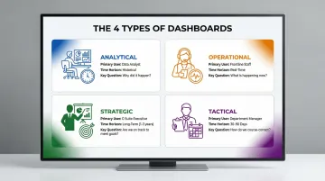
The 4 Types of Dashboard Reports
Choosing the right dashboard type depends on your audience's role and the decisions they need to make. Dashboards fall into four primary categories based on user role, time horizon, and required interactivity.
Analytical Dashboards
Designed for data analysts and power users who need to explore historical data, identify trends, and test hypotheses. These dashboards prioritize flexibility and depth, allowing users to slice data across many dimensions. A marketing analyst might use an analytical dashboard to examine which acquisition channels drove the most high-lifetime-value customers over the past 12 months, comparing conversion rates, CAC, and retention by channel, campaign, and audience segment.
Operational Dashboards
Built for real-time monitoring of day-to-day processes, flagging issues that need immediate attention. Customer support teams track open ticket volume and average response time; IT teams watch system uptime and error rates. These dashboards refresh frequently — sometimes every few minutes — and prioritize alerting over exploration.
The Nielsen Norman Group emphasizes that operational dashboards should use preattentive visual attributes like position and length to communicate status at a glance.
Strategic (Executive) Dashboards
High-level views designed for leaders and executives who need to understand whether the business is on track against long-term goals. These dashboards show aggregate metrics — revenue vs. target, customer growth, gross margin trends — and are typically reviewed in weekly or monthly leadership meetings. The emphasis is on trend direction and goal attainment, not troubleshooting.
Tactical Dashboards
Sitting between strategic and operational, tactical dashboards help team leads and department managers track progress toward specific goals or projects in the near term. A sales manager might use a tactical dashboard to see which reps are behind quota this month and which deals need coaching attention. These dashboards support mid-cycle course corrections and focus on 30-90 day time horizons.
Here's a quick comparison to help you identify which type fits your use case:
| Dashboard Type | Primary User | Time Horizon | Key Question |
|---|---|---|---|
| Analytical | Data analysts | Historical | Why did this happen? |
| Operational | Frontline teams | Real-time | What needs attention now? |
| Strategic | Executives | Long-term | Are we on track? |
| Tactical | Team managers | 30–90 days | Are we hitting our targets? |
Most organizations need more than one type — and knowing which dashboard serves which audience is the first step toward building a reporting setup that actually gets used.
Key Benefits of Dashboard Reporting
The most immediate benefit is speed. By consolidating data from multiple systems into one visual view, dashboards eliminate hours spent manually pulling and formatting data. Forrester research shows that data teams spend 70% of their time prepping new datasets versus just 30% on actual analysis. Automated dashboards flip this ratio, allowing teams to spend time acting on insights rather than preparing them.
Dashboard reporting democratizes data access across organizations. Non-technical stakeholders—executives, sales reps, operations managers—can read and act on data without SQL skills or analyst support. When more people access accurate data, better decisions happen at every organizational level. The BARC Data Culture Survey reveals that 53% of best-in-class companies rely on a "right to know" data access principle (free data access for all employees), compared to only 24% of laggard organizations.
Shared dashboards also eliminate conflicting interpretations of performance. When everyone on a cross-functional team views the same data, they debate priorities using shared facts rather than competing spreadsheets. Research by Dimensional Research found that 82% of companies make decisions based on stale information—and 85% say this directly causes incorrect decisions and lost revenue. A single real-time view removes that ambiguity entirely.
The financial returns are well-documented. Independent ROI studies show consistent gains across platforms:
- Microsoft Power BI: 366% ROI over three years, 125 hours saved per BI user annually, 42% reduction in centralized analytics effort
- ThoughtSpot: 289% ROI driven by a nearly 70% drop in manual report creation

Dashboard Reporting Examples by Department
Sales and Marketing
Sales dashboards track the metrics that reveal where deals are won or lost:
- Pipeline value by stage and rep
- Win rate and average deal size
- Revenue vs. quota (individual and team)
Marketing dashboards focus on spend efficiency and lead quality — covering customer acquisition cost (CAC), lead volume by channel, conversion rates, and campaign ROI. Together, they help managers pinpoint whether performance gaps stem from thin top-of-funnel volume, poor mid-funnel conversion, or sales cycles that are running too long.
Finance and Operations
Finance dashboards give CFOs early warning before issues escalate. Core metrics include cash flow, burn rate, gross margin, and budget vs. actuals — all in a single view that flags variances the moment they appear.
Operations dashboards go a level deeper, tracking throughput, error rates, and SLA compliance. A supply chain dashboard, for instance, might surface On-Time In-Full (OTIF) delivery rates, inventory turnover, and capacity utilization — so bottlenecks get caught before they reach the customer.
Executive and HR
Executive dashboards function as company-wide health scorecards — combining revenue, growth rate, NPS, and headcount into a single leadership view. HR dashboards sit alongside them, tracking:
- Hiring pipeline health and time-to-hire
- Employee retention rate by department
- Engagement scores over time
This pairing helps leadership answer two of the most common resource allocation questions: whether the team has capacity to support growth targets, and whether retention problems are isolated or widespread.
How to Build a Dashboard Report (Step by Step)
Step 1 — Define Your Audience and Questions First
Before selecting a tool or designing a layout, identify exactly who will use the dashboard, what decision it needs to support, and what the 3-5 most critical metrics are for that audience. A common mistake is building dashboards that show everything—dashboards that try to answer all questions end up answering none clearly.
Stephen Few's foundational principle holds that dashboards must fit a single screen with no scrolling — preserving the "simultaneity of vision" needed to spot trends at a glance.
Step 2 — Connect and Validate Your Data Sources
Identify all required data sources — CRM, marketing platform, ERP, product analytics — and connect them to your dashboard tool. The average analytics project integrates six different data sources, so plan for that complexity upfront.
Before building a single visualization, run data quality checks:
- Audit source data for gaps, duplicates, and inconsistencies
- Align metric definitions across teams (what counts as a "qualified lead"?)
- Confirm that calculated fields like MRR use the same formula everywhere
- Document agreed definitions so new users onboard with the same understanding
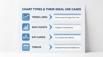
Step 3 — Choose the Right Visualization for Each Metric
Match chart type to data story:
- Trend lines — performance changes over time
- Bar charts — comparisons across categories or segments
- KPI cards — at-a-glance scorecards for key numbers
- Tables — detailed breakdowns when precision matters
Keep visual design clean and consistent. Edward Tufte's principles emphasize maximizing the data-ink ratio — strip out 3D effects, heavy gridlines, and decorative elements that pull attention away from the data itself.
Step 4 — Automate, Share, and Iterate
Once built, set up automated refresh schedules to keep data current. Sylus takes this further: teams can generate complete dashboards by asking questions in plain English, verify metrics collaboratively, and schedule AI-powered summaries delivered directly to email or Slack — removing the manual build cycle entirely.
Dashboards need ongoing maintenance. Gather feedback from users and update based on the decisions they're actually making. Gartner warns that 60% of BI initiatives fail to deliver business value — often because teams treat BI as a technical upgrade rather than a cultural shift. A quarterly review cycle keeps dashboards aligned with how the business has changed.
Frequently Asked Questions
What is the difference between a report and a dashboard?
Dashboards are dynamic, real-time visual displays designed for ongoing monitoring, while reports are static documents presenting historical data snapshots. Dashboards update continuously and support interactive exploration; reports are produced on schedules for deeper documented analysis.
What are the 4 types of dashboards?
The four types are:
- Analytical — deep data exploration, typically used by analysts
- Operational — real-time process monitoring for day-to-day teams
- Strategic/Executive — high-level goal tracking for leadership
- Tactical — near-term performance management by department leads
What is a dashboard example?
Common examples include a sales pipeline dashboard showing deals by stage and rep performance, or a marketing dashboard tracking CAC and campaign ROI. Executive dashboards typically display revenue vs. target alongside customer growth metrics.
What is a reporting dashboard?
A reporting dashboard is an interactive visual interface that aggregates data from multiple sources and displays key metrics in real time, enabling teams to monitor performance and make data-driven decisions without manual data preparation.
What are the 4 types of reports?
The four common report types are:
- Informational — presents facts without analysis
- Analytical — provides evaluation and recommendations
- Operational — monitors production and processes
- Research — presents findings from studies
All four differ from dashboards in depth, format, and intended use.
What is another name for a dashboard report?
Common alternative names include "business intelligence (BI) dashboard," "KPI dashboard," "performance dashboard," or "management dashboard"—all referring to visual data displays used to track metrics and support decisions.