Introduction
Marketers today juggle data from paid ads, SEO, social media, email, and CRM—all in separate platforms, none of them talking to each other. Pulling it into a coherent picture means hours of manual work every week.
The numbers back this up: analytics teams spend 60–80% of their time on data preparation rather than acting on insights, and 78% of B2C marketing executives admit their marketing and loyalty technologies remain siloed. That's time spent wrestling with spreadsheets instead of making decisions.
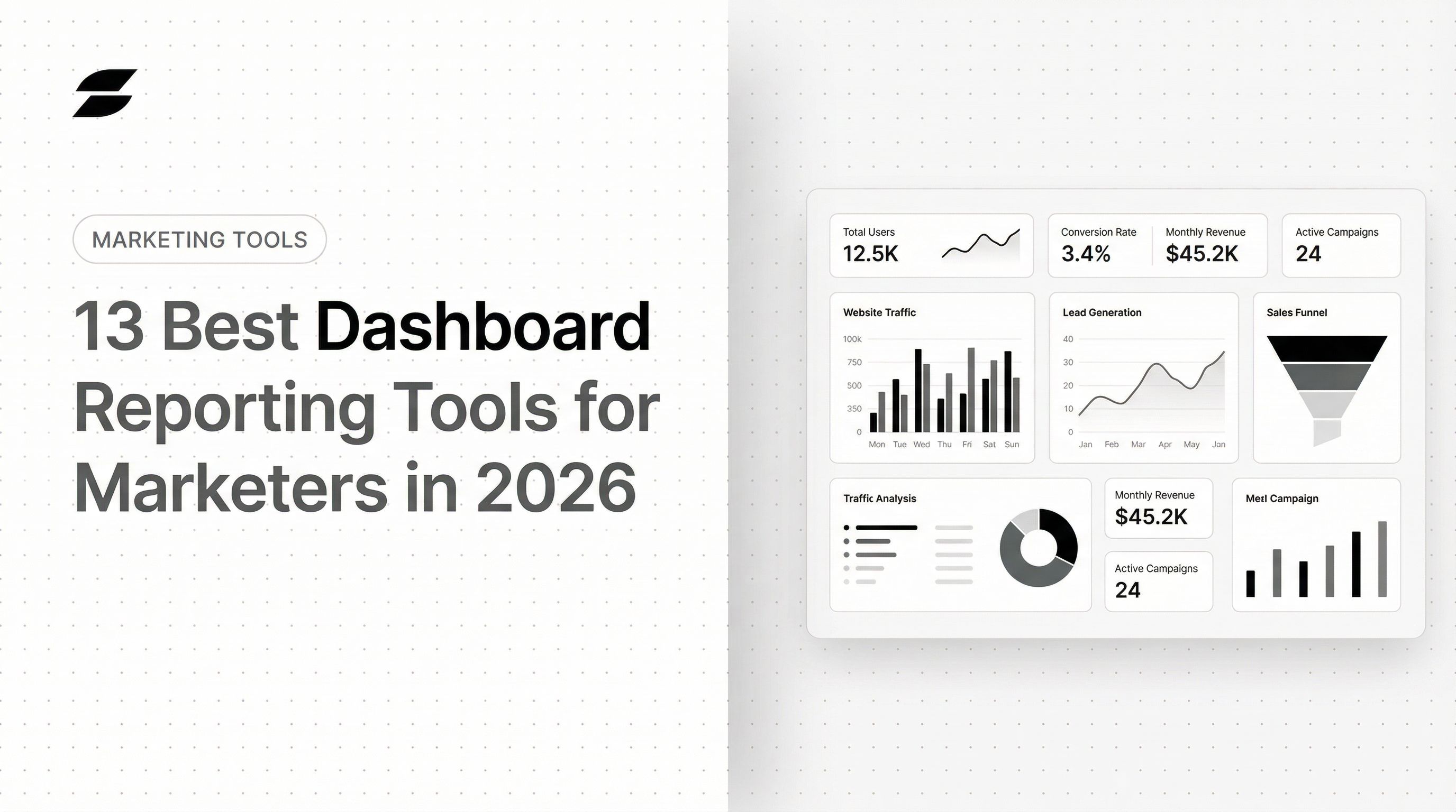
The right dashboard reporting tool eliminates fragmented reporting, replaces manual spreadsheet work, and gives teams a single source of truth for marketing performance. This guide covers the 13 best dashboard reporting tools for marketers in 2026, what to look for when choosing one, and how each tool stacks up on features, pricing, and use case fit.
Key Takeaways
- Dashboard reporting tools convert raw marketing data into visual, real-time dashboards—helping teams track performance and make faster decisions.
- Top tools in 2026 combine ease of use, strong marketing integrations, AI-assisted insights, and flexible sharing.
- Key factors to compare: integrations, AI capabilities, customization, automated sharing, access controls, and pricing model.
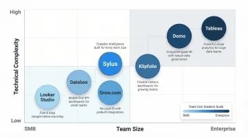
- Sylus leads the list as the most AI-native option—letting marketers generate full dashboards and query data in plain English, grounded in governed business context.
- Other top picks include Looker Studio (free, Google-native), Microsoft Power BI (enterprise-grade), Databox (mobile-first), and Tableau (advanced visualization).
What Is Dashboard Reporting?
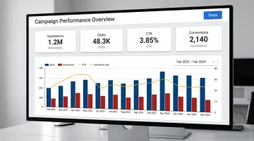
Dashboard reporting is the practice of connecting multiple data sources into a centralized, visual interface that displays key marketing KPIs in real time—replacing static spreadsheets and periodic manual reports. Marketing dashboards typically track metrics like campaign ROI, channel performance, lead volume, conversion rates, and spend across platforms.
This matters specifically for marketers in 2026 because the volume of channels has expanded dramatically. Technology marketers with $100 million or more in annual revenue now use an average of 16 marketing channels, while Salesforce reports that marketers use an average of 10 customer engagement channels. Data is siloed across those platforms, and stakeholders expect always-on visibility—making a centralized reporting layer less optional than it used to be.

13 Best Dashboard Reporting Tools for Marketers in 2026
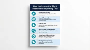
Tools were evaluated based on integration depth, AI capabilities, ease of use, sharing features, security, and pricing transparency—criteria that matter most for marketing teams.
Sylus
Sylus is an AI-powered analytics platform that lets marketers connect their data sources and generate full dashboards by asking questions in plain English—no SQL or manual chart-building required. Sylus builds on governed context (dbt models and documentation), ensuring every AI-generated insight is grounded in validated business definitions rather than guesswork.
Sylus stands out for marketers because the AI analyst autonomously explores data, validates assumptions, and returns a final deliverable (chart, dashboard, or summary) in seconds. Describe what you want and receive a complete, shareable result instantly.
The platform offers unlimited seats with usage-based pricing (no per-user license cost), SOC 2 Type II and HIPAA compliance, a self-hosted deployment option, and scheduled AI-generated summaries to email or Slack. Neither Sylus nor its model partners train on customer data.
| Feature | Details |
|---|---|
| Key Features | AI dashboard generation, plain English querying, governed context (dbt), Slack integration, activity spike alerts, embeddable dashboards, collections for organization |
| Pricing | Usage-based (not per-seat); unlimited users included; contact for custom pricing |
| Best For | Data teams and business users at fast-growing startups and enterprises who want AI-powered, self-service marketing analytics without per-seat pricing constraints |
ThoughtSpot
ThoughtSpot is an AI-augmented analytics platform built for growing businesses and enterprises that want self-service, search-driven data exploration. Its "Spotter" AI analyst lets users type natural-language questions and receive instant visualizations.
Non-technical marketers can explore data from any angle without pre-defined drill paths, and the AI Highlights feature flags unusual trends automatically. The main trade-off is an initial learning curve for advanced analytics features.
| Feature | Details |
|---|---|
| Key Features | Search-driven analytics, AI Highlights, real-time drill-down, automated KPI alerts, personalized data stories |
| Pricing | Essentials: $25/user/month; Pro: $50/user/month; Enterprise: custom pricing (billed annually) |
| Best For | Growing businesses and enterprises that want search-first, self-service BI with AI-powered trend detection |
Metrics Watch
Metrics Watch is a lightweight reporting tool designed for freelancers, small businesses, and boutique agencies that need to deliver marketing reports to clients via email, with no client login required.
Its standout feature is the ability to send fully formatted reports directly to inboxes using native email connectors for Google Analytics, Facebook Ads, and other platforms, removing extra steps for clients entirely. It is best for simple, recurring email-based reporting rather than advanced interactive dashboards.
| Feature | Details |
|---|---|
| Key Features | Email-native report delivery, native marketing connectors, recurring report scheduling, no client login required |
| Pricing | Reports: $49/month (Startup) to $399/month (Agency); Alerts: starting at $79/month |
| Best For | Freelancers and small agencies delivering lightweight, recurring email reports to clients |
Looker Studio
Looker Studio (formerly Google Data Studio) is Google's free dashboard and reporting tool, widely used by marketers for its native integrations with Google Ads, GA4, Search Console, and Google Sheets. It supports drag-and-drop report building with real-time data.
The primary differentiator is cost (free for individual use) and deep integration with the Google ecosystem. Limitations include data blending restricted to 5 sources, and connecting outside platforms requires third-party connectors (e.g., Supermetrics starting at €29/month or Power My Analytics at $49.95/month). It lacks native AI-generation or advanced alerting features.
| Feature | Details |
|---|---|
| Key Features | Free to use, Google ecosystem integrations, drag-and-drop builder, shareable live report links, community connector library |
| Pricing | Free for native connectors; third-party connectors carry additional fees |
| Best For | Marketers heavily invested in Google tools who need a free, shareable reporting solution |
Funnel.io
Funnel.io is a data collection and transformation platform that aggregates marketing data from hundreds of sources into a clean, organized data layer, which can then be pushed into dashboards or data warehouses.
With 500+ marketing-specific connectors on Enterprise plans, Funnel operates less as a visualization tool and more as a marketing data pipeline that feeds into other reporting tools. Best for teams that want reliable, centralized data collection before visualizing elsewhere.
| Feature | Details |
|---|---|
| Key Features | 500+ marketing connectors, automated data collection, data transformation, push to BI tools or data warehouses, data governance |
| Pricing | Starter: $200/month (121 connectors); Business: $800/month (579 connectors); Enterprise: custom (590 connectors) |
| Best For | Mid-market and enterprise marketing teams that want a governed marketing data layer feeding into BI tools |
Geckoboard
Geckoboard is a real-time KPI dashboard tool designed for teams that want to display live performance metrics on office TV screens or shared dashboards, with a focus on simplicity and speed to setup.
The focus is on live, at-a-glance KPI visibility rather than deep analytical exploration. It's built for operational dashboards that keep teams aligned throughout the day. Advanced customization and data blending are limited compared to full BI tools.
| Feature | Details |
|---|---|
| Key Features | TV dashboard display, real-time data updates, 90+ integrations, pre-built KPI templates, simple drag-and-drop builder |
| Pricing | Essential: $60/month; Core: $175/month; Pro: $319/month; Enterprise: custom |
| Best For | Marketing teams that want always-on, real-time KPI visibility displayed on shared screens |
Klipfolio
Klipfolio is a cloud-based dashboard and reporting platform that supports custom metrics, data blending, and flexible visualizations for marketing and business reporting.
Its formula-based custom metric builder (Klips) and 130+ data connectors give technical marketers fine-grained control over how metrics are calculated and displayed. The default 4-12 hour data refresh (depending on plan) and the learning curve for Klip formulas are key trade-offs.
| Feature | Details |
|---|---|
| Key Features | Custom metric formulas, 130+ data connectors, data blending, PowerMetrics for self-service analytics, scheduled report sharing |
| Pricing | Base: $120/month; Team+: $600/month (billed annually) |
| Best For | Technical marketers and small-to-mid-size teams who need custom metric calculations with broad connector support |
Domo
Domo is an enterprise-grade business intelligence and data platform that combines data integration, transformation, visualization, and app-building in a unified cloud environment.
For large marketing teams, the main draw is end-to-end data pipeline capabilities: connecting, transforming, and visualizing data without third-party ETL tools, plus low-code app development for custom marketing workflows. Pricing is custom and among the highest in this list, best suited for enterprise budgets.
| Feature | Details |
|---|---|
| Key Features | End-to-end data pipeline, 1,000+ connectors, low-code app studio, AI-driven insights, automated alerts, embedded analytics |
| Pricing | Custom enterprise pricing; contact sales for quote |
| Best For | Enterprise marketing and data teams that need a full-stack BI platform with built-in data transformation |
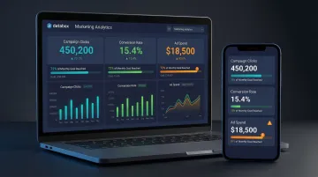
Databox
Databox is a mobile-first marketing dashboard tool built for speed and simplicity, giving marketing teams and agencies real-time visibility into key metrics across 130+ native integrations including HubSpot, Google Analytics, Facebook Ads, and Shopify.
Databox's differentiators are its mobile-optimized experience (monitor KPIs anywhere), goal-tracking features, and pre-built template library that gets teams live quickly without complex setup. It is better suited for visual KPI tracking than deep analytical exploration.
| Feature | Details |
|---|---|
| Key Features | 130+ native integrations, mobile-optimized dashboards, goal tracking, performance alerts, pre-built templates, no-code builder |
| Pricing | Free tier (up to 3 data sources); Pro: $159/month; Growth: $399/month; Premium: $799/month |
| Best For | Startups, agencies, and small marketing teams that want fast setup and mobile-friendly KPI tracking |
Cyfe
Cyfe is an all-in-one business dashboard tool that aggregates data from marketing, sales, finance, and social platforms into a single, customizable dashboard interface.
Cyfe's differentiator is its breadth: it supports historical data archiving (pre-dating integrations), a wide variety of widget types, and is one of the more affordable options for teams that need cross-functional visibility beyond just marketing. The interface feels dated compared to newer tools.
| Feature | Details |
|---|---|
| Key Features | Cross-functional data widgets, historical data archiving, pre-built marketing widgets, white-label dashboards, affordable pricing |
| Pricing | Plans range from $29/month to $190+/month; $190+ tier unlocks 100% white-label capabilities |
| Best For | Small businesses and agencies that want an affordable, all-in-one dashboard covering marketing and business metrics |
Tableau
Tableau (owned by Salesforce) is a data visualization and BI platform used by enterprise analytics teams for its interactive dashboards, storytelling capabilities, and ability to handle large, complex datasets.
Tableau connects to virtually any data source (cloud warehouses, spreadsheets, on-premise databases) and produces visualizations that few tools match in depth or quality. That said, it carries some of the highest price points in this list, a steep learning curve, and requires technical resources to manage data pipelines and Tableau Prep.
| Feature | Details |
|---|---|
| Key Features | Enterprise-grade visualizations, drag-and-drop builder, real-time data connectors, Tableau Prep for data cleaning, Tableau Server/Cloud for sharing, AI-powered analytics |
| Pricing | Viewer: $15/user/month; Explorer: $42/user/month; Creator: $75/user/month (billed annually) |
| Best For | Enterprise marketing and analytics teams with technical resources and complex data visualization needs |
Microsoft Power BI
Microsoft Power BI is a leading enterprise BI platform widely adopted by organizations already using the Microsoft ecosystem (Azure, Excel, Teams, SharePoint). It offers robust data modeling, interactive dashboards, and AI-powered analytics at a competitive price point.
Deep Microsoft integration and DAX-powered data modeling make it a natural fit for marketing teams already in that ecosystem. The learning curve for DAX is significant for non-technical users, and licensing costs can climb at scale.
| Feature | Details |
|---|---|
| Key Features | Microsoft 365 integration, DAX modeling, natural language Q&A, AI-powered insights, role-based access control, real-time dashboards |
| Pricing | Pro: $14/user/month; Premium Per User: $24/user/month; Premium Capacity (P1): ~$4,995/month (billed annually) |
| Best For | Marketing teams in Microsoft-heavy organizations that need powerful data modeling and familiar ecosystem integrations |
Grow.com
Grow.com is a no-code business intelligence and dashboard tool designed for SMBs and growing teams that want enterprise-level insights without the complexity or cost of traditional BI platforms.
A 100+ connector library, no-code data transformation, and pre-built metric templates help non-technical marketing teams get meaningful dashboards running quickly. It sits between simple KPI tools and full BI platforms, making it a practical middle-ground for scaling teams.
| Feature | Details |
|---|---|
| Key Features | 100+ integrations, no-code ETL, pre-built metric templates, live dashboards, automated report sharing, unlimited users on some plans |
| Pricing | Custom pricing; contact sales for quote |
| Best For | SMBs and mid-market marketing teams that want no-code BI with strong integrations and easy onboarding |
How We Chose the Best Dashboard Reporting Tools
Tools were assessed based on criteria that directly affect how marketing teams work day-to-day. A common mistake is over-indexing on visual design while underweighting integration reliability, data accuracy, and scalability. Teams that skip these checks often find themselves switching tools within a year — a costly and disruptive cycle.
Each criterion below maps to a specific failure point we've seen marketers hit after committing to the wrong platform.
Key selection criteria tied to business outcomes:
Marketing integration depth — Native connectors to Google Ads, Meta, HubSpot, and GA4 matter more than connector count. Third-party connectors add cost and introduce sync lag that skews reporting.
AI and automation capabilities — Auto-generated dashboards, plain-English querying, and scheduled summaries reduce manual work significantly. According to Gartner, nearly half of enterprise buyers have switched software providers to access better AI features.
Ease of use for non-technical marketers — Self-service matters. If a marketing manager needs engineering support to update a dashboard, the tool creates a bottleneck rather than removing one.
Sharing and collaboration — Can dashboards be shared with clients or stakeholders via link, email, or embed without requiring a paid seat? This affects both internal alignment and client reporting workflows.
Security and compliance — SOC 2, HIPAA, and GDPR support are table stakes for most enterprise teams. IT security scrutiny around AI tools has tightened considerably; verifying compliance upfront avoids procurement delays later.
Pricing model transparency — Is pricing predictable and scalable as your team or data needs grow? The market is sharply divided between transparent, self-serve pricing and opaque, custom-quoted enterprise models.
Conclusion
Choosing the right dashboard reporting tool in 2026 comes down to fit—not just feature lists. A tool that fits your actual workflow will always outperform one with an impressive demo you'll never fully use.
Evaluate tools against your actual data stack, team technical level, client-reporting needs, and budget before committing. Look for tools that scale with your marketing complexity, not just ones that solve today's problem. Given that 73% of organizations now use at least three different BI tools, building a composable stack is often the most practical approach.
For marketing teams and data teams that want to move beyond manual dashboard building entirely, Sylus fits naturally into that kind of stack. Its AI-powered analytics platform generates dashboards and answers data questions in plain English, grounded in your actual business data. Try Sylus or schedule a demo to see how much reporting time your team can reclaim.
Frequently Asked Questions
What are dashboard reporting tools?
Dashboard reporting tools are software platforms that connect to multiple data sources, pull in marketing and business metrics, and display them in real-time visual dashboards, replacing manual spreadsheet reporting and giving teams always-on performance visibility.
What are examples of dashboard reporting tools?
Examples include Sylus, Looker Studio, Microsoft Power BI, Databox, and Tableau. They vary in depth (from lightweight KPI trackers to full enterprise BI platforms) so the right choice depends on team size and reporting complexity.
What is the 5 second rule for dashboards?
The 5-second rule states a well-designed dashboard should communicate its key message within 5 seconds of viewing. Critical KPIs should be prominently placed, visual clutter minimized, and the most important metrics immediately obvious at a glance.
What is replacing dashboards?
AI-powered analytics tools are beginning to complement static dashboards by letting users ask questions in plain English and get instant insights, reducing the need to pre-build every chart. That said, dashboards remain the standard for ongoing performance monitoring and stakeholder sharing.
How do I choose the right dashboard reporting tool for my marketing team?
Map your data sources, team technical level, and reporting use cases first. Then evaluate tools on integration depth, ease of use, AI capabilities, and pricing — prioritizing options that cut manual work rather than create more of it.
Can non-technical marketers build dashboards without coding?
Yes, most modern dashboard tools, including Sylus, Databox, Looker Studio, and Grow.com, are built for self-service use. Drag-and-drop interfaces and plain-English AI prompts let marketers build and update dashboards without writing SQL or leaning on engineering.