Introduction
Modern data teams and business leaders share a familiar bottleneck: metrics scattered across sources, reporting that eats hours of manual effort, and dashboards that are stale before anyone reads them.
According to Anaconda's State of Data Science report, analysts spend 30%–60% of their time wrangling data rather than analyzing it — and poor data quality costs organizations an average of $12.9 million annually, per Gartner.
Performance reporting software has evolved from static spreadsheets to real-time, AI-driven dashboards that any team member can generate and act on. Choosing the right tool directly impacts decision-making speed and business outcomes—teams using the right platform close that gap between spotting a problem and acting on it in hours, not days.
This guide breaks down the top performance reporting tools, what sets each apart, and the criteria that matter most when selecting one for your team.
Key Takeaways
- Performance reporting software centralizes KPI tracking, automates data collection, and turns raw metrics into actionable dashboards
- Top tools offer real-time data access, customizable visualizations, seamless sharing, and role-based access controls to get insights to the right people quickly
- AI-powered platforms like Sylus let non-technical users query data in plain English and generate full dashboards without SQL
- Key selection criteria: ease of use, data source integrations, collaboration features, security compliance, and scalability
- Top tools: Sylus, Microsoft Power BI, Tableau, Looker, and Metabase
What Is Performance Reporting Software (and Why It Matters)
Performance reporting software connects to your data sources, tracks business KPIs, and presents results through dashboards, charts, and reports that teams can monitor and share on an ongoing basis. These tools replace manual spreadsheet workflows with automated, always-current reporting across the business.
The operational cost of poor reporting is real and measurable:
- Poor data quality costs organizations an average of $12.9 million per year
- Analysts spend 30%–60% of their time wrangling data before any analysis happens
That overhead pushes decisions downstream and keeps data teams stuck on cleanup instead of insight.
The tools reviewed below span legacy BI platforms to AI-driven solutions, covering options for teams at every stage and scale.
Best Performance Reporting Software: Top Tools Compared
These tools were evaluated on data connectivity, ease of use, reporting flexibility, collaboration features, security, and overall value—for teams ranging from lean startups to large enterprises.
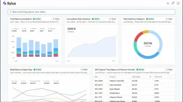
Sylus
Sylus is an AI-powered analytics platform built for modern data teams and business users. It acts like ChatGPT trained on your company's data, grounding all analysis in your dbt models and documentation to ensure governed, trustworthy outputs.
Users ask questions in plain English and receive fully built dashboards, validated metrics, and AI-generated summaries—no SQL required. The platform explores your data and validates assumptions before returning results, keeping outputs accurate and auditable.
Key differentiators include:
- Unlimited seats with usage-based pricing
- Scheduled reports to Slack or email; query data directly from Slack
- Self-hosted deployment options
- SOC 2 Type II and HIPAA compliance
- Strict data privacy policy — neither Sylus nor its model partners train on customer data
| Feature Category | Details |
|---|---|
| Key Features | AI data analyst that explores and validates data before returning results; plain-English chart customization; shareable dashboards via link, email, or embed; team collaboration for metric verification; activity spike alerts; dbt-native governed context; 500+ data source integrations |
| Pricing | Usage-based pricing with unlimited seats; contact sales for specific tiers |
| Best For | Data teams and business users at fast-growing startups and enterprises who need governed, AI-driven reporting without heavy SQL overhead |
Microsoft Power BI
Microsoft Power BI is one of the most widely adopted business intelligence platforms globally, with 30 million monthly active users across 375,000 organizations. It's deeply integrated with the Microsoft 365 ecosystem and used across industries from finance to retail to healthcare.
Standout capabilities include drag-and-drop report building, hundreds of data source connectors, AI-assisted insights through Copilot in Microsoft Fabric, and enterprise-grade governance. Its tight integration with Excel, Azure, and Teams makes it a natural fit for organizations already in the Microsoft stack. Non-technical users, however, may face a steeper learning curve than with newer AI-first tools.
| Feature Category | Details |
|---|---|
| Key Features | Interactive dashboards and paginated reports; AI-powered natural language Q&A; Power Automate integration; row-level security; DirectQuery for real-time data; Microsoft Fabric integration |
| Pricing | Power BI Pro: $14/user/month; Premium Per User: $24/user/month (billed annually); free desktop app available |
| Best For | Mid-to-large organizations already using Microsoft tools that need broad reporting coverage and strong enterprise governance |
Tableau
Tableau, now part of Salesforce, has been recognized as a Leader in the Gartner Magic Quadrant for 12 consecutive years—a track record that reflects its depth in analyst-grade visual reporting.
It offers unmatched visualization depth, an extensive library of chart types and calculated fields, and one of the largest user communities in BI. Tableau Pulse (its AI layer) now adds automated metric monitoring with natural language summaries delivered directly into workflows like Slack or email. Licensing costs and implementation complexity can be barriers for smaller teams.
| Feature Category | Details |
|---|---|
| Key Features | Drag-and-drop visual analytics; Tableau Pulse for AI-driven metric alerts; live and extracted data connections; embedded analytics; Salesforce CRM integration |
| Pricing | Creator: $75/user/month; Explorer: $42/user/month; Viewer: $15/user/month (billed annually); free Tableau Desktop Public Edition |
| Best For | Analyst and data teams in mid-to-enterprise organizations that prioritize visual depth and interactive data exploration |
Looker (Google Cloud)
Looker, part of Google Cloud, is a BI platform built for large-scale, governed data environments built around a semantic modeling layer (LookML) that ensures consistent, governed metric definitions across every report in an organization.
Three capabilities set it apart:
- Centralized metric governance through the LookML semantic layer
- Native integration with BigQuery and other cloud data warehouses
- Looker Studio (free) for lighter-weight reporting use cases
LookML requires technical setup and SQL proficiency, making Looker better suited to teams with dedicated data engineering support. Unlike Power BI and Tableau, Looker does not publish public per-user pricing and directs buyers to contact sales.
| Feature Category | Details |
|---|---|
| Key Features | LookML semantic modeling for governed metrics; embedded analytics; native BigQuery integration; Looker Studio free tier; Git-based version control for data models |
| Pricing | Contact sales for Standard, Enterprise, and Embed editions; Looker Studio is free |
| Best For | Enterprise data teams using Google Cloud infrastructure that need strong metric governance and consistent reporting across the organization |
Metabase
Metabase is an open-source business intelligence tool designed to make data accessible to non-technical users, offering a simple question-and-answer interface alongside more advanced SQL-based queries for power users. It has achieved massive community adoption with 46.4k GitHub stars and 80,000+ organizations using it globally.
The open-source version can be self-hosted for free under the AGPL license, and the interface lets anyone explore data without writing SQL. Dashboard sharing and report scheduling round out the core feature set. The tradeoff: it lacks the enterprise governance depth of Looker and the visualization sophistication of Tableau.
| Feature Category | Details |
|---|---|
| Key Features | No-code question builder; SQL editor for advanced users; automated report subscriptions; public and embedded dashboards; open-source self-hosting option |
| Pricing | Open Source: Free; Starter: $100/month (5 users); Pro: $575/month (10 users); Enterprise: Custom ($20,000/year+) |
| Best For | Startups and small-to-mid-sized teams that want fast deployment, broad data access for non-technical staff, and a cost-effective entry point |
How We Chose the Best Performance Reporting Software
The tools above were selected based on their ability to address real reporting bottlenecks—slow access to data, metric inconsistency, poor sharing workflows, and the gap between technical and non-technical users. That's why our criteria weight governance depth and integration breadth heavily, not just how polished a chart looks.
Evaluation criteria included:
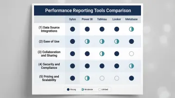
- Data source integrations: Power BI and Sylus lead with hundreds to 500+ native connectors across databases, warehouses, and SaaS tools. Looker excels specifically with native BigQuery connectivity.
- Ease of use: Sylus and Metabase prioritize plain-English querying for non-technical users. Tableau and Looker require more technical depth but unlock more advanced analytical capabilities.
- Collaboration and sharing: All five tools support dashboards, scheduled reports, and embedded links. Sylus also supports Slack-based querying and team metric verification workflows.
- Security and compliance: Sylus and Looker both offer self-hosted deployment. Sylus and Power BI hold SOC 2 Type II certification; Sylus is also HIPAA compliant.
- Pricing and scalability: Power BI starts at $14/user/month. Metabase offers free open-source hosting. Sylus uses usage-based pricing with unlimited seats — no per-seat penalty as your team grows.
The right tool depends on where your team is today. If you're a small team that needs fast answers without a data engineer, start with Metabase or Sylus. If you're scaling governed reporting across a large organization with strict compliance requirements, Looker or Sylus are worth the added complexity.
Conclusion
The right performance reporting software closes the gap between raw data and decisions teams can actually act on. The tools covered above represent the strongest options available today across a range of use cases and budgets.
Before selecting a platform, evaluate your current reporting workflow honestly:
- Where are reports bottlenecked — data access, manual prep, or limited sharing?
- Which stakeholders need self-service access without relying on analysts?
- Does your team have the technical capacity for complex setups, or do you need something that works out of the box?
If your answer to most of those questions points toward speed and simplicity, Sylus is worth a look. It connects to your existing data sources, works directly within Slack, supports unlimited users, and delivers AI-generated reports without requiring SQL or manual dashboard builds. Security is covered too — SOC 2 Type II and HIPAA compliant. Schedule a demo to see it in action.
Frequently Asked Questions
What is the most popular reporting tool?
Microsoft Power BI and Salesforce Tableau consistently rank as the top two BI platforms globally by market share and adoption. Power BI holds approximately 30% of the global BI market and dominates in Microsoft-heavy enterprise environments, while AI-native tools like Sylus are gaining traction among data-forward teams seeking governed, natural language analytics.
How to do performance reporting?
Define the KPIs that matter for your business goal, connect your data sources to a reporting tool, build dashboards or scheduled reports that surface those metrics, and establish a cadence for reviewing and sharing results with stakeholders. Modern tools automate data collection and visualization, reducing manual effort from hours to minutes.
What is performance reporting software?
Performance reporting software connects to business data sources, tracks key performance indicators, and delivers visualized metrics through dashboards and reports. Teams use these tools to monitor progress, spot trends, and make faster, informed decisions. They replace manual spreadsheet workflows with automated, real-time analytics.
What is the difference between a dashboard and a performance report?
Dashboards are real-time, always-on visual displays of live metrics, while performance reports are typically structured, periodic summaries (daily, weekly, monthly) that provide context, comparisons, and narrative around what the data means. Most modern tools support both formats.
Do I need to know SQL to use performance reporting software?
It depends on the tool. Traditional BI platforms like Tableau and Power BI have no-code interfaces for basic reporting, but complex queries often still require SQL—used by roughly 49-52% of professional developers globally. AI-powered platforms like Sylus let users ask questions in plain English and get full analyses without writing a single query.