Introduction
Modern data teams face a persistent paradox: they're drowning in data but starved for actionable insights. Traditional BI dashboards require SQL expertise or force business users to wait in analyst queues, turning visualization into a slow, exclusive process.
A Forrester Total Economic Impact study found that 34% of business domain experts lack confidence articulating data questions to their teams, while 30% feel embarrassed by their knowledge gaps — a sign the problem runs deeper than tooling alone.
AI-powered data visualization tools are tackling these confidence and access gaps directly — letting anyone ask questions in plain English and get instant charts, dashboards, and trend analysis.
The augmented analytics market alone is projected to reach $36.8 billion in 2026, driven by organizations seeking to democratize data access without sacrificing governance or security.
This guide covers the 8 best AI tools for data visualization in 2026—what they do, who they're built for, and how to choose the right one for your team.
Key Takeaways
- AI data visualization tools use natural language processing, automated chart generation, and predictive analytics to turn raw data into clear visual insights—no SQL required
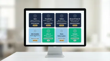
- The 8 best tools in 2026 are: Sylus, ThoughtSpot, Tableau, Microsoft Power BI, Zoho Analytics, Julius AI, Domo, and Datapad
- Evaluate tools on NLP accuracy, security certifications (SOC 2, HIPAA), integrations, pricing model, and collaboration features
- Use cases vary—embedded analytics, governed enterprise analysis, and self-service exploration each call for different tools
- For secure, governed AI analytics that builds full dashboards from plain-English questions, Sylus is the purpose-built choice
What Is AI-Powered Data Visualization?
AI-powered data visualization is the use of machine learning and natural language processing to automatically generate, interpret, and update visual representations of data—no manual chart-building required.
This differs fundamentally from traditional BI tools. Legacy platforms like Tableau or Excel require users to know exactly what question to ask and how to format the query. AI tools flip that model:
- Describe what you want in plain English
- The system surfaces the most relevant chart type automatically
- Trends and anomalies are flagged without manual configuration
- Dashboards update as new data arrives
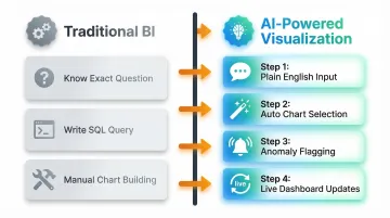
Instead of building charts from scratch, users explore data through conversation.
That speed translates directly to business outcomes. McKinsey research shows that data-driven organizations are 23 times more likely to acquire customers, six times more likely to retain them, and 19 times more likely to be profitable than their peers. AI visualization closes the gap between having data and acting on it—turning a question asked at 9 a.m. into a decision made before lunch.
8 Best AI Tools for Data Visualization in 2026
These tools were selected based on five criteria:
- AI capability depth — quality and sophistication of AI-driven features
- Ease of use — accessibility for both technical and non-technical users
- Enterprise readiness — security, compliance, and scalability
- Integration ecosystem — breadth of data source and tool connections
- Pricing transparency — clarity and predictability of cost structure
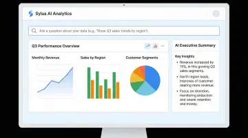
Sylus
Sylus is an enterprise-grade AI analytics platform that functions like "ChatGPT trained on your business's data." Users connect data sources and ask questions in plain English to instantly generate charts, dashboards, and AI-written summaries. It supports unlimited seats with usage-based pricing, making it cost-effective for large teams.
What makes Sylus stand out: its AI is grounded in governed context via dbt models and documentation, ensuring analysis is accurate and aligned with how your business defines metrics — not hallucinated. This is a meaningful distinction for data teams where metric consistency across the organization actually matters.
The platform is SOC 2 Type II and HIPAA compliant, offers self-hosted deployment, and neither Sylus nor its model partners train on customer data. Slack integration lets teams query data and schedule AI-generated reports without leaving their existing workflow.
| Attribute | Details |
|---|---|
| Key Features | Natural language querying, AI-generated dashboards, governed context via dbt, scheduled reports & AI summaries to email/Slack, team collaboration & metric verification, activity spike alerts, shareable/embeddable dashboards |
| Best For | Data teams at fast-growing startups and F1000 enterprises that need governed, secure AI analytics with unlimited user access |
| Pricing | Usage-based pricing; unlimited seats; self-hosted deployment available |
ThoughtSpot
ThoughtSpot is an AI-powered analytics platform built around a search-based interface and AI agents (Spotter) that allow business users to ask questions and get instant, conversational data answers with automated visualizations. It's widely used by enterprises and rated 4.5/5 on Gartner Peer Insights based on 645 ratings.
Key strengths include the Spotter AI analyst (featuring SpotterModel, SpotterViz, and SpotterCode), AI-augmented Liveboards, automated anomaly detection, and explainable AI with human-in-the-loop feedback. ThoughtSpot was named a Leader in the 2025 Gartner Magic Quadrant for Analytics and BI Platforms.
| Attribute | Details |
|---|---|
| Key Features | Natural language search, AI analyst (Spotter), AI-augmented dashboards, automated insights, anomaly detection |
| Best For | Enterprise teams wanting self-service analytics at scale with strong AI augmentation |
| Pricing | Developer tier starts at $25/month or $0.10/query; Pro at $50/user/month; Enterprise is custom |
Tableau (with Tableau AI)
Tableau, owned by Salesforce, is one of the most established data visualization platforms in the market. It has integrated AI capabilities via Tableau AI (powered by Agentforce) that enable natural language queries, predictive analytics, and automated chart recommendations through features like Tableau Pulse, Tableau Agent, and Tableau Next.
Notable capabilities include a broad library of visualization types, deep Salesforce CRM integration, a strong community and training ecosystem, and AI-driven conversational analysis. Tableau was named a Leader in the Q2 2025 Forrester Wave for Business Intelligence Platforms.
| Attribute | Details |
|---|---|
| Key Features | AI-powered chart recommendations, natural language queries (Tableau Agent), Tableau Pulse insights, predictive modeling, Salesforce integration |
| Best For | Teams already in the Salesforce ecosystem or those needing enterprise-grade visualization with a mature platform |
| Pricing | Standard edition: Viewer $15, Explorer $42, Creator $75/user/month; Enterprise: $35, $70, $115/user/month |
Microsoft Power BI (with Copilot)
Microsoft Power BI is a widely deployed BI and visualization platform that has integrated Microsoft Copilot to bring conversational AI into dashboard creation and data exploration. It's deeply embedded in the Microsoft 365 ecosystem with over 30 million monthly active users.
What sets it apart: native integration with Excel, Azure, and Teams; Copilot-driven natural language report creation; and DAX query generation — all at highly competitive pricing for organizations already on Microsoft licensing. One important caveat: Copilot requires a paid Fabric capacity (F2+) or Premium capacity (P1+) on top of Pro or Premium Per User licenses.
| Attribute | Details |
|---|---|
| Key Features | Copilot-assisted report building, natural language Q&A, DAX query generation, real-time dashboards, Azure integration |
| Best For | Organizations in the Microsoft ecosystem seeking cost-effective AI-enhanced BI |
| Pricing | Pro $14/user/month; Premium Per User $24/user/month; Copilot requires Fabric F2+ or Premium P1+ capacity |
Zoho Analytics
Zoho Analytics is an end-to-end business analytics platform with a built-in AI assistant (Zia) that supports natural language queries, automated analysis, and predictive insights. It integrates with the broader Zoho ecosystem and third-party data sources, offering scalability for growing businesses.
Standout capabilities include flexible multi-source data integration, collaborative analytics features, and auto-analysis for pattern detection powered by OpenAI's GPT-4. Pricing is structured to stay accessible at mid-market scale — plans start at $25/month compared to $50+ per user for enterprise-tier competitors.
| Attribute | Details |
|---|---|
| Key Features | Zia AI assistant, NLP queries, auto-analysis, predictive insights, drag-and-drop dashboard builder, multi-source integration |
| Best For | Mid-market and growing enterprises wanting scalable, collaborative analytics with a low entry cost |
| Pricing | Free plan available; paid plans start at $25/month (billed annually) |
Julius AI
Julius AI is a conversational data analysis tool that allows users to upload data or connect sources and interact with it through a chat interface — asking questions, generating visualizations, and running data transformations without writing code. It supports connectors to Snowflake, BigQuery, Postgres, SQL Server, and other databases.
The interface is built for non-technical users: no SQL, no configuration overhead. It also supports predictive modeling and trend detection, which is unusual at this price point, and its customer support response times are notably faster than larger BI vendors.
| Attribute | Details |
|---|---|
| Key Features | Chat-based data querying, automated chart generation, trend and anomaly detection, data transformation, predictive modeling |
| Best For | Non-technical users and smaller teams needing quick, code-free data exploration |
| Pricing | Free plan available; Pro $40/month ($33/month annual); Business $450/month; Growth $750/month |
Domo
Domo is a cloud-based data platform that combines data integration, preparation, visualization, and AI-powered analytics in a single interface. It features a drag-and-drop dashboard builder, an extensive library of over 1,000 pre-built connectors, and AI augmentation for insight discovery and workflow automation.
Domo's strength is in the pipeline: it handles data prep and integration alongside visualization in a way most BI tools don't. It also offers real-time data syncing and AI-driven anomaly detection. Domo was named a Strong Performer in the Q2 2025 Forrester Wave. Its consumption-based pricing can be unpredictable — budget carefully before committing.
| Attribute | Details |
|---|---|
| Key Features | Drag-and-drop dashboards, AI-augmented analytics, data preparation, 1,000+ connectors, real-time syncing, workflow automation |
| Best For | SMBs and mid-market teams needing an end-to-end data platform with built-in prep and visualization |
| Pricing | Consumption-based pricing; contact sales for custom quotes |
Datapad
Datapad is an AI-powered analytics and dashboard platform designed for fast-moving teams. It emphasizes ease of use with a clean, modern interface, AI-generated insights, and natural language interaction for exploring business metrics. In December 2024, Datapad raised $500K in seed funding to further develop its autonomous analyst agents.
Its differentiator is speed of setup: teams can build and share dashboards in minutes, with AI-generated summaries surfacing key metrics automatically. The tradeoff is depth — it's built for teams with moderate data complexity, not enterprise deployments that require heavy governance or advanced data modeling.
| Attribute | Details |
|---|---|
| Key Features | AI-generated insights, NLP-based querying, modern dashboard interface, metric tracking, automated summaries |
| Best For | Startups and small teams wanting a lightweight, fast AI analytics tool with minimal setup |
| Pricing | Basic $30/month ($15/month annual); Pro $50/user/month ($25/month annual); Scale $1,000/workspace/month |
Key Features to Look for in an AI Data Visualization Tool
Not all "AI-powered" tools are equal. Many apply AI only as a surface-level feature—chart auto-suggestions, for example—while the best tools embed AI throughout the entire analytics workflow. Forrester notes that while Generative AI "levels the playing field" via shared LLMs, true differentiation lies in deterministic analytical depth and governed execution beyond the LLM. When evaluating vendors, approach demos critically and test with real data, not just polished examples.
Natural Language Processing (NLP) Accuracy
The quality of NLP determines whether a non-technical user can actually get useful answers or is forced to rephrase questions repeatedly. Poor NLP creates frustration and drives users back to analysts, defeating the purpose of self-service analytics.
What to look for:
- Context-aware query understanding that interprets business terms correctly
- Support for follow-up questions without losing context
- Handling of ambiguous business terms through governed definitions
Tools with governed context—like Sylus, which grounds analysis in dbt models and documentation—produce more reliable results because the AI understands your specific metric definitions instead of inferring them from raw schema.
Automated Insight Discovery and Anomaly Detection
Manually scanning dashboards for anomalies doesn't scale. The best tools proactively surface trends, outliers, and correlations—so users spend time acting on insights rather than hunting for them.
What to evaluate:
- Real-time anomaly detection that alerts users to significant changes
- Prioritized insight alerts that focus attention on what matters
- Correlation analysis across metrics to reveal hidden relationships
Enterprise Security and Compliance
For regulated industries—healthcare, finance, HR data—the AI tool must have documented data handling policies and ideally certifications like SOC 2 Type II and HIPAA compliance. IBM reports that 13% of organizations experienced breaches of AI models or applications, with 97% of those lacking proper AI access controls.
Critical risk factor: Many tools use customer data to train their models. Verify contractually that your vendor does not train AI models on your proprietary data. Ask specifically about self-hosted deployment options and whether model partners have access to your data.
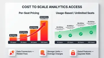
Pricing Model and Scalability
Per-seat pricing can make analytics tools prohibitively expensive as teams grow, pushing organizations to restrict data access—the opposite of democratization. A tool that costs $50/user/month becomes $60,000 annually for a 100-person team.
Usage-based or unlimited-seat models let organizations scale access without proportional cost increases. When comparing options, total cost of ownership often exceeds list price. Watch for costs tied to:
- Data connectors and integration add-ons
- Storage limits that trigger tier upgrades
- Premium features gated behind higher pricing tiers
How We Chose the Best AI Visualization Tools
Each tool was assessed across five core dimensions:
- AI capability depth — NLP accuracy and automated insight generation
- Ease of use — accessibility for non-technical users
- Enterprise security posture — certifications and data privacy policies
- Data integration breadth — range of supported connectors and sources
- Pricing transparency — clarity of cost at scale
Brand recognition wasn't a factor. Less-known tools were included when they demonstrated superior capability in one of these dimensions.
Common mistakes teams make when choosing an AI visualization tool:
- Over-indexing on demo aesthetics rather than testing with real data
- Ignoring data security and model training policies
- Choosing per-seat tools that become cost-prohibitive at scale
- Selecting tools without testing NLP accuracy against actual business terminology
- Failing to validate true agentic capabilities versus "agent washing" (rebranded chatbots)
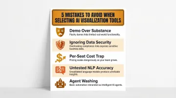
That last point deserves attention. Gartner warns that vendors are rebranding basic chatbots as agentic AI. Genuine agentic systems require autonomous reasoning, multi-step planning, and governed validation — not a chat interface bolted onto traditional BI.
Conclusion
The right AI data visualization tool should do more than generate pretty charts—it should fit your team's data governance requirements, scale with your user base, and actually answer business questions without requiring a data analyst in the loop every time.
Shortlist 2–3 tools based on your specific context: team size, data stack, compliance requirements, and technical depth. Run pilots with real data before committing, and scrutinize data privacy policies—specifically whether the vendor trains AI models on your data. Only 7% of enterprises report their data is completely ready for AI adoption, which means choosing tools that meet you at your current data maturity level matters more than chasing the most advanced option.
If your team needs a SOC 2-compliant, governed analytics platform that connects to your existing data stack and lets anyone ask questions in plain English, Sylus is built for that. Explore a demo at cal.com/sylus-ai or get started at sylus.ai/get-started.
Frequently Asked Questions
Can AI do data visualization?
Yes, AI can both generate and enhance data visualizations. Modern AI tools use natural language processing to interpret plain-English questions and automatically produce appropriate charts, dashboards, and trend analyses. They also surface anomalies and predictive insights the user didn't explicitly ask for, turning static reports into active, ongoing analysis.
What is the best AI visualization tool?
It depends on team size, use case, and governance requirements. Enterprise teams with compliance needs benefit from governed platforms like Sylus or ThoughtSpot. Smaller teams often prefer lighter tools like Julius AI or Datapad, which prioritize speed over enterprise features.
What are the 5 C's of data visualization?
The 5 C's of data visualization are: Clear (instantly understandable), Concise (communicates a single message without clutter), Consistent (maintains formatting across visuals), Correct (accurately reflects data without distortion), and Compelling (holds attention through relevance). AI visualization tools help teams apply these principles automatically through smart chart selection and narrative generation.
How do AI data visualization tools differ from traditional BI dashboards?
Traditional BI dashboards are static and require users to know what question to ask and how to query it. AI tools dynamically surface insights, detect anomalies, and allow natural language interaction, making the experience closer to asking a colleague a question than reading a report. Users can ask follow-up questions and refine analysis without rebuilding queries.
Can non-technical users use AI data visualization tools?
Most modern AI visualization tools are built for non-technical users, with natural language interfaces and drag-and-drop builders. That said, how well a tool understands business-specific terminology determines whether non-technical users can get accurate results without SQL knowledge — tools with governed context handle this most reliably.
What should enterprises consider around data security when choosing an AI visualization tool?
Enterprises should verify SOC 2 Type II and HIPAA certifications, and confirm whether self-hosted deployment is available. Most critically, check whether the vendor or its model partners train AI on customer data. This is a significant privacy risk and should be explicitly prohibited in vendor contracts.