Introduction
Picture this: A marketing director starts her Monday morning by opening her CRM to check weekend lead volume, switching to Google Analytics for website traffic, then jumping to the finance platform for campaign spend, and finally pulling up spreadsheet exports to reconcile everything. By the time she has a coherent picture of marketing performance, she's lost two hours—and the data is already outdated. This scenario repeats across departments, with knowledge workers losing nearly four hours weekly toggling between applications.
A business management dashboard solves this fragmentation by consolidating data from multiple sources into one live interface, enabling faster, better-informed decisions. This guide covers what business management dashboards are, the four main dashboard types, essential metrics to track, core benefits, and best practices for building an effective dashboard that drives results.
TLDR:
- Business dashboards consolidate KPIs from multiple systems into one real-time view
- Four types serve different needs: operational (daily monitoring), strategic (long-term tracking), analytical (deep exploration), and tactical (mid-term projects)
- Effective dashboards focus on 8–12 critical KPIs spanning sales, customer health, operations, and marketing
- Data silos cost businesses $3.1 trillion annually in lost productivity, and dashboards directly address this problem
- Modern AI tools like Sylus let users generate dashboards using plain English, no SQL required
What Is a Business Management Dashboard?
A business management dashboard is an interactive data visualization tool that consolidates KPIs and metrics from multiple business systems—CRM, finance tools, marketing platforms, databases—into a single interface for real-time monitoring and decision-making. Unlike static monthly reports or quarterly performance reviews, dashboards provide live or near-live data so managers can act on emerging trends rather than react to historical summaries.
Modern dashboards have evolved from rigid, IT-built tools into flexible platforms any business user can operate. Historically, BI was an IT-owned function that created bottlenecks—self-service analytics changed that, giving business teams direct access to data for discovery, analysis, and visualization without deep technical expertise.
That shift matters because it broke the adoption ceiling that kept BI tools in the hands of specialists. Now anyone from a marketing lead to a finance manager can build and interpret dashboards independently.
The sections below cover what to look for in a dashboard, how to choose the right one, and which platforms deliver on that promise for different team types.
Types of Business Management Dashboards
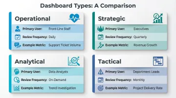
The right dashboard depends on three factors: who will use it, how often they'll check it, and what question it must answer. Deploying the wrong type for the wrong audience means users either miss critical signals or drown in data they can't act on.
Operational Dashboards
Operational dashboards monitor real-time or near-real-time data to support day-to-day decisions. Front-line managers and team leads use these to track metrics like daily sales activity, support ticket volumes, production throughput, or inventory levels.
The emphasis is on monitoring, not analysis. Users need to know what's happening right now so they can respond before small problems become bigger ones.
Strategic Dashboards
Strategic dashboards track long-term KPIs reviewed weekly, monthly, or quarterly. Senior executives use these to align progress to organizational goals, monitoring metrics like revenue growth, market share, EBITDA, and customer acquisition costs. Often implemented using Balanced Scorecard methodology, strategic dashboards provide high-level insights into whether the business is executing its corporate objectives effectively.
Analytical Dashboards
Analytical dashboards are built for deeper exploration: surfacing trends, identifying anomalies, and testing hypotheses across large or historical datasets. Traditionally the domain of data and financial analysts, these dashboards emphasize filters and drill-downs for self-service investigation.
Modern BI tools have made them increasingly accessible to business users who need to investigate patterns without writing SQL.
Tactical Dashboards
Tactical dashboards sit between strategic and operational. They track project- or department-specific performance over shorter timeframes (weeks to a quarter), helping mid-level managers course-correct on initiatives before missing targets. These dashboards emphasize analysis more than monitoring, focusing on departmental processes and project execution.
Decision Framework:
- Front-line staff checking daily metrics → Operational dashboard
- Executives reviewing quarterly targets → Strategic dashboard
- Analysts investigating trends or anomalies → Analytical dashboard
- Department leads tracking monthly project progress → Tactical dashboard
Key Metrics to Track on a Business Management Dashboard
The best dashboards surface 8–12 KPIs that directly reflect business health — not every available data point. More metrics on screen rarely means more clarity.
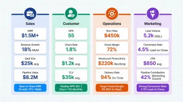
Sales and Revenue Metrics
Sales KPIs track where revenue comes from and how fast it's growing:
- Monthly Recurring Revenue (MRR) - Tracks predictable revenue streams, critical for SaaS businesses
- Revenue Growth Rate - Measures expansion velocity; top quartile SaaS companies with $1-3M ARR grow at 153% annually, while those at $15-30M ARR grow at 45%
- Average Deal Size - Indicates market positioning and sales efficiency
- Sales Cycle Length - Shows how quickly deals close, directly impacting cash flow
- Pipeline Value - Shows future revenue potential and forecasting accuracy
Customer Metrics
These metrics show whether your customer base is growing on solid ground or masking churn problems:
- Net Promoter Score (NPS) - Measures customer satisfaction and loyalty; the average NPS for SaaS is +36
- Customer Churn Rate - Tracks retention; best-in-class gross retention exceeds 86%
- Customer Acquisition Cost (CAC) - Quantifies the efficiency of growth spend
- Customer Lifetime Value (CLV) - Shows long-term customer profitability; LTV should be at least 3x greater than CAC
Operational and Financial Metrics
Financial and operational KPIs tell leadership how well the business converts activity into output:
- Burn Rate - Tracks cash consumption; most investors expect 18-24 months of runway before the next raise
- Gross Margin - SaaS gross margins typically range 85-95%
- Headcount Productivity - Revenue or output per employee
- On-Time Project Delivery Rate - Operational execution quality
Marketing Performance Metrics
Marketing metrics are only useful when they trace back to pipeline and revenue, not just traffic:
- Lead Volume - Top-of-funnel health indicator
- Conversion Rate by Channel - Shows which channels drive qualified leads
- Cost Per Acquisition - Marketing efficiency metric; B2B SaaS should target CAC payback under 12 months
- Pipeline Contribution from Marketing - Directly ties marketing to revenue outcomes
Benefits of a Business Management Dashboard
Better Decision-Making
Centralizing data into a single view eliminates the need to reconcile conflicting numbers from siloed tools and reduces decision latency. 83.5% of Fortune 1000 executives cite speed, insight, and business agility as primary drivers for Big Data investment. When managers see consistent, real-time data, they make faster, more confident decisions — often before competitors even see the same shift.
Improved Team Alignment and Collaboration
Shared dashboards create a common source of truth across departments, reducing miscommunication about priorities. Organizations that collaborate across the buyer journey see conversion rates increase by 2.3x, while 78% of sales leaders say CRM effectively improves alignment between sales and marketing teams by giving both teams shared metrics to work from.
Proactive Issue Detection
Consider the alternative: a budget overrun that surfaces in a monthly report three weeks after it started. Dashboards with threshold alerts change that dynamic — managers see revenue dips, churn spikes, or spending anomalies as they emerge and can act while options are still open. That shift from reactive reporting to real-time monitoring is where dashboards deliver their clearest operational value.
Best Practices for Building an Effective Business Management Dashboard
Start with a Clear Objective and Defined Audience
Every dashboard should be built backwards from one core question it needs to answer. Knowing the audience—executive versus team lead—determines layout complexity, data granularity, and update frequency. An executive strategic dashboard tracking quarterly revenue growth looks fundamentally different from an operational dashboard monitoring hourly support ticket resolution times.
Select KPIs Ruthlessly, Then Add Context
Show fewer metrics with benchmarks or targets rather than more metrics without context. Numbers are meaningless without comparison—a number without a comparator (prior period, goal, industry average) is hard to act on. If your dashboard shows "$48.8M revenue," add context: "up 23% vs. prior year, 5% above target."
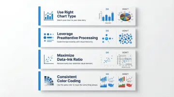
Design for Clarity, Not Comprehensiveness
Visualization best practices accelerate comprehension:
- Use the right chart type - Bar charts and line charts are easiest for human cognition to process accurately; avoid pie charts and 3D effects
- Leverage preattentive processing - 2D position and length support quick data comparisons, while area-based visuals (pie/donut charts) delay understanding
- Maximize data-ink ratio - Remove unnecessary labels, grid lines, and chart junk that obscure meaning
- Maintain consistent color coding - Use the same colors for the same metrics across all dashboards
Connect Your Data Sources Before Designing
Dashboard accuracy depends entirely on clean, integrated data. Identify all source systems—CRM, ERP, ad platforms, databases—and resolve naming or formatting inconsistencies before designing dashboards. Poor data quality costs businesses an average of $12.9 million annually, so invest in data quality upfront.
Leverage AI to Accelerate Dashboard Creation and Querying
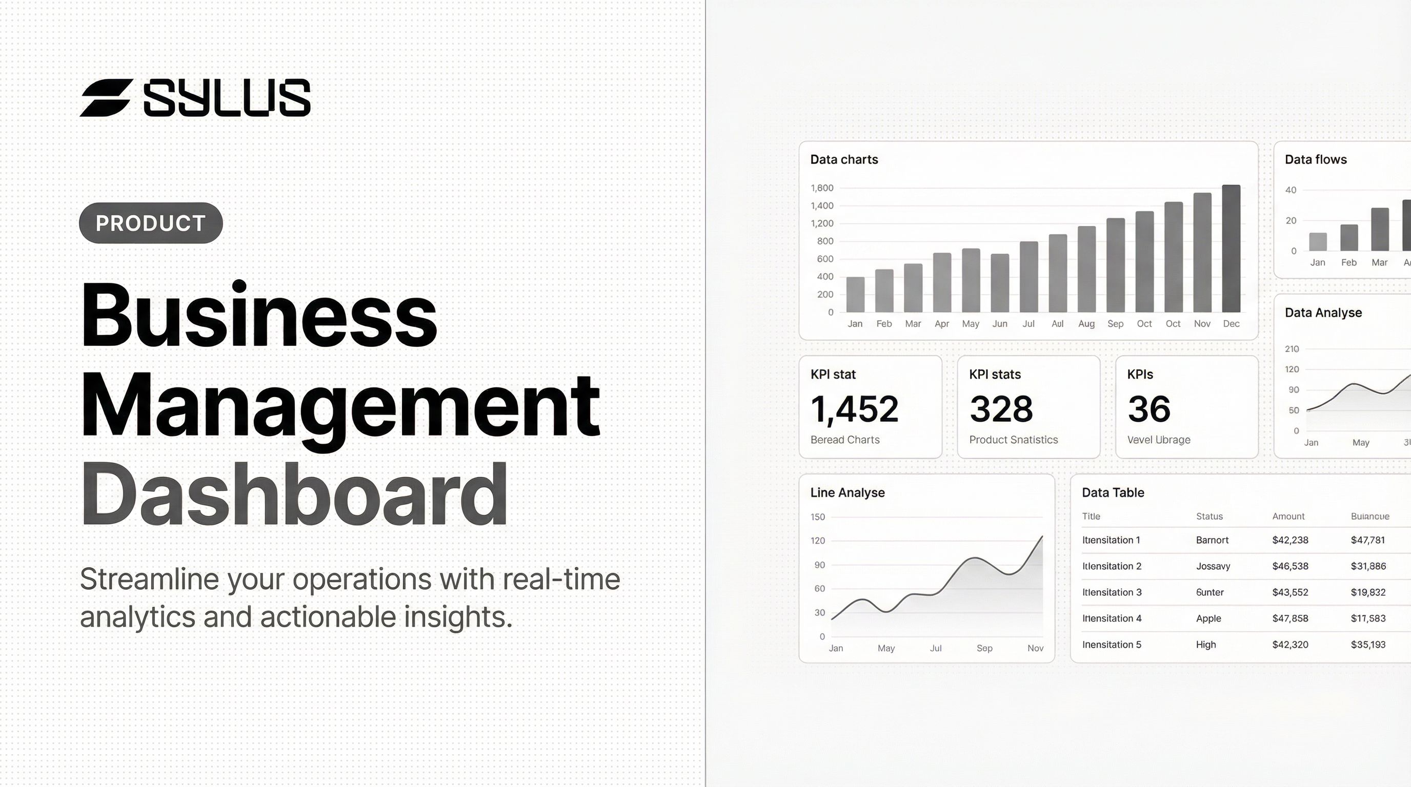
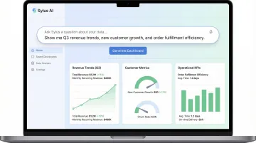
AI-native tools now allow teams to generate entire dashboards and ask questions of their data in plain English. Sylus, for instance, connects to 500+ data sources and lets business users query, visualize, and share insights without writing SQL or waiting on a data analyst. A prompt like "Build a KPI dashboard for the last 12 months" returns a complete, shareable dashboard covering revenue trends, customer metrics, and operational KPIs.
This matters because it puts analysis in the hands of the people who need it:
- Ask questions in plain English and get chart-ready answers
- Generate full dashboards without analyst handoffs
- Share results via link, email, or embedded directly in your product
Frequently Asked Questions
What is a business management dashboard?
A business management dashboard is an interactive tool that aggregates KPIs and metrics from multiple data sources into a single interface, enabling managers to monitor performance and make data-driven decisions in real time rather than relying on static reports.
What are the main types of business management dashboards?
There are four main types: operational (real-time, day-to-day monitoring), strategic (long-term KPI tracking for executives), analytical (trend and pattern exploration), and tactical (mid-term project and department focus). The right choice depends on the user's role and decision timeframe.
What KPIs should I include on a business management dashboard?
Limit your dashboard to 8–12 KPIs most critical to business goals, covering sales (MRR, pipeline), customer (NPS, churn), operational (burn rate, margin), and marketing (CAC, conversion rate) dimensions. More metrics create clutter and slow decision-making.
What is the difference between an operational and a strategic dashboard?
Operational dashboards display real-time data for day-to-day decisions, used primarily by team leads and managers. Strategic dashboards track long-term performance trends reviewed weekly or quarterly by senior executives to monitor progress toward organizational goals.
How do I build a business management dashboard from scratch?
Start by defining the dashboard's objective and audience, then select your most relevant KPIs and connect your data sources. From there, choose appropriate visualizations (bar and line charts over pie charts) and refine based on user feedback. Modern AI tools can automate much of this process.
How is AI changing business management dashboards?
AI tools now let users generate dashboards automatically, ask questions of data in plain English, and receive AI-generated summaries and alerts. This reduces reliance on data teams and cuts hours of analyst work down to minutes.