Introduction
Businesses collect more data than ever—yet most teams still can't answer basic questions fast enough to act on them. According to a 2023 Gartner survey, less than half of business decisions are informed by data, despite record investment in analytics tools. The gap between data collection and decision-making creates bottlenecks, missed opportunities, and strategic misalignment across organizations.
BI reporting bridges that gap. It transforms raw data into visual, structured insights that drive confident decisions. This guide covers what BI reporting is, the four core report types, how the reporting workflow operates, key organizational benefits, and best practices for building a BI function that delivers real value.
Key Takeaways
- BI reporting collects, analyzes, and presents business data through dashboards and reports, enabling data-driven decisions
- Four report types serve distinct purposes: descriptive (what happened), diagnostic (why it happened), predictive (what will happen), and prescriptive (what to do)
- The workflow follows four steps: collect data → clean and standardize → analyze patterns → visualize and distribute insights
- Modern BI platforms let business users query data in plain English — no SQL required — and generate validated dashboards in seconds
- Strong BI programs align reports to clear KPIs, govern data quality, and iterate based on user feedback
What Is BI Reporting?
BI reporting is the practice of using software tools to collect, process, and present business data in structured, visual formats—dashboards, reports, and charts—so decision-makers can monitor performance, spot trends, and act with confidence. Rather than sifting through spreadsheets or waiting for IT to pull custom queries, teams access real-time insights that answer critical business questions.
Reporting vs. Analytics: Understanding the Difference
While the terms are often used interchangeably, reporting and analytics serve different purposes. Reporting makes data visible and structured—it shows what happened through charts, tables, and KPIs. Analytics interprets the why behind the data, uncovering root causes and patterns. Modern BI platforms combine both capabilities in a single workflow, letting users move from viewing a metric directly into exploring what caused it.
Who Uses BI Reporting and Why It Matters
BI reporting serves multiple roles across organizations:
- Executives track company-wide KPIs to monitor strategic goals
- Operations managers measure efficiency and identify process bottlenecks
- Sales teams monitor pipeline health and conversion rates
- Finance teams review revenue, expenses, and budget variance
All these stakeholders access a single source of truth—one unified data environment that eliminates conflicting spreadsheet versions and ensures everyone works from the same metrics.
What a BI Report Looks Like in Practice
BI reports range from static PDF summaries of monthly revenue to interactive real-time dashboards with drill-down filters, charts, and automated alerts. The format depends on the audience and the decision being made. That variety is exactly why self-service access—rather than one-size-fits-all IT outputs—has become the default expectation.
The Shift to Self-Service BI
Legacy BI reporting required weeks of SQL development and IT involvement. Today, self-service BI empowers business users to access and interrogate data directly without technical expertise. According to BARC research, 73% of organizations have adopted self-service authoring tools, with average employee usage of BI tools reaching 25%.
AI-native platforms like Sylus extend this further by letting users ask questions in plain English and receive validated, dashboard-ready answers in seconds. Instead of waiting on an analyst to write a query, any team member can get a verified, chart-ready answer—grounded in your actual data models—without writing a line of SQL.
Types of BI Reports
BI reports fall into four categories, each answering a different question about your business. Most organizations rely on all four to cover historical context, root cause analysis, forecasting, and action planning.
Descriptive Reports
Descriptive reports answer "what happened?" by summarizing historical data. They're the most common report type, used for performance reviews and trend tracking.
Common use cases:
- Total sales last quarter
- Customer demographics
- Monthly expenses
- Year-over-year growth comparisons
These reports establish the baseline understanding of business performance and serve as the foundation for deeper analysis.
Diagnostic Reports
Diagnostic reports answer "why did it happen?" by identifying root causes, isolating underperforming segments, and flagging anomalies. They go beyond summary data to surface what actually drove the numbers.
Example: If conversion rates drop 15% in a specific region, a diagnostic report would drill down to identify whether the cause was pricing changes, competitor activity, seasonal factors, or marketing campaign performance.
Predictive Reports
Predictive reports answer "what is likely to happen?" by using historical patterns and statistical models to forecast future outcomes. They're valuable for budgeting, resource planning, and proactive strategy.
Common applications:
- Demand forecasting for inventory planning
- Revenue projections for financial planning
- Customer churn risk scoring
- Equipment failure prediction
According to a chemical manufacturer case study, predictive BI models achieved an 89% reduction in emergency repairs by forecasting pump failures 14+ days in advance, yielding $487,000 in annual ROI.
Prescriptive Reports
Prescriptive reports answer "what should we do about it?" by recommending specific actions based on data analysis. They go beyond prediction to suggest optimal courses of action.
Examples:
- Adjusting pricing based on demand forecasts
- Reallocating marketing spend to high-performing channels
- Triggering customer retention workflows based on churn risk signals
- Recommending inventory reordering thresholds
Together, these four report types form a feedback loop — from understanding what happened, to diagnosing why, forecasting what's next, and deciding what to do. The most effective BI setups don't rely on one type alone.

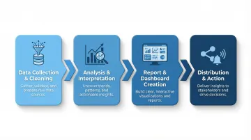
How BI Reporting Works
Step 1 — Data Collection and Cleaning
BI reporting begins by pulling data from multiple sources: databases, CRMs, data warehouses, cloud applications, and APIs. The average enterprise draws from over 400 different data sources to feed analytics initiatives, with 20% of organizations integrating 1,000+.
Once collected, data must be cleaned and standardized to remove duplicates, correct errors, and ensure consistency. Poor data quality costs organizations an average of $12.9 million annually, and 47% of newly created records contain at least one critical error — so skipping this step is rarely an option.
Step 2 — Analysis and Interpretation
Cleaned data is processed through analytical models to surface patterns and anomalies — turning raw numbers into meaningful business signals. Modern platforms use semantic layers and automated data preparation to consolidate data from disparate sources into a single view without requiring manual SQL queries.
Step 3 — Report and Dashboard Creation
Once analysis is complete, findings are translated into visual formats. Choosing the right chart type for the data matters:
- Line charts for trends over time
- Bar charts for comparisons across categories
- Heat maps for geographic distribution
- Tables for detailed record-level data
These visualizations are assembled into dashboards or formatted reports. Nearly 70% of BI initiatives fail due to poor interface design, so effective visualization is critical. The Nielsen Norman Group emphasizes that dashboards must use 2D position and length for rapid quantitative comparison—circular graphs like pie charts should be avoided because humans struggle to interpret area and angle accurately.
Step 4 — Distribution and Action
Completed reports are shared with stakeholders via:
- Scheduled email delivery
- Slack notifications
- Embedded dashboards in internal tools
- Shareable links with role-based access controls
The embedded analytics market is projected to reach $86.2 billion by 2034, driven by demand for insights delivered directly within operational applications. Distribution only works when stakeholders receive the right data, in the right format, at the moment they need to decide.
Key Benefits of BI Reporting
Faster, More Confident Decision-Making
BI reporting replaces gut-feel and slow manual analysis with real-time, data-backed visibility. According to McKinsey research, companies that base decisions on data are 23 times more likely to acquire customers and 6 times more likely to retain them compared to intuition-based organizations.
Operational Efficiency and Cost Reduction
Automated BI reporting eliminates repetitive manual data pulls, reduces analyst bottlenecks, and surfaces inefficiencies. A Forrester study found that employees saved up to 250 hours per year by automating reporting workflows with Power Automate alongside BI tools.
Automation also eliminates the error risk that comes with manual data consolidation. When teams pull from multiple sources into spreadsheets, duplication and inconsistency are almost inevitable. A consistent data pipeline removes that risk entirely.
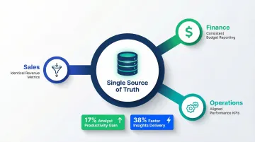
A Single Source of Truth Across the Organization
Centralizing data in a single BI platform eliminates conflicting spreadsheet versions, aligns teams on the same metrics, and builds organizational trust in data. An IDC Business Value study found that establishing a unified view of data improved analyst productivity by 17% and allowed teams to deliver insights 38% faster.
At scale, this matters more than most teams expect. When sales, finance, and operations each calculate "revenue" differently, strategic meetings stall on whose numbers to trust — instead of focusing on what to do next.
Key areas where a unified data layer pays off:
- Sales, finance, and ops teams work from identical metrics
- Onboarding new analysts is faster when one authoritative source exists
- Executive reporting becomes consistent across quarters and business units
BI Reporting Best Practices
Start with Business Objectives, Not Data
Effective BI reports are built backwards from a specific question or decision. Define the KPIs and metrics that matter before touching a data source. Avoid building reports that display data without a clear business purpose.
Ask:
- What decision will this report inform?
- Who needs to see it and how often?
- What action should they take based on the insights?
Reports built without clear objectives become unused dashboards that clutter the BI environment.
Match Your Visualization to Your Audience and Data Type
The choice of chart, graph, or table format should serve the story you need to tell. Use linear charts (bar and line graphs) for rapid, accurate quantitative comparison. Avoid pie charts, donut charts, and gauges—they consume space and are difficult to interpret accurately.
| Use Case | Best Choice |
|---|---|
| Trends over time | Line charts |
| Comparisons across categories | Bar charts |
| Part-to-whole relationships | Stacked bar charts (not pie charts) |
| Geographic distribution | Heat maps |
| Detailed records | Tables with sorting and filtering |
Cluttered dashboards undermine comprehension. Focus on communicating critical, at-a-glance KPIs rather than building expansive views of complex data that require heavy cognitive processing.
Prioritize Governance, Security, and Iteration
Good visualization gets reports read. Governance keeps them trustworthy. Sustainable BI reporting depends on three operational pillars:
- Role-based access controls — limit report access to the right people
- Data lineage documentation — trace where each metric comes from
- Regular review cycles — retire stale reports as business priorities shift
Gartner predicts 80% of data and analytics governance initiatives will fail by 2027 if they rely on outdated "command-and-control" models. Successful governance is agile, outcome-driven, and embedded in daily workflows.
Platforms like Sylus address this natively by grounding all analysis in dbt models and documentation. Every report stays validated against your team's agreed metric definitions — so finance and operations aren't working from different numbers.
Frequently Asked Questions
What is BI reporting?
BI reporting is the process of collecting, analyzing, and presenting business data using tools like dashboards and reports. It helps organizations track performance, monitor KPIs, and make data-driven decisions by transforming raw data into visual, structured insights.
What does BI stand for?
BI stands for Business Intelligence—the technology, processes, and practices organizations use to collect and analyze data and convert it into actionable insights. It covers reporting, analytics, data visualization, and decision support systems.
What does a BI report look like?
BI reports range from static tabular summaries (like monthly financials in a PDF) to interactive dashboards with live charts, filters, and drill-down capabilities. The format depends on the audience—executives typically need high-level KPI summaries, while analysts work with detailed data tables.
What is the best BI reporting tool?
The best tool depends on your team's needs. Evaluate ease of use, data source integrations, governance, AI features, scalability, and security certifications like SOC 2 and HIPAA compliance. Popular enterprise options include Microsoft Power BI, Tableau, Looker, and AI-native platforms like Sylus.
Is Excel a BI tool?
Excel can perform basic data analysis and reporting, but it is not a dedicated BI tool. It lacks real-time data connections, scalable governance, and the interactive visualization capabilities that purpose-built BI platforms provide. For enterprise reporting, Excel is best used for ad-hoc analysis rather than as the primary BI solution.
What is Power BI reporting?
Power BI is Microsoft's dedicated BI platform for connecting data sources, building interactive dashboards, and sharing reports. Microsoft has been named a Leader in the Gartner® Magic Quadrant™ for Analytics and BI Platforms for seventeen consecutive years, making it one of the most widely adopted enterprise BI tools.