Data dashboards solve this problem by consolidating the most important metrics into a single, visual view. This guide covers what a data dashboard is, the four main types, key benefits, how they work, and how to build one effectively.
Key Takeaways
- A data dashboard consolidates key metrics and KPIs from multiple sources in one visual display
- Four core types cover distinct use cases: strategic, analytical, operational, and informational
- Modern AI-powered dashboards auto-generate visuals and allow plain English queries
- Effective dashboards are built for a specific audience, use the right chart types, and pull from live data sources
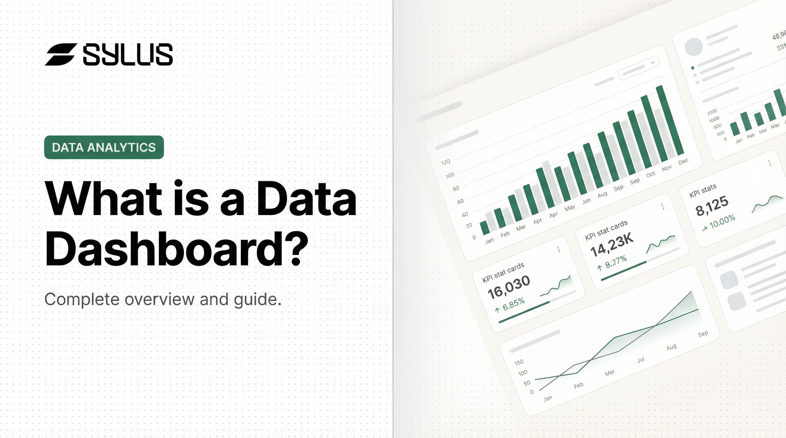
What Is a Data Dashboard?
A data dashboard is an information management tool that visually tracks, aggregates, and displays key performance indicators (KPIs) and metrics from multiple data sources in one centralized view. Instead of switching between five different reports to piece together a picture, a dashboard surfaces the metrics that matter in one place, in real time.
Core Components:
Every data dashboard contains three essential elements:
- Data sources — The origin of raw data (CRM systems, databases, spreadsheets, APIs)
- Visualizations — Charts, graphs, and tables that represent data visually
- KPIs and metrics — The specific measurements being tracked (revenue, conversion rates, customer counts)
Dashboard vs. Data Visualization
A common misconception is that a data dashboard and a data visualization are the same thing. A data visualization is a single graphical representation of data — one chart or graph. A dashboard is a collection of multiple visualizations arranged to answer a central business question.
Who Uses Data Dashboards
Dashboards serve diverse audiences across organizations:
- Executives need high-level performance snapshots to track strategic goals
- Analysts run deep comparisons and identify trends in historical data
- Operations teams monitor live activity and respond to changing conditions
- Clients and stakeholders receive clear, story-driven performance updates
Because each of these audiences needs something different, modern dashboards have evolved well beyond static charts. Today's platforms offer real-time updates, interactive drill-downs, AI-generated insights, and mobile access — tools like Sylus take this further by letting users query their data directly in plain English, so non-technical team members can build and explore dashboards without writing a single line of SQL.
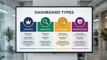
The 4 Types of Data Dashboards
Choosing the right dashboard type depends on your audience, the time horizon of the data, and the decision it needs to support. There are four recognized types, each built for a different use case.
| Dashboard Type | Primary User | Data Refresh | Primary Purpose |
|---|---|---|---|
| Strategic | Executives / senior leadership | Weekly or monthly | Track long-term goals and org health |
| Analytical | Analysts / middle management | Varies | Explore trends and build forecasts |
| Operational | Frontline managers / operations teams | Real-time or near real-time | Monitor day-to-day performance |
| Informational | Clients / stakeholders | Scheduled (weekly/monthly) | Communicate results clearly |
Strategic Dashboards
Strategic dashboards are high-level tools designed for senior leadership and executives. They monitor long-term company goals, critical success factors, and organizational health. Data typically refreshes less frequently—weekly or monthly—because strategic decisions don't require minute-by-minute updates.
Example: A CMO dashboard showing marketing qualified leads (MQLs), sales qualified leads (SQLs), revenue pipeline, and year-over-year growth.
Analytical Dashboards
Analysts and middle managers use analytical dashboards to explore historical data, identify trends, and build forecasts. They support deeper investigation, often including drill-down features and multi-variable comparisons that let users answer follow-up questions.
Example: An MRR (monthly recurring revenue) dashboard tracking new subscriptions, churn rates, and revenue trends over time.
Operational Dashboards
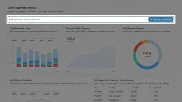
Operational dashboards are built for day-to-day performance management. Data updates frequently—sometimes by the minute—because frontline teams need to react quickly to changing conditions. Think of them as the live pulse of your operations.
Example: A Google Analytics dashboard tracking live session counts, bounce rates, traffic sources, and goal completions.
Informational Dashboards
Unlike the other three types, informational dashboards prioritize storytelling over exploration. They're designed for a specific audience—often clients or external stakeholders—and favor simple, digestible visuals over complex charts.
Example: A monthly content performance summary shared with a client showing sessions, goal completions, and channel breakdown.
Key Benefits of Using a Data Dashboard
Centralization and Time Savings
Dashboards eliminate the need to log into multiple tools to manually compile reports. All relevant KPIs from disparate sources—CRM, web analytics, financial tools—live in one view, reducing human error and cutting down on context-switching.
Without that centralization, the cost adds up fast. Employees lose approximately four hours of productive time per week just reorienting themselves between applications.
Faster, More Informed Decision-Making
Because dashboards display real-time or near-real-time data, teams can identify trends, spot anomalies, and act before problems escalate—rather than waiting for end-of-month reports. Companies making intensive use of customer analytics are 23 times more likely to acquire customers and 19 times more likely to achieve above-average profitability. Advanced insights-driven businesses are eight times more likely to report revenue growth of 20% or more.

Transparency and Alignment Across Teams
Speed matters less when teams are pulling in different directions. Shared dashboards fix that by making performance visible to everyone—from individual contributors to the executive team.
The practical effects include:
- Connecting daily work to top-level business goals
- Reducing siloed decisions driven by incomplete data
- Building accountability without requiring constant status meetings
Data Dashboards vs. Reports: What's the Difference?
Reports are detailed, retrospective documents that provide a deep-dive into a specific dataset, event, or time period. They're typically static, generated on a schedule (weekly, monthly, quarterly), and consumed by a narrow audience. Dashboards, by contrast, are dynamic, always-on, and designed for ongoing monitoring rather than one-time review.
Practical comparison:
Imagine needing to check how a marketing campaign performed last month. A report gives you a full narrative with context and detailed breakdowns—well-suited for a board presentation. A dashboard shows you the live numbers right now and whether you're on track—ideal for daily monitoring.
The two are complementary tools, each with a distinct job to do:
| Dashboard | Report | |
|---|---|---|
| Purpose | Ongoing monitoring | One-time or periodic analysis |
| Update frequency | Real-time or near-real-time | Scheduled (weekly, monthly, quarterly) |
| Best for | Daily tracking, quick decisions | Stakeholder presentations, deep narrative |
| Format | Dynamic, interactive | Static document |
How Do Data Dashboards Work
The Technical Flow
Dashboards connect to data sources (databases, SaaS tools, spreadsheets, APIs), pull in raw data either in real-time or on a defined refresh schedule, and then transform that data into visual elements. Data connectors and integrations make this seamless. For example, Sylus supports 500+ pre-built integrations across ERP systems, CRM platforms, accounting software, e-commerce tools, and direct database connections.
Choosing the Right Visualizations
Visualization choice directly affects how quickly users understand data:
- Line graphs — Trends over time
- Bar charts — Comparing categories
- Pie charts — Distribution (use sparingly for 3 or fewer categories)
- Gauge/progress bars — Goal tracking
- Tables — Ranked metric comparisons
Research shows that bar charts, line charts, and scatter plots are the easiest for users to comprehend quickly. Avoid 3D charts and radial gauges: they distort data and require heavy cognitive processing.
Interactivity and KPIs
Filters, date range selectors, drill-downs, and clickable elements let users explore data beyond the surface view. This interactivity answers follow-up questions without needing a new report or analyst request, turning dashboards into tools business users can navigate independently.
That independence only holds if the right metrics are tracked. Before building any visualization, teams should define the business questions they need to answer, then identify the KPIs that measure progress toward those goals. This question-first approach prevents information overload and ensures every metric earns its place on the dashboard.
How AI is Changing Dashboards
Modern AI-powered platforms like Sylus let teams connect their data sources and ask questions in plain English, generating complete dashboards without requiring technical expertise. Rather than returning instant guesses, the AI reasons through the data before presenting final results, grounding every analysis in dbt models and documentation for accuracy.
Key capabilities this unlocks for data teams:
- Ask questions in plain English and receive a fully built dashboard
- Analysis validated against dbt models, not raw query outputs
- Alerts when metrics spike or anomalies appear
- SOC 2 Type II and HIPAA compliant, with self-hosted deployment for air-gapped environments
Best Practices for Building an Effective Data Dashboard
Start with Audience and Goal
Before selecting a single chart, define who will use the dashboard and what question it needs to answer. A dashboard for a sales rep tracking daily pipeline is very different from one an executive reviews weekly. Tailoring the dashboard to its audience prevents information overload and ensures adoption.
Keep It Simple and Consistent
Limit the number of metrics to only the most critical ones. Experts recommend limiting dashboards to two or three primary views—too many metrics cause the big picture to get lost in details. Keep these design principles in mind:
- Use a consistent color scheme with clear labels and a logical layout
- Avoid redundant visuals and clutter
- Remove any metric that isn't directly actionable
- Organize views so users can scan key information at a glance
Iterate Based on Feedback and Real-Time Data
Treat the dashboard as a living tool. Collect input from primary users, update data sources regularly to maintain accuracy, and refine visualizations as business priorities evolve. Static dashboards that aren't maintained quickly lose relevance and trust. Poor data quality costs organizations an average of $12.9 million annually—a strong case for building review cycles into your dashboard workflow from day one.
Frequently Asked Questions
What are the 4 types of data dashboards?
The four types are strategic (long-term, executive-level monitoring), analytical (historical data and trend analysis), operational (real-time, day-to-day monitoring), and informational (client-facing storytelling with data). Each serves a different audience and decision-making purpose.
Do I need a dashboard?
If your team tracks KPIs, reports on performance, or pulls data from more than one source, a dashboard will save significant time and sharpen decision-making. Single-tool teams with minimal reporting needs can hold off — but most businesses outgrow that quickly.
What is a data dashboard activity?
A data dashboard activity refers to any action taken within or because of a dashboard — such as monitoring a KPI, drilling down into a metric, setting a performance goal, or generating a report.
Is Excel a data dashboard?
Excel can be used to build basic dashboards using charts, pivot tables, and conditional formatting, but it lacks the real-time data connectivity, automated updates, and interactivity of purpose-built dashboard tools. For small static datasets, Excel works; for live business monitoring, dedicated dashboard software is more effective.
What is a computer dashboard used for?
A computer dashboard is used to display key information and metrics in a single visual interface, enabling users to monitor performance, track progress toward goals, and make faster decisions. It acts as a centralized control panel for data across any business function.