for 2026](https://cdn.gushwork.ai/cover-images/sylus.ai/db4fee05-1c0b-4387-a68c-81d29e65c8e8.jpg)
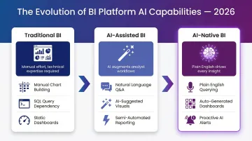
Not all BI visualization tools are built the same. Traditional platforms like Tableau and Power BI prioritize dashboards and charts, offering deep customization for technical users. Newer AI-native platforms like Sylus and ThoughtSpot are reshaping how teams interact with data entirely—enabling plain English queries, automated insights, and governed self-service analytics.
This guide covers the 10 best BI data visualization tools for 2026, what to look for when evaluating them, and a clear selection framework to match your team's needs.
Key Takeaways
- BI data visualization tools turn raw data into interactive charts, dashboards, and reports that drive business decisions
- Leading tools in 2026 pair proven visualization features with AI capabilities — natural language querying, automated insights, and anomaly detection
- Top picks span enterprise staples like Tableau and Power BI alongside AI-native platforms built for modern data teams
- Evaluate tools on ease of use, AI/ML features, governance, security compliance, deployment options, and total cost of ownership
What Are BI Data Visualization Tools?
BI data visualization tools are software platforms that transform raw structured data into visual formats—charts, graphs, maps, and dashboards—so business users and analysts can spot trends, outliers, and patterns without writing complex code. The two categories serve different needs:
- Standalone visualization tools focus purely on rendering data visually
- Full BI platforms layer in data modeling, transformation, governance, querying, and sharing capabilities
AI is reshaping how users interact with data in 2026—moving away from manual dashboard-building toward plain-English queries, auto-generated dashboards, and proactive alerts. Forrester notes that Generative AI is "leveling the playing field as all BI vendors integrate generative and agentic AI capabilities". Gartner now lists Natural Language Query (NLQ) and Automated Insights as mandatory features for modern Analytics and BI platforms.
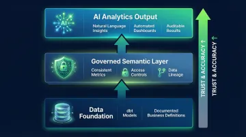
That reliability question matters. As AI-generated insights become standard, teams need outputs grounded in verified business logic—not raw model guesses. "Governed context" approaches, which anchor AI analysis in dbt models and documented business definitions, are emerging as the answer.
The 10 Best BI Data Visualization Tools for 2026
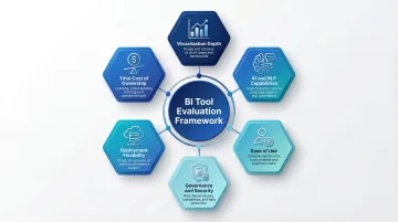
These tools were selected based on data visualization depth, AI capabilities, ease of use, integration breadth, security/compliance, and deployment flexibility.
Sylus
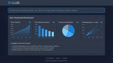
Sylus is an AI-powered analytics platform built for modern data teams—from fast-growing startups to Fortune 1000 enterprises. Its core differentiator is functioning like "ChatGPT, but trained on your business's data," connecting directly to your data sources so users can ask questions in plain English and receive validated answers grounded in your dbt models and documentation.
Sylus generates entire dashboards automatically and lets users customize charts with plain English commands. Pricing is usage-based with unlimited seats—no per-seat licensing friction. It offers self-hosted deployment for strict data residency requirements, is SOC 2 Type II and HIPAA compliant, and neither Sylus nor its model partners train on customer data.
Users can schedule AI-generated reports to email or Slack, or query data directly from Slack for instant insights.
| Key Features | Details |
|---|---|
| Features | AI data analyst that validates assumptions before returning outputs; governed context grounded in dbt models; dashboard generation; plain English chart customization; Slack integration; alerts on data spikes; secure sharing via link, email, or embed |
| Pricing | Usage-based pricing with unlimited seats; self-hosted deployment available; verify current pricing at Sylus's website |
| Best For | Data teams and business users at startups and enterprises who want AI-powered analytics without per-seat licensing friction, especially teams already using dbt |
Microsoft Power BI
Microsoft Power BI is Microsoft's flagship BI platform, widely adopted by organizations already embedded in the Microsoft ecosystem (Excel, Azure, Teams, Dynamics). It offers real-time dashboards, AI-powered visuals, and a flexible pricing model including a free tier.
Its strengths lie in deep Microsoft stack integration, natural language Q&A, strong role-based access controls, and a large community. Microsoft has held a Leader position in the Gartner Magic Quadrant for Analytics and BI Platforms for 18 consecutive years.
That said, DAX modeling has a steep learning curve, performance can degrade on very large datasets, and enterprise-scale costs climb quickly.
| Key Features | Details |
|---|---|
| Features | Real-time dashboards; AI visuals; natural language Q&A; 100+ data connectors; deep Microsoft ecosystem integration |
| Pricing | Free tier available; Pro $14/user/month; Premium Per User $24/user/month; capacity-based pricing via Fabric |
| Best For | SMBs to large enterprises already using Microsoft tools seeking affordable, scalable BI |
Tableau
Tableau is a widely-used data visualization platform, favored by enterprises and data analysts for its visual storytelling depth, rich connector library, and flexible deployment (cloud, desktop, on-premise).
Differentiators include unmatched visualization depth, strong community, and AI-driven insights through features like Tableau Pulse Enhanced Q&A and Explain Data. Tableau was named a Leader in the 2024 Gartner Magic Quadrant for Analytics and BI Platforms for the 12th consecutive year. Limitations include expensive and complex licensing, steep learning curve for advanced features, and performance lags on high-volume data.
| Key Features | Details |
|---|---|
| Features | Interactive visual analysis; 100+ connectors; Enhanced Q&A (NLP); Explain Data AI insights; cloud and on-prem deployment |
| Pricing | Viewer $15/user/month; Explorer $42/user/month; Creator $75/user/month (Standard Edition) |
| Best For | Data analysts and enterprises prioritizing visualization depth and storytelling over cost |
Qlik Sense
Qlik Sense is an enterprise-grade BI platform known for its unique associative analytics engine, which lets users explore data connections freely in any direction—beyond the predetermined query paths of SQL-based tools. It offers strong self-service analytics, interactive dashboards, and robust governance.
Differentiators include in-memory processing for fast performance, augmented analytics with ML-driven suggestions via Insight Advisor, strong data governance and security rules engine, and good mobile support.
The associative engine highlights related data in green/white and unrelated data in gray, preventing the data loss common in SQL-based joins. Limitations include a steeper learning curve than Power BI and higher costs when adding enterprise features.
| Key Features | Details |
|---|---|
| Features | Associative data engine; augmented analytics; interactive dashboards; embedded analytics; strong governance |
| Pricing | Starter $300/month (10 users/10GB); Standard $825/month (25GB); Premium $2,750/month (50GB); Enterprise custom |
| Best For | Enterprises needing deep, unrestricted data exploration with strong governance |
Looker Studio (Google)
Looker Studio is Google's free cloud-based data visualization tool, offering 800+ data sources and seamless integration with the Google ecosystem (BigQuery, Google Analytics, Sheets). It enables easy dashboard creation, sharing via Google Drive, and collaboration without cost.
Differentiators include completely free access for standard use, extensive Google ecosystem integration, and easy sharing. Limitations include limited advanced analytics compared to Tableau or Power BI, slower performance with complex queries, and fewer native connectors outside Google.
| Key Features | Details |
|---|---|
| Features | 800+ connectors; Google ecosystem integration; shareable dashboards; real-time data reporting |
| Pricing | Free for Looker Studio; advanced Looker (Google Cloud) features require custom enterprise pricing |
| Best For | Teams operating in Google Cloud or those needing free, shareable dashboards quickly |
ThoughtSpot
ThoughtSpot is an AI-powered analytics platform built around search and natural language querying—users type questions and get instant visual answers. It is designed to democratize data access for non-technical business users while maintaining enterprise-grade governance.
Differentiators include SpotIQ AI engine for automated insights, live query against cloud data warehouses (Snowflake, BigQuery, Redshift), and Liveboards for real-time interactive dashboards. Limitations include premium pricing, requirement for a cloud data warehouse, and setup complexity for large deployments.
| Key Features | Details |
|---|---|
| Features | Natural language search; SpotIQ AI insights; Liveboards; live cloud data warehouse queries; embedded analytics |
| Pricing | Free tier available (Developer, 1 year); Essentials, Pro, Enterprise custom; user-based starts at $25/user/month |
| Best For | Enterprises wanting to expand analytics access for business users via natural language search |
Domo
Domo is a cloud-native BI platform that combines data integration (1,000+ connectors), visualization, and collaboration in a single platform. It targets business users who need real-time dashboards and reports without heavy IT involvement.
Differentiators include strong collaboration features (alerts, annotations, social data discussions), mobile-first design, and broad connector library.
Domo uses a consumption-based pricing model where customers pay for usage rather than rigid per-seat licenses. Limitations include pricing that can scale quickly and advanced analytics requiring add-ons.
| Key Features | Details |
|---|---|
| Features | 1,000+ connectors; real-time dashboards; collaboration tools; mobile-first; AI-assisted insights |
| Pricing | Custom pricing based on usage; consumption-based model |
| Best For | Business teams needing a collaborative, all-in-one cloud BI platform with broad integrations |
Sisense
Sisense is a hybrid-cloud BI platform known for its embeddable analytics capabilities, allowing SaaS companies and enterprises to white-label and embed dashboards directly into their own applications and products.
Differentiators include strong plugin ecosystem, flexible architecture, AI/ML integrations, and NLP support. Embedding options include iFrames, Sisense Embed SDK, and Compose SDK for fully white-labeled deployments.
Limitations include a UI that feels less modern than competitors, performance lags at very high data volumes, and pricing starting around $399/month for basic plans.
| Key Features | Details |
|---|---|
| Features | Embeddable analytics; hybrid-cloud; AI/NLP integrations; self-service dashboards; white-label support |
| Pricing | Launch $399/month; Grow $1,299/month; Scale custom |
| Best For | SaaS vendors and enterprises needing to embed BI directly into their products |
Zoho Analytics
Zoho Analytics is a user-friendly, SMB-focused BI platform offering AI-driven insights via its "Zia" AI assistant, drag-and-drop report creation, and 500+ integrations across Zoho apps and third-party platforms.
Differentiators include excellent value for SMBs, tight Zoho ecosystem integration, natural language queries via Zia, and collaborative analysis features. Zia is a search-driven, conversational AI assistant that allows users to ask questions in natural language to instantly generate reports and KPI widgets. Limitations include performance lags on very large datasets and limited advanced modeling.
| Key Features | Details |
|---|---|
| Features | Zia AI assistant; 500+ integrations; drag-and-drop interface; forecasting; mobile apps |
| Pricing | Basic, Standard, Premium, and Enterprise tiers available; pricing varies by region |
| Best For | SMBs seeking affordable, AI-assisted BI with broad third-party integrations |
Metabase
Metabase is a popular open-source BI tool known for its simplicity, allowing teams to build dashboards and run queries without SQL knowledge. It has both a free self-hosted version and paid cloud offerings.
Differentiators include easy setup, open-source flexibility, intuitive question-builder for non-technical users, and low cost of entry. Metabase can be self-hosted using an official Docker image or JAR file. Limitations include limited advanced analytics, less suitability for complex enterprise-scale deployments, and fewer AI capabilities than newer tools.
| Key Features | Details |
|---|---|
| Features | No-SQL question builder; interactive dashboards; open-source; embedding support; alerts |
| Pricing | Free open-source (self-hosted); Starter $100/month; Pro $575/month; Enterprise starts at $20k/year |
| Best For | Startups and technical teams wanting a lightweight, low-cost BI tool with self-hosting flexibility |
How We Chose the Best BI Data Visualization Tools
Tools were assessed on six core criteria:
- Visualization depth and chart variety — How many chart types are available, how far they can be customized, and whether the tool supports coherent visual narratives across dashboards
- AI and natural language capabilities — How well natural language queries perform against real data models, whether automated insights are accurate, and whether AI is built into the platform or added as an afterthought
- Ease of use — Accessibility for both technical and non-technical users
- Data governance, security certifications, and compliance — SOC 2, HIPAA, access controls, and data lineage
- Deployment flexibility — Cloud, on-premise, self-hosted options
- Total cost of ownership — Per-seat vs. usage-based pricing, hidden costs as adoption scales
Common Selection Mistakes
Teams often over-index on feature lists rather than fit, ignoring governance and security requirements until too late, and failing to account for how pricing scales as user adoption grows. A primary mistake is deploying AI analytics without a governed data foundation—ungoverned data leads to "confidently wrong answers faster" and can result in millions in wasted investment.
Avoiding these mistakes starts with matching the tool to your team's actual context: maturity level, existing data stack (dbt, Snowflake, BigQuery), and whether the priority is self-service exploration or AI-driven analytics.
The 2026 Differentiator: Governed AI
AI capabilities are no longer optional — they're a baseline requirement for any serious BI platform. Teams should specifically evaluate whether AI features are native to the platform and grounded in governed business context, or bolted-on and disconnected from actual data models.
The key questions to ask:
- Native vs. bolted-on — Is AI built into the query and modeling layer, or added as a separate module?
- Governed context — Does the AI ground its analysis in your semantic layer and documented data models?
- Transparency — Can users trace AI-generated insights back to source data through clear lineage?
AI-powered data governance platforms enable autonomous enforcement of policies, reducing data errors by 20-40%. The differentiator is no longer whether a platform has AI, but whether that AI operates within strict guardrails, consistent semantic definitions, and auditable data lineage — so teams can trust what the AI tells them.
Conclusion
Choosing the right BI data visualization tool requires aligning the platform's capabilities to your data stack, team size, governance requirements, and whether you need traditional dashboard depth or modern AI-driven analysis. Enterprise staples like Tableau and Power BI excel at visualization depth and Microsoft ecosystem integration, while AI-native platforms like Sylus and ThoughtSpot democratize analytics through natural language interfaces and automated insights.
Use trial periods and demos to validate real-world performance with your data. Involve both data team members and business users in evaluation—the best tool is one that both groups will actually adopt, not the one with the longest feature list.
For teams that want to skip building dashboards manually and start getting answers in plain English, Sylus is worth a closer look. It grounds all analysis in your dbt models and data sources, so answers stay consistent with how your team defines metrics. Key details for enterprise evaluation:
- SOC 2 Type II and HIPAA compliant
- Unlimited seats with usage-based pricing (no per-user licensing fees)
- Self-hosted deployment available for strict data residency requirements
Frequently Asked Questions
What are the top 5 data visualization tools?
The most widely used tools in 2026 are Tableau (known for visual depth and storytelling), Microsoft Power BI (Microsoft ecosystem integration), Qlik Sense (associative analytics), Looker Studio (free accessibility), and ThoughtSpot (AI-powered natural language search).
What is AI for business intelligence tools?
AI in BI tools refers to capabilities like natural language querying, automated insight generation, anomaly detection, and predictive analytics. The best AI-native platforms ground these capabilities in governed business logic so results reflect your actual business definitions rather than raw data alone.
What is the difference between BI tools and data visualization tools?
Data visualization tools focus specifically on rendering data as charts, graphs, and dashboards. Full BI platforms also include data modeling, transformation, governance, and querying. Most modern BI tools treat visualization as one component of a broader analytics stack.
Which BI data visualization tool is best for small businesses?
Zoho Analytics (affordable, SMB-friendly), Looker Studio (free), and Metabase (open-source) are strong choices for smaller teams with limited budgets. Usage-based platforms like Sylus can also be cost-effective because they don't charge per seat, allowing teams to scale without licensing friction.
Can BI visualization tools integrate with existing data infrastructure?
Yes. Most modern BI tools connect to common data sources including cloud data warehouses (Snowflake, BigQuery, Redshift), databases, SaaS applications, and APIs. Tools with governed context capabilities (like those built on dbt) further ensure that analysis is grounded in verified, documented metrics.
What should I look for when choosing a BI data visualization tool in 2026?
Prioritize AI and natural language capabilities, ease of use for non-technical users, data governance and security compliance (SOC 2, HIPAA), deployment flexibility, integration with your existing data stack, and a pricing model that scales with your team without penalizing user growth.