Introduction
Data teams and business analysts spend 60–80% of their week on manual reporting: pulling data, cleaning it, choosing chart types, and formatting visuals. This bottleneck buries insights and delays critical decisions by days or even weeks.
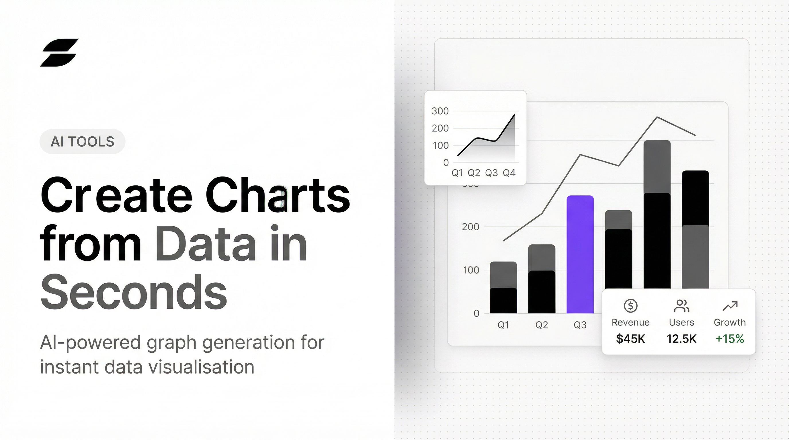
An AI graph maker solves this problem by letting anyone describe what they want to see in plain English and receive a polished, accurate chart in seconds. No coding, no spreadsheet formulas, no manual formatting. Just instant, shareable visualizations built directly from your data.
This article covers what AI graph makers are, how they work behind the scenes, the measurable benefits they deliver, what to evaluate when choosing one, and practical tips to maximize their value.
Key Takeaways
- AI graph makers convert raw datasets into charts instantly — just describe what you need in plain English
- They reduce report creation time by up to 70%, reclaiming hundreds of analyst hours annually
- Advanced tools connect directly to databases and dbt models, keeping every chart grounded in verified, governed data
- Users can refine charts conversationally with follow-up instructions like "filter to Q3" or "change colors"
- Enterprise-ready tools offer SOC 2 Type II, HIPAA compliance, and a firm no-training-on-customer-data policy
What Is an AI Graph Maker?
An AI graph maker uses natural language processing and machine learning to transform raw datasets into charts, graphs, and dashboards automatically. Ask a question in plain English, and the tool returns a presentation-ready visual in seconds — no manual setup, no visualization expertise required.
How It Differs from Traditional Tools
Traditional charting tools like Excel or Google Sheets require users to manually select chart types, format axes, clean data, and configure every visual element. AI graph makers automate all of that. Instead of building a chart cell-by-cell, you type "show me monthly revenue by region as a bar chart" and get a finished visual instantly — no configuration needed.
Range of Visual Outputs
Modern AI graph makers generate comprehensive visual outputs:
- Bar charts for categorical comparisons
- Line graphs for trends over time
- Pie charts for proportional data
- Scatter plots for correlation analysis
- Heatmaps for pattern detection
- Multi-chart dashboards combining multiple visualizations
Advanced platforms can generate full executive dashboards with 8+ metrics — bar charts, line graphs, and pie charts combined — from a single plain-English question against your connected data source.
How AI Graph Makers Work
AI graph makers follow a five-step pipeline that transforms natural language questions into accurate, formatted visualizations.
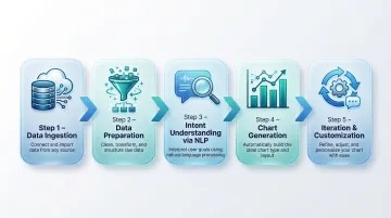
Step 1: Data Ingestion
The tool connects to your data source—whether that's an uploaded CSV, an Excel file, a live database connection, a cloud data warehouse like Snowflake or BigQuery, or an integrated platform. Advanced tools built for data teams connect directly to structured data sources—no manual file exports needed.
For example, platforms like Sylus ground analysis in dbt models and documentation, ensuring every chart reflects governed, validated metrics rather than ad-hoc file uploads.
Step 2: Data Preparation
AI automatically detects column types, handles missing values, identifies variable relationships, and flags anomalies that could distort visualizations. Most manual data cleaning becomes unnecessary.
Amazon QuickSight uses machine learning to infer semantic information about data, automatically selecting high-value columns and updating technical column names with friendly business terms. This ensures numeric fields like ZIP codes are treated as dimensions (strings) rather than measures for calculation.
Step 3: Intent Understanding via Natural Language
The NLP layer interprets your plain-English question—like "show me monthly revenue by region as a bar chart"—and maps it to the correct chart configuration, axes, and filters. Natural language query (NLQ) pipelines parse key elements like metrics, dimensions, filters, and time periods, then generate the SQL query needed to retrieve the data.
For NLQ to work accurately, the AI must understand your specific business vocabulary: column synonyms, term mappings, and domain-specific language. Configuring synonyms is where this breaks down or succeeds—if a user asks "show me sales by territory," the AI needs to know "sales" maps to your revenue column and "territory" maps to your region field.
Step 4: Chart Generation and Formatting
The AI selects the most appropriate chart type for your data, applies consistent formatting (colors, labels, legends, scales), and produces a presentation-ready visual. AI chart recommendation features automatically choose optimal formats based on data structure, removing the guesswork from chart selection entirely.
Step 5: Iteration and Customization
Users can refine AI-generated charts conversationally by giving follow-up instructions like "change the color scheme," "add a trend line," or "filter to only Q3 data." This makes chart-building an iterative conversation—each follow-up instruction refines the output without starting from scratch.
Key Benefits of Using an AI Graph Maker
Speed: Reclaiming 70% of Report Creation Time
Tasks that previously took hours—pulling data, cleaning it, choosing chart types, formatting—now complete in seconds. The numbers back this up:
- Forrester's Total Economic Impact study on ThoughtSpot found a 289% ROI driven by a nearly 70% reduction in report creation time
- Enterprise Strategy Group validated that Amazon Q in QuickSight lowers total BI costs by up to 67% over three years, delivering a 310% ROI
Accessibility for Non-Technical Users
AI graph makers remove the skill barrier entirely. Business users, analysts, and executives can generate accurate charts without knowing SQL, Python, or BI tool configuration. This democratizes data access across entire organizations.
Forrester research shows that only 20% of enterprise decision-makers use analytical platforms today—the other 80% still rely on that technical 20% for data sourcing and insights. AI graph makers break this bottleneck by letting anyone ask data questions directly, no technical handoff required.
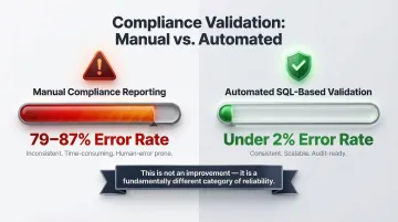
Reduced Human Error
Automated data preparation and chart selection reduce the risk of misrepresenting data—such as using the wrong aggregation, selecting a misleading chart type, or leaving in outliers that skew visuals.
Academic research by Raymond Panko consistently shows that 94% of operational spreadsheets contain errors. JPMorgan's $6.2 billion "London Whale" loss is a well-documented example: the trades were risk-managed using manually updated Excel models. A single formula error—dividing by a sum instead of an average—distorted the risk figures entirely.
Automated AI pipelines change this picture significantly. Research on healthcare data shows the contrast clearly:
| Process Type | Error Rate |
|---|---|
| Manual compliance reporting | 79–87% |
| Automated SQL-based validation | <2% |
That's not a marginal improvement—it's a different category of reliability.
Consistent, Shareable Outputs
AI graph makers produce consistently formatted, shareable visuals—charts can be embedded in reports, shared via link, or pushed to dashboards. This eliminates the inconsistency of manually rebuilt charts across teams and ensures everyone works from the same visual language.
Deeper Insights from the Same Data
Some AI graph makers go beyond visualization to proactively highlight trends, outliers, and anomalies you might not have thought to look for. ThoughtSpot's SpotIQ uses machine learning to automatically scan billions of rows, surfacing statistically significant patterns without requiring manual queries.
The result: chart generation becomes a discovery process, not just a formatting step. The AI surfaces what matters before you know to ask for it.
What to Look for in an AI Graph Maker
Natural Language Interface Quality
The core of any AI graph maker is how well it understands plain-English questions. Evaluate whether the tool can handle ambiguous questions, follow-up refinements, and domain-specific terminology without requiring users to learn a query language.
Look for platforms that support conversational iteration—where you can refine a chart by saying "filter to last quarter" or "change to a line graph" rather than rebuilding from scratch.
Data Source Connectivity
Consider whether the tool supports only file uploads (CSV, Excel) or can connect directly to live databases, data warehouses, and business intelligence layers. For data teams, direct connectivity to sources like dbt models is critical for accuracy and governance.
Sylus is built on governed context grounded in dbt models and documentation, making it a strong fit for modern data teams who need analysis tied to verified, documented metrics rather than ad-hoc file exports. This ensures every chart reflects your organization's single source of truth.
Security and Compliance
For organizations handling sensitive business or customer data, verify that the tool meets enterprise security standards:
- SOC 2 Type II compliance: 83% of enterprise buyers require this certification before signing SaaS contracts — it validates operational controls across security, availability, and privacy over 6-12 months.
- HIPAA compliance: Required for healthcare data; confirms the vendor has signed BAAs and implemented safeguards for protected health information.
- Self-hosted deployment options: For air-gapped environments and maximum data control.
- Explicit policies on model training: Verify the vendor does not train AI models on your customer data.

Sylus holds SOC 2 Type II and HIPAA certifications and explicitly does not train models on customer data — a meaningful distinction as more enterprise buyers audit vendor AI practices before procurement.
Collaboration and Sharing Features
Assess whether charts and dashboards can be shared with teammates, embedded in products or websites, or sent on a schedule. Single-user charting tools create bottlenecks; enterprise-grade tools should support:
- Team verification workflows for peer review
- Alerts for metric changes or activity spikes
- Organized collections for grouping related dashboards
- Scheduled delivery to email or Slack
Common Use Cases for AI-Generated Charts
Business Performance Monitoring
For data and operations teams, AI graph makers do more than display KPIs — they make those numbers answerable. Teams track revenue, churn, conversion rates, and pipeline, then ask follow-up questions like "break this down by sales rep" to pinpoint root causes without waiting on an analyst.
For example, Zencargo migrated to ThoughtSpot and enabled 90% of business users across finance, product, and sales to actively use the platform, eliminating the need for dedicated analysts to build dashboards.
Financial and Executive Reporting
Finance teams use AI-generated charts for board decks, budget reviews, and forecasting. Corporate Board Member research found that nearly half of directors now receive real-time or near-real-time operational data between meetings, and 40% stated that AI-powered technology would improve oversight.
Kitchen cabinet manufacturer Fabuwood replaced a month-long Power BI reporting cycle with ThoughtSpot Liveboards, empowering executives to access real-time sales revenue and drill down into live Databricks data instantly—resulting in a 300% increase in data queries.
Marketing and Product Analytics
Marketing and product teams generate charts across the full analytics stack — without filing tickets to a data team. Common use cases include:
- Campaign performance by channel or spend
- User funnel drop-off at each conversion step
- Feature adoption curves over time
- A/B test results with statistical breakdowns
Dutch telecom carrier Odido used ThoughtSpot to cut data investigation time from weeks to just 90 minutes. By empowering marketing colleagues to build their own dashboards and analyze complex datasets independently, Odido saved an estimated €1 million annually by freeing up at least 40 hours a month in data analyst time.
Best Practices to Get the Most Out of AI Chart Generation
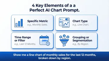
Be Specific in Your Prompt
Vague prompts produce generic results. Instead of "show me sales data," try "show monthly sales by region as a line chart for the last 12 months." Include:
- The specific metric you want to see
- The chart type (bar, line, pie, scatter)
- The time range or filter criteria
- Any grouping or segmentation (by region, by product, by rep)
Clear parameters give the AI everything it needs to generate exactly what you're looking for on the first try.
Verify the Underlying Data Before Sharing
AI-generated charts should be reviewed before distribution. Confirm that the data source, aggregation logic, and filters match what was intended. Tools that expose the underlying query or allow team verification—like Sylus's collaboration features—make this step more efficient and reduce the risk of sharing a chart built on misaligned assumptions.
Iterate Conversationally
Once your data is verified, treat the first chart as a starting point — not a final output. Refine it through follow-up instructions:
- Switch to a different chart type ("make this a bar chart instead")
- Narrow the scope ("filter to Q3 only")
- Adjust presentation ("group by product category, not region")
- Pull a summary ("give me a one-paragraph takeaway from this chart")
Each iteration builds on the last, so you reach a polished, shareable result in far fewer steps than generating charts from scratch each time.
Frequently Asked Questions
What is an AI graph maker?
An AI graph maker is a tool that uses artificial intelligence and natural language processing to automatically transform raw datasets into charts, graphs, and dashboards — no manual configuration or coding required.
Do I need coding skills to use an AI graph maker?
No coding skills are needed. Users describe what they want in plain English, and the AI handles chart selection, formatting, and data preparation automatically.
What types of charts can an AI graph maker create?
Most AI graph makers support bar charts, line graphs, scatter plots, pie charts, heatmaps, trend lines, and multi-chart dashboards. The specific range varies by tool.
Can AI graph makers connect to live databases, not just uploaded files?
Yes. Advanced AI graph makers connect directly to databases, data warehouses like Snowflake and BigQuery, and BI layers, generating charts from live data rather than requiring manual CSV exports.
How accurate are AI-generated charts?
Accuracy depends on data quality and how well the tool interprets intent. Tools built on governed, documented data models — such as Sylus, which grounds all analysis in dbt models and documentation — produce more reliable results than those working from raw, unstructured file uploads.
How do I customize an AI-generated chart after it's created?
Most AI graph makers support conversational customization. Users can issue follow-up plain-English instructions to change chart types, colors, filters, axis labels, or data ranges without rebuilding the chart.