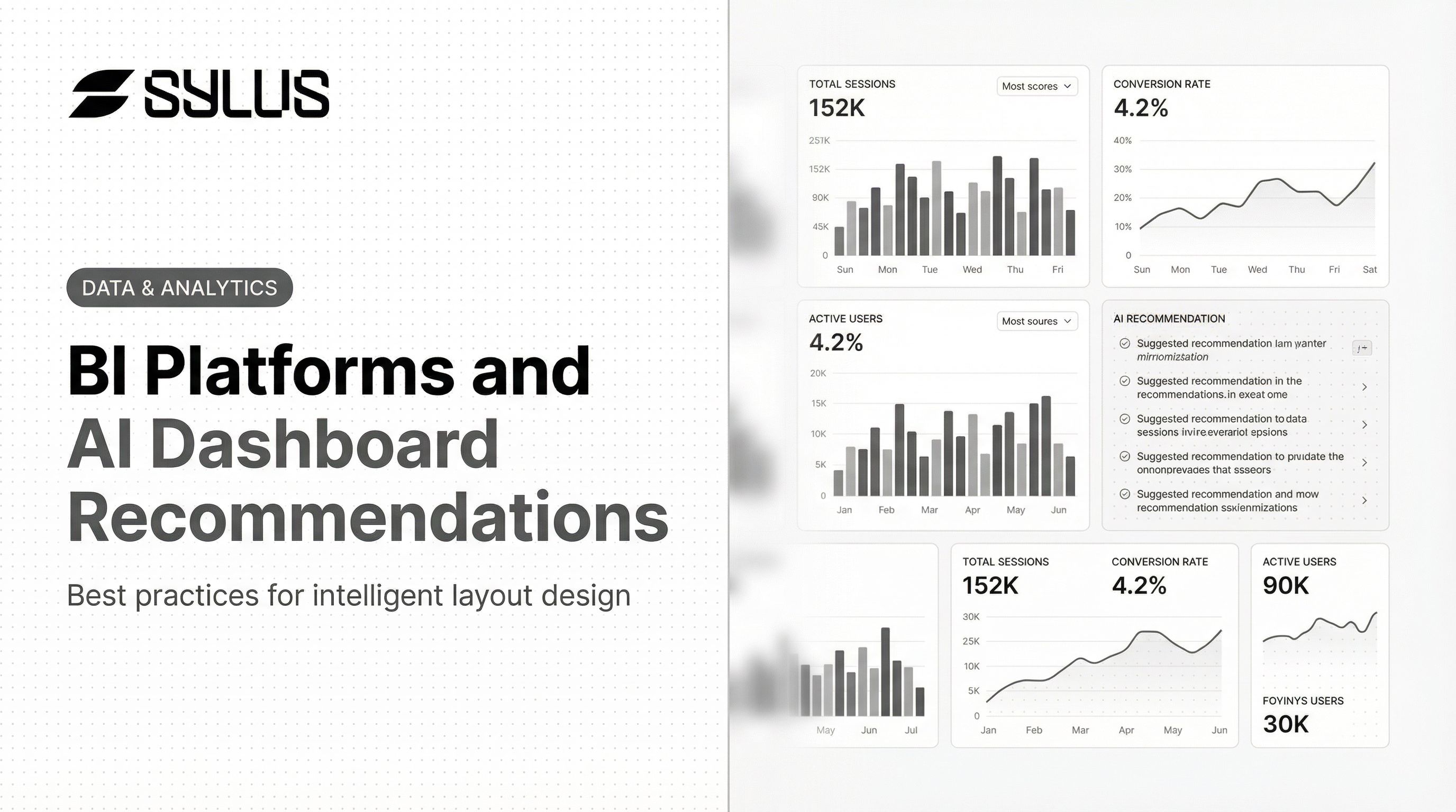
Introduction
Most BI teams have adopted AI tools, yet their dashboard layouts remain stuck in old patterns—static grids, too many charts, no clear hierarchy—undermining the intelligence those tools deliver. While 90% of organizations now use AI in their BI stack, only 39% report any impact on earnings, because poorly designed layouts bury AI-generated insights before anyone acts on them.
The fix starts with layout. What follows are practical best practices for AI-powered BI dashboards—covering both enduring design fundamentals and AI-native decisions that most teams overlook—so your dashboards make AI insights visible, actionable, and trusted.
Key Takeaways
- Cluttered dashboards get AI insights ignored — even at 90% platform adoption, poor layout kills value
- Use top-to-bottom hierarchy: summary KPIs first, trend context second, AI anomalies third
- Build role-specific templates (executive, analyst, operator) from the same governed data source
- Place AI features (NLQ bars, alerts, summaries) deliberately—not bolted onto existing charts
- Govern metrics first via semantic layers like dbt; inconsistent definitions break AI-driven layouts
Why AI Is Reshaping BI Dashboard Design
The Shift from Static to Conversational Dashboards
Traditional dashboard layouts—fixed grids, pre-built charts—were designed for human curation. AI introduces surfaces that generate content on demand, and layouts need to be flexible enough to handle both static and dynamic elements without losing visual clarity.
A static bar chart shows what happened. An AI anomaly flag with a natural language explanation shows what to do about it — and the layout has to hold both without creating hierarchy confusion.
AI-Native vs. Traditional Components
Traditional BI components:
- Pre-configured KPI cards displaying fixed metrics
- Manually built charts requiring SQL or drag-and-drop tools
- Static filters and date range selectors
AI-native components:
- Natural language query bars that generate charts on demand
- Automated anomaly detection with contextual explanations
- AI-generated narrative summaries framing the data story
- Proactive alerts surfaced inline with relevant visuals
Sylus embodies this shift directly — users generate entire dashboards or customize individual charts using plain English, which means the NLQ bar isn't just a search box but an active layout generator.
The Urgency for Updated Layout Thinking
Gartner predicts that by 2027, 75% of new analytics content will be contextualized through generative AI. Meanwhile, Microsoft is deprecating Power BI's legacy Q&A by December 2026 in favor of Copilot, and ThoughtSpot reports 52% of customers actively use their AI agent.
Taken together, these signals point to the same conclusion: keyword search is giving way to embedded, conversational AI — and dashboard layouts built for the old model will struggle to surface AI-generated content where it actually matters.
Core Layout Principles That Still Apply in AI-Powered BI
The 5-Second Rule
A well-designed dashboard must communicate its primary message within 5 seconds, relying on preattentive visual processing rather than deep cognitive effort. AI features do not override this rule—they must be positioned to support it, not distract from it.
Dashboards must impart "at-a-glance information" by leveraging preattentive attributes like 2D position and line length, which humans process accurately without fully engaging attention.
That constraint shapes every layout decision that follows—especially where AI elements live on the page.
Establish Visual Hierarchy Before Adding AI Elements
Follow the F-Pattern Reading Flow
Eye-tracking research confirms users scan dashboards with a strong top-left location bias, with attention dropping steeply from left to right. Place the most critical KPI tiles and trend indicators in the top-left zone, with supporting charts filling mid-sections and AI-generated detail available but secondary.
Stratified (top-down hierarchical) layouts encourage users to view more regions and engage deeply, whereas grid layouts suffer from sharp attention drop-off.
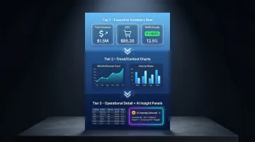
The Three-Tier Layout Framework
Tier 1 — Executive Summary Row (Top):
- 3-5 KPI cards with large numbers and trend indicators
- Example: Total Revenue, Average Order Value, Monthly Growth Rate
Tier 2 — Trend/Context Charts (Middle):
- 2-3 visuals showing performance over time or key comparisons
- Example: Revenue trend line, Orders by channel bar chart
Tier 3 — Operational Detail + AI Insight Panels (Bottom):
- Drill-down tables, AI-generated anomaly flags, NLQ results
- Example: Top customers table, AI alert about checkout conversion drop
Concrete Example — Revenue Dashboard:
- Top row: Total Revenue ($2.4M), Average Order Value ($156), Month-over-Month Growth (+12%)
- Middle row: Revenue trend line (12 months), Revenue by product category (bar chart)
- Bottom row: AI anomaly alert ("Checkout conversion dropped 8% on March 15 due to page load times"), Top 10 customers table
Limit Chart Density and Choose the Right Visual Type
The 4-Chart Maximum Rule
Human working memory is limited to approximately 4 "chunks" of information. Leading BI vendors translate this into strict design rules:
- Tableau: 2 to 3 views maximum to prevent visual clarity loss and slow load times
- InterWorks: Maximum 4 worksheets to avoid unacceptable wait times
- UX Audits: 3 to 7 primary metrics respecting human processing limits
AI-generated visuals compound clutter risk if there's no cap on auto-generated chart placement. Do not exceed 4 primary visual elements per dashboard page.
Once the density limit is set, the next decision is which chart type earns each of those slots.
Map Business Questions to Chart Types
| Business Question | Chart Type | Why |
|---|---|---|
| Trend over time | Line chart | Emphasizes shape and direction preattentively |
| Comparison across categories | Bar chart | Humans easily compare 2D length |
| Part-to-whole | Bar chart (avoid pie) | Humans cannot accurately judge 2D areas/angles |
| Distribution | Histogram/box plot | Shows clustering and outliers |
| Performance vs. goal | Bullet graph | Linear progress display |
AI auto-visualization tools should follow these rules, and users should be able to override AI chart suggestions when needed.
Use Whitespace and Consistent Spacing as a Design Signal
Whitespace guides eye movement and signals importance. Dense dashboards make it impossible for AI-highlighted anomalies or alerts to stand out visually.
Spacing rules:
- Consistent spacing between chart elements (match units across the layout)
- Two blank lines before each major section
- Consistent padding around KPI cards (e.g., 16px minimum)
- Generous margins between charts (minimum 24px)
AI-Native Layout Features to Design Into Your Dashboard
Position the Natural Language Query Bar Intentionally
Placement determines adoption. Where you put the NLQ bar signals to users whether querying is a core workflow or an afterthought.
For analyst-facing dashboards: Top-center placement works well—analysts need frequent access to explore data through queries.
For executive dashboards: NLQ should be accessible but not the primary interface—place it in a collapsible header or secondary toolbar.
ThoughtSpot reports 52% of customers actively use their AI agent when it's prominently positioned. Burying the NLQ bar at the bottom cuts that adoption significantly.
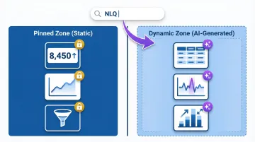
Design for Dynamic Content Population
Tools like Sylus let users generate entire dashboards or customize individual charts using plain English. Plan for where AI-generated content lands when a user submits a query:
- Reserve a flexible zone below or to the right of pinned KPIs
- Use consistent card dimensions for AI-generated charts
- Provide visual indicators when new content is being generated
Surface AI Anomaly Alerts and Summaries in Context
AI-driven anomaly detection can cut manual discovery timelines from 3-4 weeks to just 12 hours. But alerts only deliver value if users actually see them—and users won't hunt for a notification pane buried in a sidebar.
Best practice: Anomaly flags and AI-generated commentary should appear adjacent to the chart they reference, not in a separate notification pane users must hunt for.
Recommended layout patterns:
- Add a small icon or colored border on the chart itself, with a hover/click explanation
- Place an AI summary card directly below or beside the affected chart
- Skip sidebar alert feeds—they sever the connection between the alert and the visual it references
AI Summaries as TL;DR Blocks
Automated AI summaries (e.g., weekly performance narrative) work best when placed at the top of a dashboard as a "TL;DR" block—framing the data story before users dive into individual charts.
Example format:
AI Summary: Revenue grew 12% this month driven by enterprise accounts (+24%), while SMB segment declined 6% due to checkout friction. Recommend prioritizing page speed optimization.
Design for Auto-Generated and Static Content Coexistence
If AI-generated charts look visually different from manually built ones, users will doubt their accuracy. Establish these standards upfront so the origin of a chart is invisible:
- Same font scale and typography
- Same color palette (use your brand colors consistently)
- Same card dimensions and padding
- Same axis formatting and number notation
Visual consistency sets the foundation. The next step is deciding which parts of the layout stay fixed and which flex on demand.
Pinned zone (static, always visible):
- Core KPI tiles
- Primary trend charts
- Navigation and filters
Dynamic zone (AI-generated content populates here):
- Drill-down visuals
- Query results
- Anomaly detail panels
This model keeps the primary layout stable while accommodating AI's on-demand content generation.
Role-Based Layout Recommendations for BI Dashboards
The same dataset should power multiple layout templates tuned for different roles—not one "universal dashboard" that serves no one well.
Executive Layout: Summary-First, Drill-Down on Demand
Executives need answers in seconds, not exploration tools. The layout reflects that priority:
- Single screen showing 4-6 KPIs with trend indicators
- One headline chart (e.g., revenue trend)
- AI-generated summary narrative at top
- No drill-down clutter visible by default
- All detail accessed via click-through or conversational query
- Minimal scroll (everything above the fold)
Analyst Layout: Context-Rich with AI Exploration Tools
Analysts need density—and AI to help surface what they haven't thought to ask yet. This layout delivers both:
- Multiple chart rows grouped by theme (acquisition → engagement → revenue)
- NLQ bar prominent at top-center
- Anomaly flags visible inline
- Filter/segmentation controls accessible
- 6-8 charts organized into logical sections
- Drill-down paths clearly marked
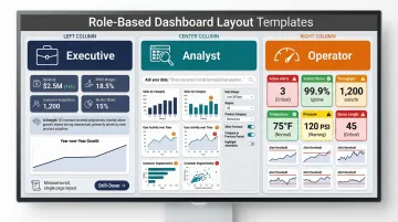
Operational Layout: Real-Time Metrics with Alert Priority
Operators need immediate visibility into system health and exceptions—not exploratory tools or dense chart rows:
- Real-time data tiles front and center
- Alert thresholds prominently configured
- Visual flags when metrics cross thresholds
- Large, readable numbers
- Color-coded status indicators (green/yellow/red)
- Simplified interface requiring minimal data fluency
The governance implication: Role-based layouts only work if the metric definitions underneath them are consistent. If "revenue" means different things to the analyst and executive dashboards, layouts become siloed rather than complementary.
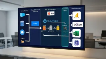
Grounding AI analysis in a shared semantic layer—such as dbt models—prevents this drift. Sylus grounds all analysis in dbt models and documentation, so metrics calculate consistently regardless of which role is querying them.
Common AI Dashboard Layout Mistakes to Avoid
Mistake 1: AI Overload
Adding every available AI feature — NLQ bar, anomaly alerts, predictive trend lines, auto-summaries, chatbot widget — to a single dashboard creates cognitive overload. Prioritize which AI features belong on which layout type:
- Executive dashboards: AI summaries only
- Analyst dashboards: NLQ bar + anomaly alerts
- Operational dashboards: Alert thresholds + real-time flags
Mistake 2: Ignoring Mobile and Embedded Contexts
The Mobile BI market is projected to reach $66.28 billion by 2031, and 81% of users now use embedded analytics. Layouts designed only for desktop fail in these contexts.
Mobile-first adjustments:
- Single-column flow
- Large tap targets (minimum 44x44px)
- Collapsed AI panels that expand on demand
- Simplified navigation
Embed-ready adjustments:
- Responsive width (adapts to container)
- Minimal navigation and toolbars
- Self-contained context (users may not have access to full platform)
Mistake 3: Skipping the Data Governance Layer
77% of IT decision-makers do not trust dashboard data, and even well-designed AI dashboards erode trust quickly when built on inconsistent or ungoverned data.
Establish a semantic layer (for example, dbt Semantic Layer, LookML, or AtScale) before investing heavily in AI layout customization. Routing generative AI queries through a semantic layer reduces data errors and hallucinations by up to two-thirds. No amount of layout polish compensates for metrics that don't match across reports.
Frequently Asked Questions
What is the best layout structure for a BI dashboard?
Use the three-tier layout: summary KPIs at top, trend context in the middle, operational detail at the bottom. Layer AI components intentionally into this structure: AI summaries as TL;DR blocks at the top, anomaly alerts adjacent to relevant charts, and NLQ bars prominent for analysts but secondary for executive views.
How does AI change traditional dashboard design principles?
AI introduces dynamic, on-demand content (generated charts, anomaly alerts, NLQ outputs) alongside static visuals, requiring layouts that accommodate both without losing visual hierarchy. The 5-second rule and 4-chart limit still apply, but you must now design flexible zones where AI-generated content can populate without disrupting the primary layout structure.
How many charts should a single BI dashboard display?
Strictly limit dashboards to 2-4 primary charts. Industry guidance (Tableau: 2-3 views; InterWorks: 4 worksheets) aligns with cognitive psychology research showing working memory holds only 4 chunks. AI auto-generation makes this limit harder to enforce, so set hard caps on auto-generated chart placement to prevent clutter.
What's the difference between a BI dashboard and an AI dashboard?
Traditional BI dashboards display pre-built, static visuals requiring manual configuration. AI dashboards generate visuals on demand via natural language queries, flag anomalies automatically with explanations, and respond conversationally to user questions. AI dashboards shift from passive reporting to proactive alerting and exploration.
How do I design dashboards for both executives and analysts using the same data?
Create role-based layout templates from the same governed data source. Executives get summary-first layouts (4-6 KPIs, one headline chart, AI summaries), while analysts get exploration-rich layouts (multiple chart rows, NLQ bar, anomaly flags, filter controls). Both pull from the same semantic layer so metrics stay consistent.
How do I maintain consistency in metrics across multiple AI-generated dashboards?
Implement a semantic layer (dbt models, LookML, or AtScale) so AI-generated dashboards calculate metrics identically regardless of who asks or where results appear. Define metrics centrally in code, version-control them, and route all AI queries through this layer to prevent metric inconsistency across teams.