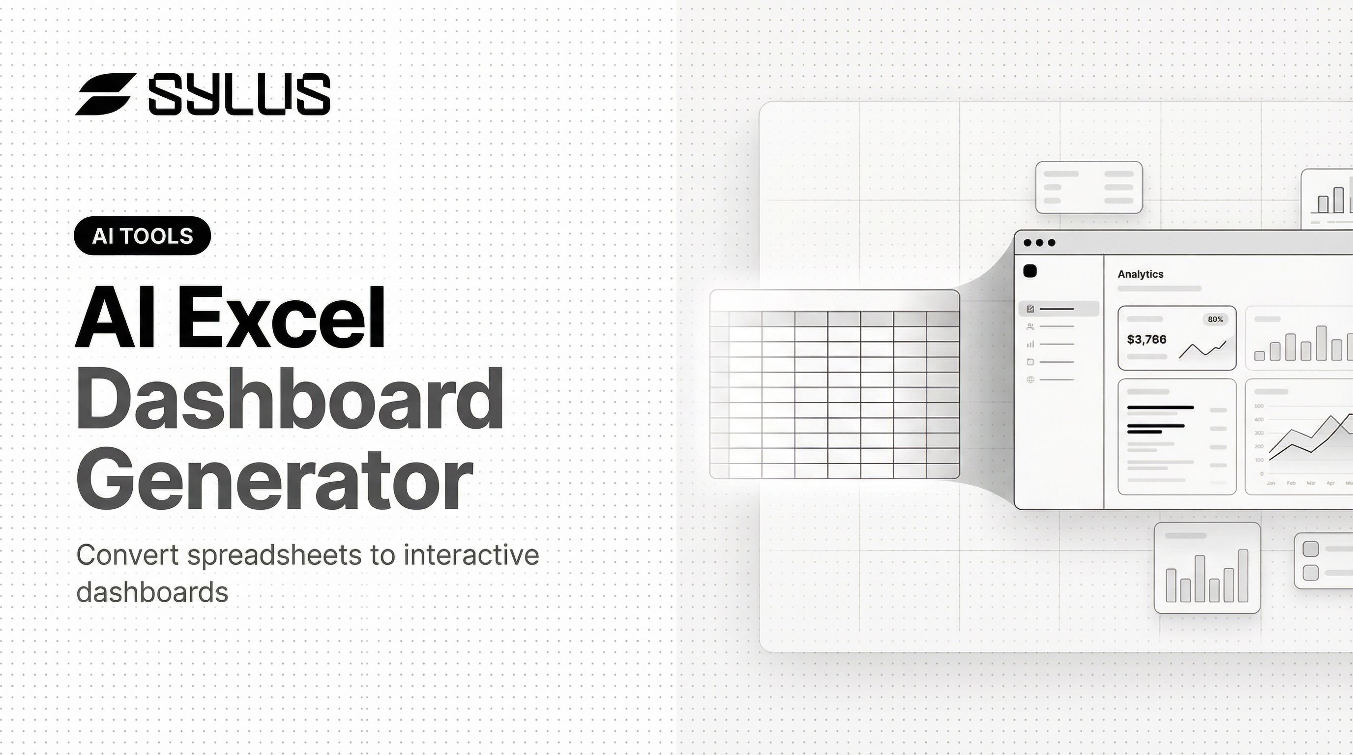
Introduction
Manually building dashboards in Excel can consume hours: configuring charts, wrestling with pivot tables, writing complex formulas, and fighting formatting inconsistencies. After all that effort, the result is often a static file that can't be shared easily, updated dynamically, or interacted with by stakeholders who need real-time insights.
For data professionals already spending 70% to 80% of their time finding, cleaning, and organizing data rather than analyzing it, manual dashboard creation compounds an unsustainable workflow.
This guide walks through the exact steps to convert a spreadsheet into an interactive AI dashboard, what your data needs to look like beforehand, which variables determine output quality, and the common mistakes that produce underwhelming results.
Key Takeaways
- AI dashboard generators analyze your spreadsheet structure and automatically select chart types, KPIs, and layout in 30–60 seconds—no formulas or coding required
- Clean headers, consistent formats, and properly formatted date columns directly improve AI output quality
- Results vary based on prompt specificity, column labeling, and dataset complexity
- AI dashboards work best for static or periodically updated data; live data streams and complex data models may require direct database connections
- Teams that need collaboration, scheduled reporting, and governed analysis can go further with platforms like Sylus—which supports natural language querying, team verification, and automated report delivery
How to Convert Your Excel Spreadsheet into an Interactive AI Dashboard
Step 1: Prepare and Clean Your Spreadsheet
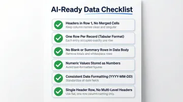
"Ready for AI" data follows specific structural rules. Each column should have a clear, descriptive header—"Monthly Revenue" rather than "Col_B" or "Value1." The AI uses these headers as the primary signal for understanding what each field represents, directly influencing which visualizations it proposes.
Structural requirements include:
- Headers in row 1 with no merged cells
- One row per record (tabular format)
- No blank rows mid-table or summary rows mixed into the data body
- Numeric values stored as numbers, not text
- Consistent date formatting throughout (YYYY-MM-DD or MM/DD/YYYY)
- No multi-level headers or commentary mixed with data
Most AI dashboard tools accept .xlsx, .xls, and .csv formats. Check file size and row count limitations before uploading—typical limits range from 100 MB to 1 GB depending on the platform. For reference, Zoho Analytics caps uploads at 1,000,000 rows or 100 MB, while Microsoft Power BI Pro allows up to 1 GB compressed per dataset.
Fix ambiguous column names and formatting inconsistencies before uploading—clean data produces a more relevant first output and fewer revision cycles downstream.
Step 2: Upload Your File to the AI Dashboard Tool
The upload process typically uses drag-and-drop or a file picker. Once uploaded, the AI scans each column's type—numeric, categorical, date—to build an internal model of your data's structure. If a numeric column is stored as text, the AI won't offer trend charts or aggregations. If date columns use inconsistent formats, time series analysis becomes unavailable. The cleaner the upload, the more relevant the initial output.
Step 3: Write a Specific Prompt
A vague prompt like "make dashboard" produces a generic output. A specific prompt such as "Create a sales dashboard showing monthly revenue trends by region, with a KPI card for total deals closed and a bar chart comparing product category performance" guides the AI toward a contextually relevant layout.
Effective prompt patterns include:
- Name the dashboard type: sales, financial, marketing, inventory, or operations
- Specify the metrics you need: revenue, conversion rate, customer acquisition cost, inventory turnover
- Request chart types that fit your story: line charts for trends, bar charts for comparisons, pie for composition
- Define filter dimensions: date range, region, product category, or sales rep
- Set visual preferences: light or dark mode, dense or minimal layout
The more specific your prompt, the fewer revision cycles you'll need.
Step 4: Review the Generated Dashboard and Iterate
Check that KPIs reflect the right metrics, chart types match the story your data tells, and filters function correctly.
Most AI tools support natural language revision commands, making iteration conversational rather than technical:
- "Add a pie chart for product category breakdown"
- "Change the color scheme to dark mode"
- "Show top 10 customers by revenue instead of all customers"
- "Add a filter for date range"
This iterative refinement process typically takes minutes, not hours. The AI adjusts the dashboard based on your feedback without requiring you to reconfigure charts manually.

Step 5: Share or Embed the Dashboard
Primary sharing options include:
- Public or password-protected URL for easy distribution
- Iframe embed for websites or internal tools
- PDF export for static reports
For teams needing ongoing collaboration and dashboard verification, platforms like Sylus extend beyond one-time sharing. Team members can query the same data using natural language, leave comments on specific metrics, and receive scheduled report summaries via email or Slack. The platform supports structured verification workflows where users can request metric validation from colleagues, with status tracking through stages like In Review, Verified, and Backlogged.
Some tools also allow exporting the underlying code to GitHub, providing full ownership and the ability to self-host.
What You Need Before You Upload
Preparation directly impacts output quality. The AI works only with what it receives—ambiguous or messy data forces it to make assumptions that produce incorrect visualizations.
Data Format and Structure Requirements
Your data must meet these structural standards:
- Tabular format: One row per record, headers in row 1
- No summary rows: Mixed into the data body
- Numeric values: Stored as numbers, not text (check with Excel filters)
- Consistent date formatting: YYYY-MM-DD or MM/DD/YYYY throughout the column
- Single header row: No multi-level headers or merged cells
Date columns require particular attention. Inconsistent formats prevent the AI from detecting time series patterns and generating trend charts automatically. If your date column contains "Jan 2024," "01/15/2024," and "2024-01-20" in different rows, the AI can't reliably parse temporal relationships.
These requirements follow Hadley Wickham's tidy data principles—each variable as a column, each observation as a row—which most AI dashboard tools expect by default.
File Size and Volume Considerations
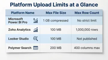
AI dashboard tools impose strict upload limits. Typical thresholds include:
| Platform | Max File Size | Max Row Count |
|---|---|---|
| Microsoft Power BI Pro | 1 GB (compressed) | No strict limit |
| Zoho Analytics | 100 MB | 1,000,000 rows |
| Looker Studio | 100 MB | Not published |
| Polymer Search | 200 MB | 400 columns max |
Once you hit these ceilings, flat-file exports become a bottleneck. Direct database connections bypass upload limits entirely and keep dashboards in sync with live data. Platforms like Sylus support this approach—connecting directly to your data sources so analysis stays accurate and maintainable without repeated file exports.
Key Factors That Shape Your Dashboard's Output Quality
Two people uploading the same dataset can get very different results based on how they configure their inputs. These variables matter most.
Column Header Clarity
The AI uses column headers as its primary signal for what each field represents. Generic names like "Value1" or "Data" give the model nothing to work with.
Descriptive headers — "Q3 Sales Revenue USD" or "Customer Acquisition Channel" — produce accurate chart labels, logical metric grouping, and KPI cards that reflect real business meaning. Vague headers force the AI to guess, which often results in mislabeled axes or unrelated data grouped together.
Prompt Specificity
The prompt is the AI's instruction set for design and layout decisions. A vague prompt produces something technically functional but contextually useless.
Prompts that specify dashboard type, desired metrics, grouping dimensions, and visual preferences dramatically cut revision cycles. Compare "make dashboard" with: "Create a financial dashboard showing quarterly revenue trends by product line, gross margin percentage as a KPI card, and operating expenses by department as a stacked bar chart." The second version gives the AI enough direction to get it right on the first pass.
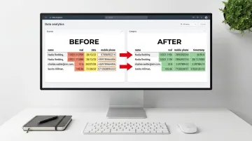
Data Completeness and Consistency
Missing values, inconsistent category labels (for example, "US," "U.S.," and "United States" in the same column), and mixed data types confuse the AI's pattern recognition before it even starts building.
The result: duplicate categories in charts, incorrect aggregations, or visualizations that silently drop large portions of your data. Poor data quality costs organizations an average of $12.9 million annually, and 85% of organizations report that low-quality contact data directly disrupts operational processes. Those errors carry through every chart, metric, and report the AI produces.
Dataset Size and Complexity
Very wide datasets or deeply nested relationships between tables push past what a static Excel upload can handle reliably.
For multi-table datasets or data that refreshes continuously, a direct database or data warehouse connection delivers more accurate and maintainable dashboards. Platforms like Sylus ground all analysis in dbt models and dbt documentation, providing governed context. That means multi-table relationships, transformation logic, and business definitions stay consistent across every dashboard and query — not just the one you built today.
Common Mistakes and How to Fix Them
Most dashboard generation failures trace back to one of three preparation mistakes. Catching them before you upload saves significant rework.
Unstructured or Semi-Structured Spreadsheets
Merged cells, multi-level headers, and data mixed with commentary all break AI parsing. The generator can't reliably map your data if the structure is inconsistent.
Fix: Restructure to a flat, single-header table before uploading. Remove summary rows and ensure every column has exactly one header in row 1.
Overly Generic Prompts
Vague prompts produce generic dashboards. Accepting the first output without iteration compounds the problem.
Fix: Include the dashboard type, key metrics, desired groupings, and formatting preferences in your initial prompt. Then iterate with follow-up prompts for specific revisions.
Data Type Mismatches
Numeric values stored as text or dates formatted inconsistently cause calculation errors and broken chart axes — often silently.
Fix: Audit the spreadsheet in Excel first. Use column filters to check data types, resolve inconsistencies, and confirm numeric columns contain only numbers before uploading.
When AI Dashboard Generators Are the Right Choice (and When They Aren't)
AI dashboard generators excel in specific scenarios:
- One-off reporting projects where you need a shareable dashboard quickly
- Rapid prototyping to present to stakeholders before investing in full BI implementation
- Business users without BI tool expertise who need insights without learning Power BI or Tableau
- Teams needing shareable links instead of file attachments that become outdated immediately
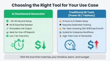
Manual dashboard creation in traditional BI tools takes 8 hours to 6 weeks, while AI-native tools generate baseline interactive dashboards in 30 to 60 seconds. For rapid, one-time visualization needs, this time savings compounds fast on deadline-driven projects.
However, simple AI Excel uploaders hit their limits when:
- Data needs to update in real time from live transactional systems
- Analysis must be grounded in business-specific logic such as dbt models and company metric definitions
- Enterprise compliance requirements (SOC 2 Type II, HIPAA) govern how data is processed and stored
- Multiple data sources need to be joined and analyzed together
- Ongoing collaboration requires team members to verify metrics, leave comments, and iterate on analysis
When those limitations start surfacing, the tool choice shifts from "fast visualizer" to something built for governed, multi-source analysis. Platforms like Sylus are designed for that layer — covering ad hoc questions through scheduled reports, with:
- Unlimited seats with usage-based pricing
- Governed dbt context that grounds analysis in company metric definitions
- Team verification workflows for checking and iterating on results
- Native Slack integration for querying data and receiving reports without leaving team channels
Frequently Asked Questions
Which AI tool creates dashboards?
Options fall into three categories: dedicated AI dashboard generators (Zoho Analytics, Polymer Search), BI platforms with AI features (Power BI, Tableau), and AI analytics platforms (Sylus). The right choice depends on whether you need a quick one-time visualization or an ongoing workflow with team collaboration and scheduled reporting.
Can ChatGPT make dashboards?
ChatGPT can generate dashboard code (Python or HTML/JavaScript) or describe a layout, but it does not natively produce deployed, interactive dashboards from an Excel file upload. Dedicated AI dashboard tools manage the entire process — from file upload to a deployed, shareable dashboard.
What file formats can AI dashboard generators accept?
Most tools support .xlsx, .xls, and .csv formats. More advanced platforms support direct database connections, API data sources, and cloud storage integrations—eliminating the need to export data to Excel first.
How long does it take to create an AI dashboard from Excel?
Most tools generate and deploy a dashboard in 30–60 seconds for a standard dataset. More complex files with many columns or relationships take slightly longer.
Is my data secure when uploading to an AI dashboard generator?
Look for SOC 2 Type II and HIPAA compliance, private or password-protected dashboards, and a clear policy against using customer data to train AI models. Sylus meets all three — SOC 2 Type II and HIPAA compliant, with neither Sylus nor its model partners training on customer data.
How is an AI dashboard generator different from Power BI or Tableau?
AI generators use a zero-setup, natural language approach: upload → prompt → live dashboard in seconds. Traditional BI platforms like Power BI ($14–$24/user/month) and Tableau ($42–$115/user/month) require learning curves, manual configuration, and per-seat licensing costs.