Introduction
Modern data teams face a familiar problem: business data is scattered across dozens of tools, and generating meaningful reports consumes hours of manual work. By the time insights surface, decisions have already been made.
The cost is measurable. According to a 2026 West Monroe study, slow decision-making costs U.S. companies up to 5% of annual revenue—a "slowness tax" tied directly to data fragmentation. Meanwhile, data engineers spend 40-61% of their time fixing data issues rather than delivering the analysis that drives decisions.
Web dashboards solve this by consolidating data from multiple sources into a single, browser-accessible interface that updates in real time. This guide covers what web dashboards are, the main types, how to design and build one, and where AI-powered tools are making the process faster and less dependent on engineering resources.
Key Takeaways
- Web dashboards consolidate data from multiple sources into browser-based visualizations, enabling faster decisions without local software installation
- Four main types cover distinct needs: operational, analytical, strategic, and tactical dashboards
- Effective dashboards combine clear KPIs, appropriate chart types, interactive filters, and live data connections
- Good design respects cognitive limits — cap primary metrics at 4-6 and structure views for your specific audience
- Platforms like Sylus generate complete dashboards from plain English descriptions, no SQL or manual design required
What Is a Web Dashboard?
A web dashboard is a browser-accessible data interface that pulls information from one or more sources and presents it through charts, graphs, scorecards, and tables in a single, unified view. Data visualization expert Stephen Few defines it as "a visual display of the most important information needed to achieve one or more objectives; consolidated and arranged on a single screen so the information can be monitored at a glance".
Unlike static reports, web dashboards are interactive and refresh in near-real-time. Users can filter, drill down, and explore data rather than reading a fixed document. Anyone with the right permissions can access them through a browser—no local installation required.
When Your Organization Needs a Dashboard
Several scenarios signal it's time to implement a web dashboard:
- Teams copy-paste numbers from multiple tools into spreadsheets weekly
- Stakeholders wait days for reports that answer basic questions
- No single source of truth exists for performance metrics
- Decision-makers can't see current data without requesting custom reports
Types of Web Dashboards
Different audiences need different dashboard types. Stephen Few and industry analysts categorize dashboards into three primary roles, each serving distinct purposes:
| Dashboard Type | Primary Audience | Update Cadence | Key Characteristics |
|---|---|---|---|
| Operational | Front-line teams, operations managers | Real-time to sub-minute | Simple displays, immediate alerts, highly dynamic for time-sensitive tasks (e.g., server monitoring, support ticket queues) |
| Analytical | Analysts, line managers | Hourly to daily | Rich context, historical comparisons, highly interactive with drill-downs and filters to explore causes |
| Strategic (Executive) | C-Suite, executives | Daily to monthly | High-level KPIs, static snapshots, minimal interactivity, focuses on long-term health and forecasting |
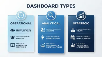
Each type has a distinct design logic — here's what separates them in practice.
Operational Dashboards
Designed for real-time or near-real-time monitoring of day-to-day processes. Examples include support ticket queues, live sales pipelines, system uptime monitors, and fraud detection alerts. The audience needs to act within seconds or minutes, so visual cues — color-coded alerts, threshold indicators — matter more than historical context.
Analytical Dashboards
Designed for investigating historical trends, patterns, and root causes. Analysts and data teams use these to slice data by multiple dimensions, test hypotheses, and surface insights that aren't visible in daily snapshots. A marketing analyst tracking campaign attribution across six months is a typical use case.
Strategic (Executive) Dashboards
High-level summaries of business health using top-line KPIs: revenue, growth rate, churn, Net Promoter Score. Designed for leadership who need the big picture without granular detail. Updated daily or weekly — real-time feeds here create noise, not clarity.
Misaligning dashboard type with audience is one of the most common reasons dashboards go unused. Match the format to how the viewer actually makes decisions.
Key Components of an Effective Web Dashboard
Charts and Data Visualizations
The choice of chart type should match the data story you're telling. Human visual perception processes linear position and length far more accurately than two-dimensional areas and angles, which is why bar charts and line graphs vastly outperform pie charts and bubble charts for business decisions.
Chart selection guide:
| Chart Type | Best Used For |
|---|---|
| Line charts | Trends over time, performance tracking across periods |
| Bar charts | Categorical comparisons, ranking items by value |
| Scatter plots | Correlation between two variables, identifying outliers |
| Pie/donut charts | Simple composition of 3-4 parts maximum — use sparingly |
Edward Tufte's "data-ink ratio" principle is the practical test: every pixel should earn its place. Avoid 3D effects, excessive gridlines, and decorative chartjunk that obscures meaning.
KPI Scorecards and Summary Metrics
Every dashboard needs a headline layer — single-number cards showing the most critical metrics at a glance, with period-over-period change indicators. These give users an instant health check: Is revenue up or down? Are conversions improving? Has customer satisfaction changed?
Place these scorecards at the top of the dashboard where they're immediately visible. Users should be able to assess overall health within three seconds of landing on the page.
Interactive Filters and Controls
Date range pickers, dropdown segment filters, and search inputs let users personalize their view without needing a new dashboard built for every question. Without filters, dashboards become static and lose much of their value.
Common filter types:
- Date ranges (last 7 days, last month, custom range)
- Geographic segments (region, country, city)
- Product categories or SKUs
- Customer segments or cohorts
- Sales representatives or teams
Live Data Source Connections
That "static" problem often comes down to data freshness. Dashboards that pull from a live database or API are always current; those running on cached or manually refreshed exports can lag by hours. Forrester defines real-time data as data made available immediately to support workloads, but acceptable latency is highly use-case specific.
Data freshness requirements by dashboard type:
- Operational dashboards: Sub-60-second latency for non-mission-critical; under 2 seconds for mission-critical (fraud detection, patient monitoring)
- Analytical dashboards: 10-15 minutes typical; batch processing acceptable
- Strategic dashboards: Daily batch updates usually sufficient

Pin down your freshness requirements before choosing a tool. Real-time pipelines carry higher infrastructure and maintenance costs — worth it for operational use cases, often overkill for strategic reporting.
Navigation and Layout Structure
The placement of components matters as much as the components themselves. A few layout principles hold across nearly every effective dashboard:
- Put the most critical metrics top-left, where eyes naturally start scanning
- Group related metrics by theme or workflow, not by data source
- Label every number clearly — users should never have to guess what a figure means or where it came from
Web Dashboard Design Best Practices
Establish a Clear Visual Hierarchy
Guide the reader's eye from the most critical information to supporting detail. Use size, weight, and whitespace deliberately to communicate what matters most at each level of the dashboard. Large, bold numbers for primary KPIs. Smaller supporting charts below. Detailed tables at the bottom for drill-down.
Limit the Number of Metrics Per View
Human working memory has limits. While dashboard design historically relied on George Miller's 1956 "7±2" rule, modern cognitive psychology proves the actual capacity limit is about 4 chunks of information when information isn't grouped or rehearsed.
Guideline: Restrict individual dashboard views to 4-6 primary KPIs on a single, non-scrolling screen. A focused dashboard with five meaningful metrics outperforms a crowded one with thirty. Scroll breaks context — users can no longer compare data side by side.
Match Design to the Audience
An executive dashboard should prioritize simplicity and trend direction—up or down, green or red. An analyst dashboard can support more density and interactivity because analysts expect to spend time exploring.
Example: A CEO needs to see "Revenue: $2.4M, ↑12% vs. last month" at a glance. A marketing analyst needs to see revenue broken down by channel, campaign, geography, and time period with filters to test hypotheses. Design decisions that work well for one audience will frustrate the other.
Use Consistent, Accessible Color
Color should encode meaning (red for below target, green for on track), not decorate. Approximately 1 in 12 men (8%) and 1 in 200 women have color vision deficiency, yet many enterprise dashboards still rely exclusively on red/green indicators.
Accessibility requirements:
- Follow WCAG 2.1 standards requiring 3:1 contrast for UI components like chart lines and graph elements
- Use redundant encodings: combine color with shapes, icons, or text labels
- Never rely on color alone to convey critical information
Design for Responsiveness
Web dashboards are increasingly accessed on mobile devices and tablets. Practical implications include:
- Collapsible panels to reduce visual clutter on smaller screens
- Readable font sizes (minimum 14px on mobile)
- Touch-friendly filter controls with adequate tap targets
Test across multiple screen sizes before launch — what looks clean on a 27-inch monitor often breaks on a tablet.
How to Build a Web Dashboard
Step 1: Define Your Goal and Audience
Before opening any tool, write down the one or two decisions this dashboard is supposed to support and who will use it. This scoping step prevents the most common failure mode: dashboards built without a clear purpose that no one uses after launch.
Questions to answer:
- What specific decision will this dashboard inform?
- Who needs to see this data, and how often?
- What action should users take after viewing it?
Step 2: Identify and Connect Your Data Sources
List the systems that hold the data you need: CRM, database, data warehouse, marketing platform, ERP system. Determine whether they can be connected via native integration, API, or a data connector.
Data quality issues surface at this stage and must be resolved before building visualizations. Check for missing values, inconsistent naming conventions, duplicate records, and mismatched date formats.
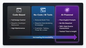
Step 3: Choose Your Dashboard Tool
Three main categories exist:
Code-based tools : Custom-built dashboards using frameworks like D3.js or Plotly give complete control over design and logic, but require dedicated developer resources and ongoing maintenance.
No-code/BI tools : Platforms like Tableau, Power BI, and Looker offer drag-and-drop interfaces that reduce build time significantly. They still require solid understanding of data modeling and chart design to use well.
AI-powered platforms: Tools like Sylus let data teams and business users generate dashboards by describing what they need in plain English — connecting directly to 500+ data sources, including dbt models, without writing SQL or manually designing layouts. Gartner predicts that by 2027, 75% of new analytics content will be contextualized via GenAI, meaning AI tools will handle more of the analysis work while users focus on decisions.
Step 4: Build and Test Your Visualizations
Once your tool is configured and connected to clean data, start with the highest-priority KPIs, add filters, and test with a sample of the intended audience before a full rollout. Specifically test that:
- Data refreshes correctly at the expected cadence
- Filters work as expected and don't break visualizations
- Edge cases (zero values, nulls, missing data) display sensibly
- The dashboard loads quickly even with large datasets
Step 5: Publish and Iterate
A dashboard is never truly finished. Set a review cadence (monthly is common) to assess whether the metrics being tracked still align with current business goals. Retire or update panels that are no longer relevant. BARC research indicates that only 25% of employees actively use BI tools—low adoption often signals dashboards that don't match user needs.
How to Share and Collaborate on Web Dashboards
Sharing Methods
Effective dashboards need to reach the people who act on them. Main options include:
Shareable link: Generate a view-only or interactive URL that anyone with the link can access. Fastest method for broad distribution.
Email invitation with role-based access: Invite specific users and assign permissions (full access, edit, view-only). Provides granular control over who can modify dashboards versus simply consume them.
Embedding: Insert dashboards directly into internal tools, websites, or products using an iframe or embed code. Ideal for customer-facing analytics or embedding live data directly into product pages.
The right sharing method depends on whether recipients need to interact with the data or simply consume it. Once sharing is set up, the next question is who should see what—and how tightly that access is controlled.
Security and Access Controls
When dashboards contain sensitive business, financial, or health-related data, authentication requirements and role-based permissions determine who can view, edit, or export that data. For regulated industries, compliance with SOC 2 Type II and HIPAA sets the baseline.
SOC 2 Type I vs. Type II: A Type 1 report evaluates control design at a specific point in time, while a Type 2 report evaluates operating effectiveness over 3-12 months. Enterprise buyers prefer Type II because it proves vendors actually follow security policies over time.
HIPAA for Cloud BI: HHS.gov guidance stipulates that when a covered entity uses a cloud service provider to create, receive, maintain, or transmit electronic protected health information (ePHI), the provider is legally a "business associate" and must sign a Business Associate Agreement (BAA).
For teams where both standards apply, Sylus is SOC 2 Type II and HIPAA compliant, with self-hosted deployment available so data stays within the organization's own infrastructure.
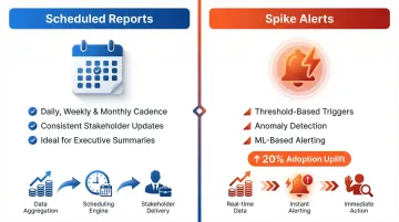
Alerts and Scheduled Reports
Proactive delivery—automated email or Slack summaries sent on a schedule or triggered by a metric crossing a threshold—removes the need for stakeholders to check in manually.
Scheduled reports: Regular cadence delivery (daily, weekly, monthly) ensures stakeholders receive updates consistently. Ideal for executive summaries and recurring performance reviews.
Spike alerts: Threshold-based notifications triggered when metrics cross predefined limits or show anomalous patterns. Forrester notes that ML-based alerting can drive a 20% adoption uplift among business users by pushing critical insights directly into workflows rather than requiring users to hunt for outliers.
Frequently Asked Questions
What is a web dashboard?
A web dashboard is a browser-based interface that consolidates data from multiple sources into interactive visualizations and metrics. It provides at-a-glance monitoring of key business information without requiring local software installation.
What are the main types of web dashboards?
The three main types are operational (real-time monitoring for front-line teams), analytical (trend exploration with rich interactivity for analysts), and strategic/executive (top-line KPI summaries for leadership).
What are the key components of a web dashboard?
Every effective web dashboard relies on a few core components:
- KPI scorecards — critical metrics visible at a glance
- Data visualizations — charts matched to the analytical question being asked
- Interactive filters — let users slice data for personalized views
- Live data connections — keep information current for the decisions being made
- Clear navigation — guides users to the right information without friction
What makes a web dashboard effective?
Effective dashboards focus on 4-6 primary metrics per view, match design complexity to the audience's needs, establish clear visual hierarchy using size and whitespace, and refresh data at the right cadence for the decisions being made. The best ones feel obvious to use — and leave no doubt about what to do next.
How is an AI-powered web dashboard different from a traditional one?
AI-powered dashboards allow users to generate visualizations and complete dashboards through plain English prompts rather than manual chart configuration or SQL queries. This cuts time to insight—from hours or days to seconds—and makes dashboard creation accessible to business users without technical skills. Sylus, for example, lets teams query their data and generate full dashboards in plain English, without writing a single line of SQL.
Can web dashboards be embedded in other products or websites?
Yes, most modern dashboard tools support embedding via iframe or embed code. This allows dashboards to be surfaced inside internal tools, customer portals, or public-facing websites, bringing analytics directly into existing workflows rather than requiring users to switch contexts.