
Introduction
Excel's line graph is one of the most widely used tools for tracking trends—and its real power shows when you plot multiple data series side by side to compare performance, growth, or patterns across categories. With over 1.2 billion users globally, Excel remains the dominant standard for business charting and data visualization.
Adding a second or third line seems simple — until it isn't. Results depend heavily on how data is structured and how series are defined, and poorly set up multi-series charts are one of the most common Excel frustrations.
Users frequently run into issues like the "Select Data Source" dialog blanking out or Excel plotting only one line when multiple columns are selected.
This guide walks through the exact steps to get it right — including setup, formatting, and the mistakes most users don't catch until something looks off.
Key Takeaways
- Organize data with each series in its own column and a shared X-axis column (dates or categories) on the left
- Select the full data range including headers, then go to Insert > Charts > Line to generate the chart in one click
- Use "Select Data Source" to add, edit, or reorder series if Excel doesn't detect them correctly
- If series have very different value scales, add a secondary Y-axis to keep both lines readable
- Cap charts at 4–5 lines and differentiate each with color, markers, and a clear legend to avoid visual clutter
How to Plot Multiple Series in a Line Graph in Excel
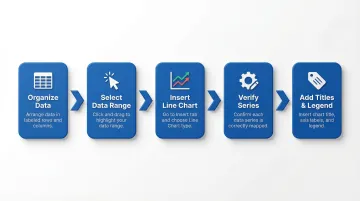
Follow these five steps to build a multi-series line chart in Excel. Step 4 covers pulling series from multiple sheets if your data isn't all on one worksheet.
Step 1: Organize Your Data
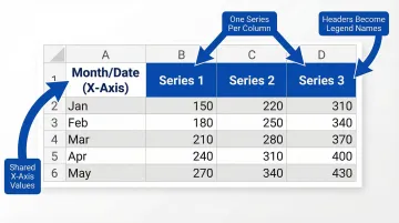
Structure data in a table with the first column holding the X-axis values (dates, time periods, or categories) and each subsequent column representing one data series. Column headers in Row 1 will become the series names in the legend.
Critical requirements:
- All series must share the same number of rows
- X-axis values must be consistent across all series
- Mismatched or missing entries will cause lines to break or plot incorrectly
Example structure:
| Month | Product A | Product B | Product C |
|---|---|---|---|
| Jan | 5000 | 3200 | 4100 |
| Feb | 5500 | 3800 | 4300 |
| Mar | 6200 | 4100 | 4600 |
Step 2: Select Your Data Range
Click and drag to select the entire data table including headers. For non-adjacent columns, hold Ctrl and select each range separately.
Common selection errors to avoid:
- Excluding the header row (series names won't appear in the legend)
- Omitting the category column (X-axis labels will be missing or incorrect)
Step 3: Insert the Line Chart
Go to the Insert tab, click the Charts group, and select Line or Line with Markers. For time-based data, "Line with Smooth Lines" is an option, but it can obscure sharp changes in the data.
Excel will auto-generate the chart and attempt to detect which column is the X-axis and which are data series. Confirm this is correct before moving on.
Step 4: Verify and Edit Series Assignments
Right-click the chart and choose Select Data (or go to Chart Design > Select Data) to open the Select Data Source dialog. Here you can confirm which columns are plotted as series and which defines the horizontal axis labels.
To add a series from a different sheet:
- Click Add in the Legend Entries panel
- Click the Collapse Dialog icon next to "Series values"
- Navigate to the other sheet tab and select the data range
- Click Expand Dialog and OK
Additional series management:
- Use the Up/Down arrows to reorder series
- Click Edit to rename them
- Click Remove to delete any incorrectly auto-added series
Step 5: Add Titles, Legend, and Axis Labels
Click the green "+" Chart Elements button that appears when the chart is selected. Check boxes for Chart Title, Axis Titles, and Legend to add them. Double-click any element to edit the text directly.
Legend placement tip: With 3 or more series, position the legend to the right or bottom of the chart to prevent it from overlapping the plot area. Right-click the legend and choose Format Legend to adjust its position.
When Should You Use a Multi-Series Line Graph in Excel?
If you're deciding between chart types, a multi-series line graph works best when you need to compare how two or more related variables change across the same continuous X-axis. Common examples include monthly revenue by product line, weekly website traffic by channel, or quarterly performance across departments.
Avoid this chart type when:
- Data series are not logically comparable
- Categories are not sequential or continuous (a bar chart is better)
- You have so many series (6+) that the chart becomes unreadable—in those cases, consider small multiples or a different chart type
- You have so many series (6+) that the chart becomes unreadable—consider small multiples or a different chart type instead
- You're showing part-to-whole relationships—a stacked area chart or pie chart communicates composition better
Key Formatting Tips to Make Your Multi-Series Line Chart Readable
A technically correct multi-series chart can still fail to communicate if it isn't formatted for clarity.
Color and Line Style Differentiation
Assign each series a distinct, high-contrast color. WCAG 2.1 Success Criterion 1.4.1 mandates that charts cannot rely solely on color for differentiation.
- Supplement with different line styles (solid, dashed, dotted)
- Add data point markers (dots, squares, triangles)
- Ensure charts are readable in black-and-white printouts
- Maintain a 3:1 contrast ratio between adjacent colors
Secondary Y-Axis for Mismatched Scales
Color alone won't save a chart where one line hugs the bottom because its scale is dwarfed by another series. When two series have very different value ranges — revenue in millions vs. unit count in hundreds, for example — right-click the smaller series line, select Format Data Series, and choose Secondary Axis. This keeps both lines visible and readable instead of one flattening into near-invisibility.
Data Labels and Markers
Add data labels only to the most important series or key inflection points. Labeling every data point creates visual noise that makes the chart harder to read, not easier.
Chart and Axis Titles
Always include a descriptive chart title that states what is being compared and over what time period. Label both Y-axes if a secondary axis is present, and format the X-axis dates so they display at readable intervals (right-click X-axis > Format Axis > set interval unit).
Gridlines and Plot Area Clean-Up
Data visualization experts emphasize maximizing the "data-ink ratio" by removing or lightening major gridlines. Heavy gridlines compete with your data lines for attention — and the gridlines always lose that fight, taking your reader's focus with them.
- Remove minor gridlines entirely
- Set major horizontal gridlines to light gray (right-click > Format Gridlines)
- Delete the chart border
- Reduce chart padding to give data more visual space
Common Mistakes When Plotting Multiple Series in Excel
These three errors account for most multi-series charts that confuse rather than communicate:
- Too many lines: Most readers can't track more than 3–5 intersecting lines at once. If you have more than 4–5 series, split into separate charts or use a filter to show one series at a time.
- Misaligned X-axis data: Different date formats, blank cells, or uneven row counts across series columns cause Excel to plot missing or incorrect data points. Audit your source data before building the chart.
- Default series names: "Series 1" and "Series 2" tell readers nothing. Rename each series via the column header or the Series Name field in the Select Data dialog before sharing.
Beyond Excel: Faster Ways to Visualize Multiple Data Series
Excel's manual workflow (organizing data, inserting the chart, editing series, and formatting) works well for one-off analysis. It becomes time-consuming when you need to update charts regularly, share them across a team, or explore data from multiple sources simultaneously.
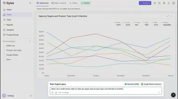
AI-powered analytics tools like Sylus let data teams connect their data sources and generate multi-series charts by asking a question in plain English — no manual range selection or formatting required. A user can type "@sylus show me my top customers" and receive instant visualizations with multi-series bar charts showing metrics like Average Order Value across different customer segments.
The resulting dashboards are shareable via link or embeddable directly into products, which makes them practical for ongoing reporting rather than one-time exports.
What that looks like in practice:
- Connect 500+ data sources including databases, CRMs, and cloud data warehouses
- Generate charts through conversational queries without manual setup
- Schedule reports and AI-generated summaries to email or Slack
- Query data directly from Slack and receive instant visualizations
- Share dashboards via link, email invitation, or embedded in websites
- Unlimited seats—pricing based on estimated usage, not headcount
For teams pulling data from databases, CRMs, or cloud warehouses rather than flat Excel files, building charts in a connected analytics layer eliminates the error-prone export/import step entirely. This matters most when data freshness is critical and manual hand-offs aren't an option.
Sylus is SOC 2 Type II and HIPAA compliant, with self-hosted deployment available for organizations that require air-gapped environments.
Frequently Asked Questions
Why is my Excel line graph only showing one line when I selected multiple columns?
Excel automatically plots the larger dimension (rows vs. columns) on the horizontal axis. If your data is plotted incorrectly, click anywhere in the chart, navigate to the Design tab, and click Switch Row/Column to instantly correct the axis assignment.
How do I add a second Y-axis to a multi-series line graph in Excel?
Right-click the target data series line, select Format Data Series, then choose Secondary Axis under Series Options. This is recommended when two series have very different value scales, preventing one line from appearing nearly flat.
How do I add a new data series to an existing Excel line chart?
Right-click the chart and select Select Data, then click Add in the Legend Entries panel. Alternatively, if the new series is adjacent to existing data, simply expand the data selection range by dragging the blue border around your chart's source data.
Can I plot multiple series from different sheets in a single Excel line chart?
Yes, use the Select Data Source dialog, click Add, and use the Collapse Dialog button to navigate to another sheet and select that series' data range. Excel will automatically write the correct 3-D reference syntax (e.g., Sheet2!$A$1:$A$10).
How many data series can I realistically plot on one Excel line chart?
Excel supports up to 255 data series, but readability degrades noticeably beyond 4–5. Past that threshold, try one of these approaches:
- Differentiate with distinct colors and markers
- Use small multiples (separate panels per line)
- Split into individual charts
How do I change the color of a specific line in my Excel multi-series chart?
Click once on the chart to select it, then click the specific line you want to recolor. Right-click and choose Format Data Series, then select a new fill/line color under the paint bucket icon. You can also access this via the Shape Format tab by selecting Shape Outline.