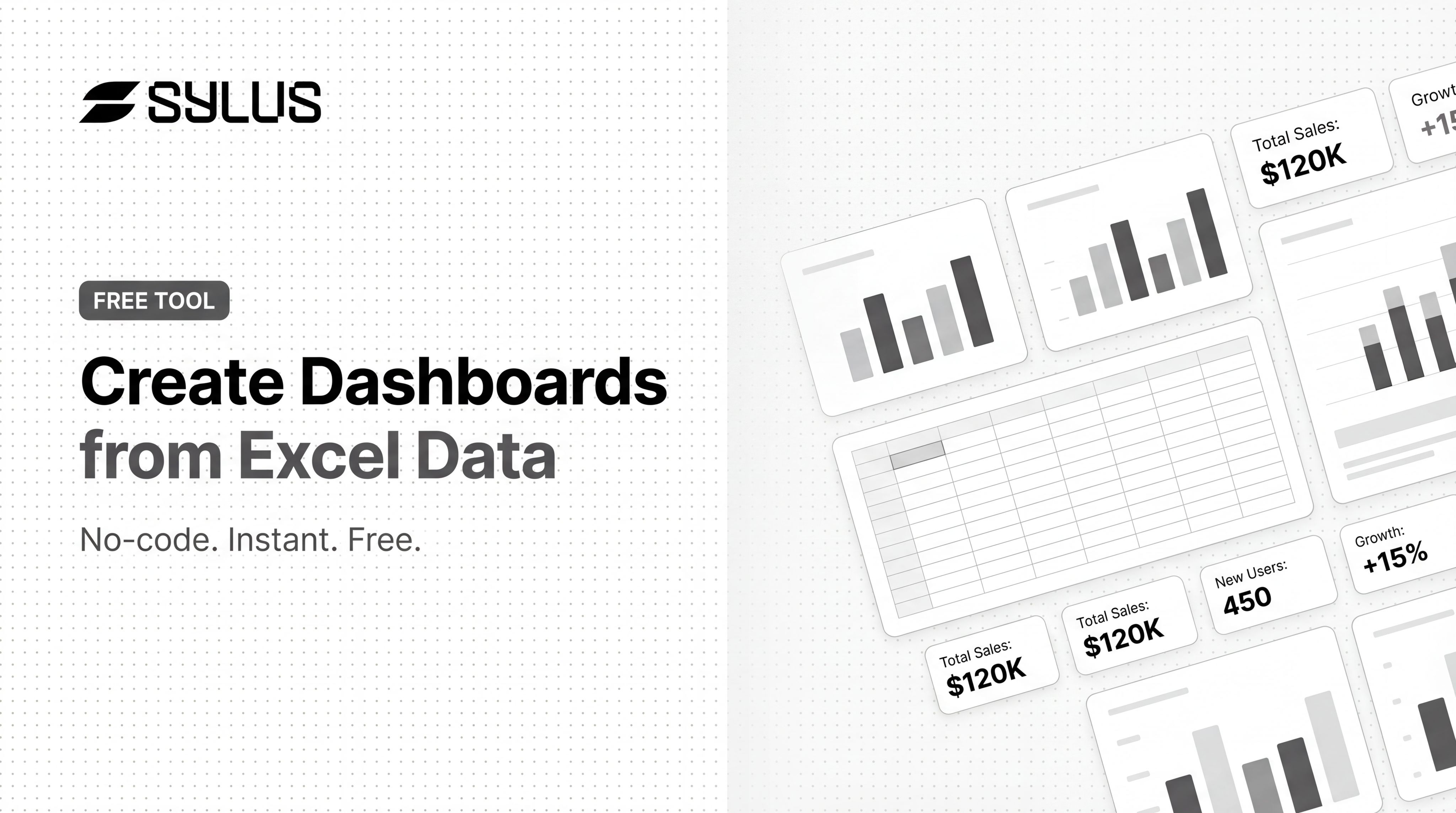
Introduction
Most business data lives in Excel — but getting from a raw spreadsheet to a shareable visual dashboard typically means hours of formatting, manual cleanup, or paying for BI tools most teams can't justify. According to a 2025 survey by Alteryx, 76% of data analysts still rely on spreadsheets for data preparation, yet nearly half spend over six hours per week on data cleansing before they can build a single visualization.
That manual wrangling consumes roughly 45% of data professionals' time. Poor data quality alone costs organizations an average of $12.9 million annually.
Dashboard builders make the process faster — but uploading an Excel file doesn't guarantee a usable result. Output quality depends on your data structure, the tool you choose, and how clearly you define what you need. Mismatched date formats, ambiguous column headers, and vague requirements produce dashboards that misrepresent data or need rebuilding from scratch.
This guide covers the exact steps to build a dashboard from Excel data, what to prepare before you start, the parameters that affect output quality, and the most common mistakes to avoid.
Key Takeaways
- Clean headers, consistent data types, and a date column give dashboard tools the best chance of producing accurate results
- Most tools require no coding — upload a file, describe what you want, and a dashboard generates in under a minute
- Results vary widely based on data cleanliness, prompt specificity, and visualization settings
- File size limits, row caps, and watermarks are common restrictions on entry-level tiers
- For teams needing shareable, auto-updated dashboards, tools like Sylus connect directly to your data sources and remove manual rebuild cycles
How to Build a Dashboard from Excel Data
The process has five key stages. Skipping any one of them leads to dashboards that misrepresent data or require significant rework.
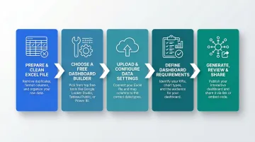
Step 1: Prepare and Clean Your Excel File
Ensure column headers are descriptive. Use names like "Monthly Revenue" instead of "Col_A"—AI and BI tools use headers to auto-detect field types and label charts. Ambiguous names like "Q1" or "Value" produce mislabeled charts.
Remove structural problems that break parsers:
- Blank rows between data
- Merged cells in headers or data
- Multi-header structures (two header rows)
- Summary rows embedded mid-sheet
These break most dashboard parsers and cause column type misdetection. Microsoft documentation confirms that Excel tables must have a single header row to enable filtering and sorting, which is critical for BI tools to identify column names correctly.
Standardize date formats. Use ISO 8601 format (YYYY-MM-DD) to guarantee unambiguous parsing across platforms. The ISO 8601 standard tackles uncertainty by setting out an internationally agreed way to represent dates. Mismatched regional settings (US MM/DD/YYYY vs. European DD/MM/YYYY) are a primary cause of dashboard failure. Looker Studio documentation explicitly states the platform works best when date fields are stored in ISO 8601 format before importing.
Ensure numeric columns contain only numbers. Remove currency symbols, percentage signs, and mixed text. All cells within a specific column should be of the same data type to prevent parsing errors during import.
Step 2: Choose a Dashboard Builder
Three main options exist, each with different capability ceilings and time investments:
Excel-native (Pivot Tables + Charts): Best for simple internal reports. Excel's Data Model supports up to 1,999,999,997 rows in a table, but workbooks are limited to 2 GB when shared via SharePoint or 250 MB via Excel for the web. Requires manual chart configuration and lacks modern web sharing.
Dedicated BI tools (Power BI Desktop, Looker Studio): Power BI Desktop is fully functional for authoring at no cost. However, users on the base tier cannot securely share reports with colleagues unless content is hosted in a paid Premium capacity or they upgrade to Pro licenses ($14/user/month). Looker Studio offers 800+ connectors and web sharing but does not scale well with large volumes of data and many charts.
AI-powered dashboard builders: Tools like Sylus let you connect your data and describe what you want in plain English—generating a complete, modern dashboard without any formula or chart configuration. Connected data sources are converted into interactive dashboards automatically, with no manual chart setup required.
Tier constraints to check before committing:
| Tool | Max File/Upload Size | Row Limits | Secure Sharing | Public Access Required |
|---|---|---|---|---|
| Power BI Desktop | 1 GB per dataset | 1,999,999,997 | No (requires Pro) | Optional (Publish to web) |
| Looker Studio | 100 MB per file | 50,000 rows (table charts) | Yes | No |
| Tableau Public | 10 GB total storage | 15 million rows/workbook | No | Yes (100% public) |
| Metabase | 50 MB per CSV | 1,048,575 export limit | Yes (self-hosted) | No |
Step 3: Upload Your File and Configure Data Settings
Upload the .xlsx or .csv file and immediately verify that column types are auto-detected correctly. Dates should read as dates, numeric fields as numbers, and categorical fields as text.
Power Query inspects column types based on the first 200 rows only. If your dataset contains decimals in row 201 of an otherwise integer column, the type is misdetected. UK-formatted dates (DD/MM/YYYY) in a US English locale also return errors for any day value above 12.
If the tool offers a schema preview or column mapping step, review it before generation. A misidentified column type is the single most common cause of wrong chart types appearing in the output. For Looker Studio, CSV files must be in UTF-8 encoding and the first line must be a single header row with unique field names containing only letters, numbers, or underscores.
Schema drift is another common failure point. Both major tools handle it differently:
- Power BI: Renamed or deleted columns break refresh in the service. Fix the schema locally in Power BI Desktop, then republish the semantic model.
- Looker Studio: Schema changes aren't detected automatically. Click "Refresh data source fields" manually after any upstream change.
Step 4: Define Your Dashboard Requirements
Write a specific prompt or select chart types based on what decisions the dashboard needs to support. Vague inputs produce generic output.
Include the key metrics you want highlighted:
- Monthly revenue trend
- Top 5 products by sales
- Regional breakdown
- Total deals closed (KPI card)
Specify preferred chart types if known:
- "Show monthly revenue trend as a line chart"
- "Display top 10 customers by revenue as a bar chart"
- "Add a KPI card for total deals closed"
Identify filter dimensions: Region, date range, product category, sales representative. These allow users to explore the data interactively without building separate dashboards.
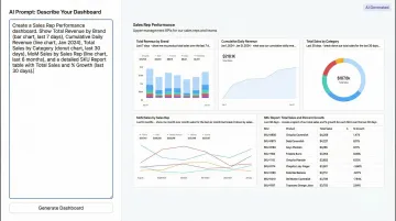
AI-powered tools like Sylus let users ask questions in plain English and receive complete dashboards including KPI cards and charts. The platform recommends chart types based on your data structure, so there's no manual configuration needed.
Step 5: Generate, Review, and Share
Run generation and immediately review whether KPI cards, chart types, and axis labels match intent. Check:
- Do the chart types match your data structure? (Line charts for time-series, bar charts for comparisons)
- Are axis labels clear and correctly formatted?
- Do KPI cards display the right metrics?
- Are filters functional and applied to the correct charts?
Most AI dashboard tools allow natural language edits after generation. Users can customize charts with plain English commands like "change the bar chart to a line chart" or "add a filter by region."
Once satisfied, use the share options:
- Shareable link: Generate a URL that anyone with the link can access
- Email invitation: Send access to specific users with permission controls
- Iframe embed: Embed the dashboard into a website or internal portal
- PDF export: Export to PDF for static reporting
Sylus lets teams share dashboards via link or embed them directly into websites. Data can also be exported as CSVs and PDFs for external distribution.
When Should You Use a Dashboard Builder for Excel Data?
Entry-level dashboard builders are the right fit when you need a visual summary of existing spreadsheet data quickly, don't have a dedicated BI team, and aren't working with live database connections or real-time streams.
Ideal use cases:
- One-off reporting for stakeholders
- Tracking KPIs from weekly or monthly data exports
- Sales or financial performance reviews
- Project status summaries
- Operational metrics shared across a small team
Entry-level builders become limiting when:
- Datasets exceed row or file size caps (100 MB for Looker Studio, 1 GB for Power BI)
- Dashboards need to auto-refresh from a live data source
- Enterprise security compliance (SOC 2, HIPAA) is required
- Multiple teams need governed, context-aware analysis with audit trails
Once you hit those limits, you need a platform built for data teams rather than individual spreadsheet users. Sylus is designed for exactly that: it offers SOC 2 Type II and HIPAA compliance, real-time data syncing from 500+ integrations, and self-hosted deployment for air-gapped environments—covering the gaps that entry-level tools consistently leave open.
What You Need Before Building Your Excel Dashboard
Preparation quality directly determines how useful the final dashboard is. Most poor dashboard outputs trace back to data or planning gaps, not tool limitations.
Data and File Requirements
Your Excel file should be in .xlsx or .csv format with a single flat table structure: one header row, no merged cells, and no summary rows embedded mid-sheet. This structure works reliably across all major dashboard tools.
Research and note file size limits for your chosen tool:
- Looker Studio: 100 MB per CSV/Excel file
- Power BI Desktop: 1 GB per dataset
- Tableau Public: 10 GB total storage
- Metabase: 50 MB per CSV upload
If your file exceeds these limits, aggregate before uploading. Converting daily transactional data into monthly summaries, for instance, can cut file size by 80-90% and noticeably improve dashboard load times.
Dashboard Goals and Metrics Clarity
Before uploading, list the 3-5 decisions or questions the dashboard should answer. This guides your chart selection and filter setup — and prevents a dashboard that shows everything but communicates nothing.
Identify which columns are:
- Metrics — what you're measuring: revenue, units sold, conversion rate
- Dimensions — how you want to slice the data: region, product category, sales rep
- Time fields — whether you need trend views: daily, weekly, or month-over-month
Having these mapped out before you start means your axes, filters, and KPI cards reflect actual business questions — not just whatever columns happened to import cleanly.
Key Parameters That Affect Your Dashboard Quality
The same Excel file run through the same tool can produce dramatically different dashboards depending on five controllable variables.
Data Structure and Header Quality
Dashboard builders—especially AI-powered ones—use column names to infer meaning, label charts, and select visualization types. Ambiguous names like "Q1" or "Value" produce mislabeled charts.
Rename columns to full, descriptive labels before upload. Change "Rev" to "Monthly Revenue," "Cust" to "Customer Name," and "Q1" to "Q1 2025 Sales." Of all data prep steps, this one delivers the most immediate improvement to output quality.

Date Column Presence and Format Consistency
A well-formatted date column unlocks time-series charts, trend lines, and period-over-period comparisons. Without one, the dashboard is limited to static snapshots.
Ensure all dates use a single, consistent format. ISO 8601 (YYYY-MM-DD) is most universally parsed. Mixed formats like "Jan-25" and "2025-01-15" in the same column cause parsing failures.
Prompt or Configuration Specificity
Vague prompts ("make a dashboard") produce generic layouts. Specific prompts ("show monthly revenue trend as a line chart, top 10 customers by revenue as a bar chart, and a KPI card for total deals closed") produce targeted, decision-ready dashboards.
When writing your prompt, name the metrics, chart types, and filter dimensions explicitly. Treat it like a brief to a junior analyst—the more specific the instruction, the less guesswork the tool has to do.
File Size and Row Volume
Entry-level tiers typically cap file size and row counts. Exceeding those limits causes silent truncation—the dashboard generates successfully but on incomplete data, producing misleading metrics.
If you're near those tier limits, aggregate or filter your data to the relevant time window before upload. Switching from raw transactional rows to monthly aggregates can cut file size by 80–90%.
Visualization Type Selection
The wrong chart type obscures patterns. A pie chart with 15 categories is unreadable; a line chart on non-time-series data is misleading. Override auto-selected chart types when they don't match your data structure.
The Nielsen Norman Group recommends sticking to basic charts: bar charts, line charts, and scatter plots—because humans process 2D position and length pre-attentively and accurately. Avoid circular and area-based graphs (pie charts, donut charts), where humans struggle to judge quantitative differences in area and angle.
If you must use pie charts:
- Limit to five categories or fewer
- Ensure there's a clear dominant category
- Never use 3D effects (they distort perception)
- Group tiny categories into "Other"
Common Mistakes When Building Dashboards from Excel
Four mistakes consistently derail Excel-based dashboards — and most are easy to avoid once you know what to look for.
Uploading raw export files. Transactional exports from CRMs or ERPs often contain summary rows, merged header cells, and inconsistent formatting that break column detection. Create a clean, flat-table version before uploading.
Tracking everything instead of specific decisions. Dashboards with 20+ charts and no clear narrative are rarely used. Prioritize 5-8 key metrics that map to real decisions, then use filters to let users explore further. Human short-term memory holds three to nine chunks of visual information at once — keep dashboards focused and scroll-free.
Skipping the sharing and update workflow. Many users build a dashboard, share a static screenshot, and lose the value of interactivity. Verify that the tool's share mechanism — link, embed, or export — works for your audience before investing time in layout and design.
Using truncated axes or 3D effects. Starting a bar chart's y-axis above zero distorts relative proportions. The UK Office for Statistics Regulation publicly reprimanded HM Treasury for a bar chart where the y-axis started at 8%, which gave a "misleading impression of the scale of deceleration in inflation." 3D charts compound this problem — the viewer's angle tilts the bottom slices closer, making them appear disproportionately larger.

Frequently Asked Questions
How do I export a dashboard to Excel?
Most dashboard tools offer a data export option (CSV or Excel) for the underlying data, while the visual dashboard itself is typically exported as a PDF or shared via a live link. Re-importing a dashboard visual back into Excel usually requires a screenshot or manual rebuild.
Can I create a dashboard from Excel data?
Yes, multiple tools exist—including Excel's native Pivot Charts, AI dashboard builders like Sylus, and Power BI Desktop. The main trade-offs are row limits, watermarks, or restricted sharing features depending on the plan.
What is the best tool to build a dashboard from Excel data?
The best tool depends on your use case. Excel-native Pivot Charts handle simple internal reports; Power BI Desktop suits teams already in the Microsoft ecosystem. For a shareable, web-based dashboard with no manual chart setup, AI-powered tools like Sylus are the stronger choice.
Do I need to know coding to build a dashboard from Excel?
No coding is required with modern AI-powered dashboard builders. Users upload their Excel file and describe the dashboard they want in plain English, and the tool handles all chart generation and layout automatically.
How do I keep my dashboard updated when my Excel data changes?
Static upload tools require re-uploading the new file to refresh the dashboard. Tools with live connection features—like Sylus's 500+ integrations or Power BI's OneDrive refresh—auto-sync whenever the source file changes.
What Excel data format works best for building dashboards?
A single flat table with one header row, no merged cells, consistent date formats (YYYY-MM-DD), and numeric columns free of symbols. Both .xlsx and .csv are widely accepted, with .csv being the most universally compatible format across dashboard tools.