Introduction
Data teams waste staggering amounts of time on manual reporting. According to McKinsey, analysts spend 60% to 80% of their time finding, preparing, and performing quality assurance on data—not analyzing it. That translates to roughly 12 hours per week lost before any real analysis begins.
The financial toll compounds quickly. Poor data quality and manual reporting errors cost organizations an average of $12.9 million annually, with data inefficiencies accounting for 20-30% in revenue loss. At that scale, slow reporting isn't a workflow inconvenience — it's a strategic liability that delays confident, timely decisions.
In 2026, AI-native reporting platforms have moved well beyond static dashboards. The best tools now take teams from raw data to board-ready reports in seconds — exploring data, validating assumptions, and generating plain-language summaries that non-technical stakeholders can act on directly.
Key Takeaways
- Automated reporting tools eliminate manual data pulls by connecting directly to your sources and generating reports, dashboards, and summaries on schedule
- Top 2026 platforms combine AI analysis, real-time data syncing, and automated delivery via email or Slack
- Key selection factors: data source integrations, AI capabilities, security compliance, pricing, and ease of use for non-technical teams
- Whether you run a lean startup or an enterprise data team, this guide helps you find the right tool without wading through vendor marketing
What Is Automated Reporting — and Why It Matters in 2026
Automated reporting software connects directly to your data sources—databases, CRMs, ad platforms, data warehouses—and generates reports, dashboards, or summaries on a schedule or trigger without manual intervention. Instead of analysts pulling data from five systems, formatting spreadsheets, and emailing stakeholders every Monday morning, the software does it automatically.
For data teams and business users, that shift has four concrete payoffs:
- Eliminates human error in data compilation
- Ensures stakeholders always have current data
- Frees analysts to focus on interpretation rather than data gathering
- Reduces reporting time from hours to minutes
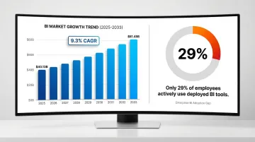
Adoption pressure is building fast. The BI software market is projected to grow from $40.13 billion in 2025 to $81.45 billion by 2033 at a 9.3% CAGR. Yet adoption hasn't kept pace with investment — only 29% of employees actively use deployed BI tools, creating significant license waste across organizations.
What separates 2026 from prior years is that AI is no longer a feature add-on. The newest generation of tools actively explores data, validates assumptions, and generates narrative summaries in plain English. Platforms like Tableau Pulse, Microsoft Copilot, and Gemini in Looker have made reporting conversational — analysts ask questions instead of building queries, and the software explains what the numbers actually mean.
10 Best Automated Reporting Tools for Your Business in 2026
These tools were evaluated on data connectivity, automation depth, AI capabilities, security compliance, pricing transparency, and suitability across company sizes—from fast-growing startups to F1000 enterprises.
Sylus
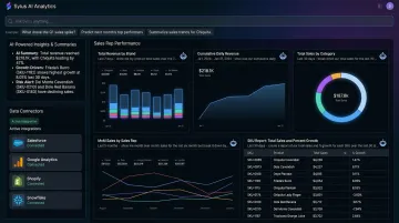
Sylus is an AI-native analytics platform built for modern data teams. It connects directly to your data sources and lets users ask questions in plain English—acting as an AI data analyst that explores data and validates assumptions before delivering a final result. Trusted by companies like OpenAI.
What sets Sylus apart:
- Governed context built on dbt models ensures all analysis is grounded in verified business logic and documentation
- Unlimited seats with usage-based pricing removes access barriers—teams scale without per-seat costs
- Self-hosted deployment, SOC 2 Type II, and HIPAA compliance make it enterprise-ready
- Scheduled AI-generated report summaries delivered to email or Slack, or queried directly from Slack
- 500+ one-click integrations across ERPs, CRMs, databases, e-commerce platforms, and spreadsheets
- Automated dashboard generation creates clean, shareable dashboards from your data without manual configuration
- Alerts for data spikes notify teams of significant activity changes in real-time
| Feature | Details |
|---|---|
| Key Features | AI data analyst with governed context, natural language queries, automated dashboard generation, Slack integration, scheduled reports and AI summaries, alerts for data spikes, 500+ integrations |
| Pricing | Usage-based; unlimited seats — verify current pricing at sylus.ai |
| Best For | Data teams and business users at fast-growing startups and F1000 enterprises needing governed AI-powered reporting |
Tableau
Tableau is one of the most established BI platforms, known for powerful data visualization and a broad connector ecosystem. Now part of Salesforce, it serves enterprises across industries with precisely formatted dashboards and interactive analytics.
Tableau Pulse brings AI-powered metric insights to business users, delivering personalized summaries and natural language Q&A directly into workflows—letting users uncover hidden patterns without writing a query. That said, Tableau carries a steeper learning curve and higher cost than most newer entrants.
Pricing tiers:
- Creator: $75/user/month
- Explorer: $42/user/month
- Viewer: $15/user/month (Standard Edition)
| Feature | Details |
|---|---|
| Key Features | Interactive dashboards, Tableau Pulse AI insights, 100+ data connectors, embedding capabilities, scheduled report distribution |
| Pricing | Verify current per-user licensing tiers (Creator, Explorer, Viewer) on tableau.com |
| Best For | Enterprises with dedicated BI teams and complex visualization needs |
Microsoft Power BI
Power BI is Microsoft's flagship BI platform, widely adopted in enterprises already embedded in the Microsoft 365 ecosystem. It offers strong self-service reporting, DAX-based calculations, and deep Azure integration.
Copilot in Power BI provides chat-based experiences for both business users and report authors, generating DAX expressions, summarizing semantic models, and answering ad-hoc natural language questions. Power BI connects to more than 100 data sources natively.
Value proposition: Low entry cost, strong governance features, and seamless Microsoft stack integration. However, advanced modeling can require technical expertise.
2026 Pricing:
- Power BI Pro: $14/user/month
- Power BI Premium Per User: $24/user/month
| Feature | Details |
|---|---|
| Key Features | Automated data refresh, Power Automate integration, Copilot AI Q&A, paginated reports, 100+ data connectors |
| Pricing | Verify current pricing (Power BI Pro and Premium tiers) on microsoft.com |
| Best For | Organizations within the Microsoft ecosystem seeking cost-effective, scalable BI reporting |
Looker (Google Cloud)
Looker is Google Cloud's semantic layer-based BI platform. Its LookML modeling language enforces consistent business metrics across all reports, making it a natural fit for technical data teams that need a governed single source of truth.
LookML creates a universal semantic data model that standardizes metrics across the organization. Gemini in Looker layers on Conversational Analytics, a LookML Assistant to auto-generate code, and a Visualization Assistant.
Looker's deep BigQuery integration and embedded analytics make it well-suited for enterprises requiring governed metric definitions at scale—though expect meaningful engineering investment during onboarding.
| Feature | Details |
|---|---|
| Key Features | LookML semantic layer, embedded analytics, scheduled report delivery, API-first architecture, Google Cloud integrations, Gemini AI assistant |
| Pricing | Verify current pricing tiers on cloud.google.com/looker |
| Best For | Data engineering teams at enterprises requiring governed metric definitions at scale |
Domo
Domo is a cloud-native BI platform combining data integration, visualization, and app-building in a single platform. It targets business users and executives with real-time, mobile-friendly dashboards.
Over 1,000 pre-built cloud connectors let teams ingest data without costly engineering projects. Domo.AI adds AI Agents, AI Chat for natural language queries, and automated machine learning (AutoML) capabilities.
Domo uses a consumption-based pricing model ("Pay only for what you use"), moving away from rigid per-seat constraints—ideal for organizations prioritizing business-user accessibility and broad data connectivity.
| Feature | Details |
|---|---|
| Key Features | 1,000+ connectors, automated alerts, AI-generated insights, mobile dashboards, low-code app building, Domo.AI suite |
| Pricing | Verify current pricing on domo.com (consumption-based) |
| Best For | Mid-market and enterprise teams prioritizing business-user accessibility and broad data connectivity |
Sisense
Sisense is an analytics platform built for embedded analytics and complex data environments. Its in-chip data processing handles large datasets efficiently, and its Compose SDK lets product teams embed white-labeled data experiences directly into their own applications—without rebuilding from scratch.
This developer-first approach makes Sisense a practical choice for SaaS companies adding analytics to customer-facing products.
AI-powered augmented analytics features provide automated insights, while the developer-first approach enables deep customization.
Transparent entry pricing:
- Launch: $399/month
- Grow: $1,299/month
- Scale: Custom enterprise quote
| Feature | Details |
|---|---|
| Key Features | Embedded analytics SDK, in-chip processing, AI-driven insights, white-labeling, API-first design, Compose SDK |
| Pricing | Verify current pricing on sisense.com (Launch $399/mo, Grow $1,299/mo, Scale custom) |
| Best For | SaaS product teams embedding analytics into customer-facing applications |
Qlik Sense
Qlik Sense is a self-service analytics platform built around an associative data engine that surfaces relationships other query-based tools miss. It has since added AI capabilities through Qlik Cloud.
The Associative Engine lets users explore data in any direction without the constraints of linear, query-based tools—instantly showing which values are associated and which are unrelated, no matter where the analysis starts.
Insight Advisor serves as an intelligent AI assistant, offering search-based visual analysis and fully conversational analytics.
Capacity-based pricing:
- Starter: $300/month (10 users/10GB)
- Standard: $825/month (25GB)
- Premium: $2,750/month (50GB)
- Enterprise: Custom quote
| Feature | Details |
|---|---|
| Key Features | Associative engine, Insight Advisor AI, automated reporting, multi-cloud deployment, embedded analytics |
| Pricing | Verify current pricing tiers on qlik.com (Starter $300/mo, Standard $825/mo, Premium $2,750/mo) |
| Best For | Analysts handling complex, multi-source datasets who need exploratory data discovery |
Metabase
Metabase is an open-source business intelligence tool known for being fast to deploy and highly accessible to non-technical users. Popular with startups and product teams for its simple question-and-answer interface.
Ease of setup and an affordable open-source tier make Metabase attractive for teams needing quick, lightweight reporting. It supports 20+ database and data warehouse connectors.
"Pulses" enable automated scheduled report delivery to email or Slack. Metabase supports interactive and guest embedding—though it lacks the advanced data modeling and governed analytics that enterprise platforms provide.
Pricing:
- Open Source: Free (AGPL)
- Starter: $100/month or $6/user
- Pro: $575/month or $12/user
- Enterprise: Custom pricing (starting at $20k/year)
| Feature | Details |
|---|---|
| Key Features | No-code question builder, automated scheduled reports (Pulses), embeddable dashboards, open-source tier, 20+ database connectors |
| Pricing | Verify current pricing on metabase.com (Open Source free; Starter $100/mo, Pro $575/mo) |
| Best For | Startups and product teams needing quick, lightweight reporting without technical overhead |
Google Looker Studio
Google Looker Studio (formerly Data Studio) is a free, cloud-based reporting tool that connects seamlessly to Google's ecosystem—Google Analytics, Google Ads, BigQuery, and Sheets—to generate shareable dashboards.
Zero-cost entry point and ease of sharing are key strengths. Looker Studio connects to more than 800 data sources via its extensive partner connector gallery.
However, it lacks advanced data modeling, AI-powered analysis, and enterprise governance—making it better suited as a supplementary tool rather than a primary BI platform.
Looker Studio Pro ($9/user/project/month) adds team workspaces, automated report delivery, and Cloud Customer Care support.
| Feature | Details |
|---|---|
| Key Features | Free to use, 800+ connectors via partner marketplace, real-time Google data syncing, shareable links, template library |
| Pricing | Free (Looker Studio Pro $9/user/mo at lookerstudio.google.com) |
| Best For | Marketing teams and small businesses reporting on Google ecosystem data |
Zoho Analytics
Zoho Analytics is a self-service BI and analytics platform within the broader Zoho ecosystem, offering AI-powered reporting via the Zia AI assistant, deep Zoho CRM integration, and competitive pricing for SMBs.
Ask Zia allows users to generate insights, build pipelines, and create predictive models using natural language—now integrated with OpenAI's ChatGPT for generative AI capabilities.
Zoho Analytics is cost-effective for teams already in the Zoho ecosystem, with AI-powered auto-analysis and collaborative reporting features. However, its third-party connector coverage is narrower than tools like Tableau or Power BI.
Pricing:
- Basic: $24/month (billed annually)
- Additional users: $8/user/month
- Supports 50+ native apps, 500+ via Zoho Flow
| Feature | Details |
|---|---|
| Key Features | Zia AI assistant, 500+ data connectors (via Zoho Flow), automated report scheduling, collaborative dashboards, embedded analytics |
| Pricing | Verify current pricing tiers on zoho.com/analytics (Basic $24/mo, additional users $8/mo) |
| Best For | SMBs and teams within the Zoho ecosystem seeking affordable AI-assisted reporting |
How We Chose the Best Automated Reporting Tools
Many buyers choose tools based on brand name or UI alone, without checking whether the platform can handle their data infrastructure, security requirements, or team's technical skill level. The result: underutilized software and wasted budgets.
These five criteria cut through the noise:
1. Data Source Connectivity and Integration Depth
The platform must connect natively to your existing data stack — databases, CRMs, ad platforms, data warehouses, ERPs — without requiring custom-built APIs that break with upstream changes. Tools like Domo (1,000+ connectors) and Looker Studio (800+ connectors) excel here. Aim for platforms covering at least 90% of your sources natively. This reduces engineering overhead and shortens time-to-insight from weeks to days.
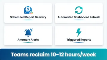
2. Automation Capabilities
True automation means scheduled reports, triggered alerts, and real-time data refresh without manual intervention. Look for:
- Scheduled report delivery to email or Slack
- Automated dashboard refresh on data changes
- Alerts for data spikes or anomalies
- Triggered reports based on business events
Teams that automate these workflows typically reclaim 10-12 hours per week that analysts previously spent on manual report generation.
3. AI and Natural Language Features
AI-native platforms — Sylus, Tableau Pulse, Copilot in Power BI, Gemini in Looker — let non-technical users ask questions in plain English and get accurate, context-aware answers. This moves data access beyond the analytics team, reducing the bottleneck of a single analyst fielding every ad hoc request.
4. Security and Compliance Credentials
SOC 2 Type II compliance is now a baseline requirement. Over 78% of enterprise buyers won't engage with SaaS vendors that lack it. Look for:
- SOC 2 Type II certification
- HIPAA compliance (if handling healthcare data)
- Self-hosting options for air-gapped environments
- Data residency controls
Missing any of these can stall or kill enterprise procurement cycles outright.
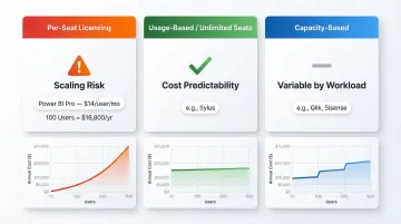
5. Total Cost of Ownership at Scale
Per-seat licensing can become prohibitively expensive as teams grow. Microsoft's recent price increase to $14/user/month for Power BI Pro sets a new baseline — at 100 users, that's $16,800/year.
Model your user count before committing. Tools with unlimited-seat or usage-based models (like Sylus) or capacity-based pricing (like Qlik, Sisense) offer more predictable costs as your organization scales — and avoid the sticker shock of a mid-year headcount increase.
Commonly Overlooked Factor: Scalability of Access
Gartner reports that only 29% of employees actively use deployed BI tools. This underutilization often stems from per-seat licensing that restricts access to "essential" users only.
When casual users can't access data, they request reports from analysts, recreating the exact manual reporting bottleneck the tool was supposed to solve. Prioritize platforms where adding a 50th user doesn't double your bill.
Conclusion
The best automated reporting tool is the one that fits your data infrastructure, your team's technical skill level, your compliance requirements, and your budget at scale.
Prioritize tools that:
- Reduce dependency on a single analyst or gatekeeper
- Offer AI-native features allowing business users to ask questions directly
- Provide governed context to ensure accuracy and consistency
- Scale access without punishing per-seat costs
In 2026, the platforms that earn long-term adoption combine automation, AI, and broad accessibility—not visualization alone.
If those priorities match your team's needs, Sylus is worth a close look. It offers unlimited seats, dbt-governed context, SOC 2 Type II and HIPAA compliance, and the ability to query data or receive scheduled reports directly in Slack—without the per-seat pricing that limits adoption. Get started at sylus.ai.
Frequently Asked Questions
What is reporting automation?
Reporting automation is the use of software to automatically collect data from multiple sources, process it, and generate reports or dashboards on a set schedule or real-time trigger—removing the need for manual data pulls, formatting, or distribution.
What are the benefits of report automation?
Key benefits include significant time savings for analysts (up to 12 hours per week), elimination of human errors in data compilation, faster access to insights for decision-makers, and the ability to scale reporting across teams without adding headcount.
What are reporting automation tools?
These are software platforms, ranging from BI tools like Tableau and Power BI to AI-native platforms like Sylus, that connect to data sources and automate the creation, scheduling, and delivery of reports and dashboards.
What are the 4 types of reports?
The four common report types are operational reports (day-to-day performance), analytical reports (trends and patterns), strategic reports (executive-level KPIs and forecasts), and compliance/regulatory reports. Automated tools can generate all four types.
What are the 4 types of dashboards?
The four dashboard types are operational (real-time monitoring), analytical (historical trends), strategic (high-level KPIs for leadership), and tactical (team-level performance tracking). Most modern reporting tools support all four.
What is an example of automation in reporting?
Consider a marketing team that spent hours each week pulling ad spend data from Google Ads, Facebook, and LinkedIn into a spreadsheet. An automated reporting tool handles that entire process—syncing all sources, refreshing data daily, and emailing a formatted report to stakeholders every Monday morning.