Introduction
Most teams drown in data yet starve for visibility. Metrics sit locked in siloed systems, dashboards go stale by the week, and critical decisions get delayed because the right numbers aren't where leaders need them. According to Fivetran's 2024 survey, 82% of companies rely on outdated information for decision-making, leading to incorrect choices and lost revenue.
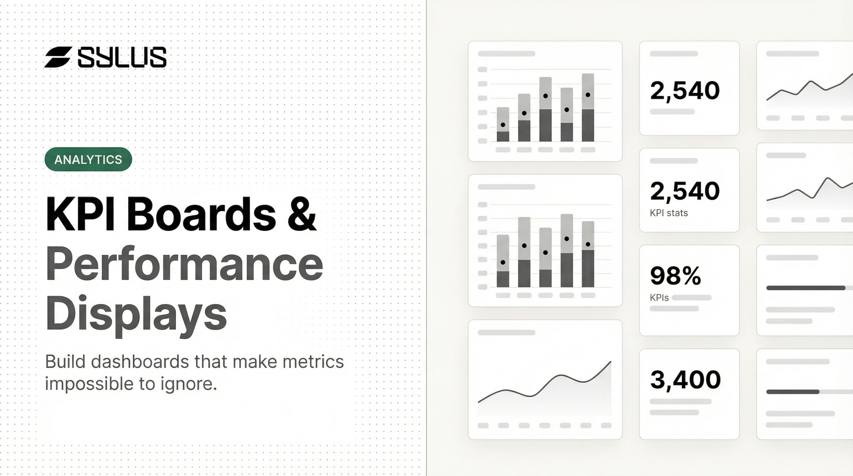
A KPI board solves this visibility crisis by consolidating your most critical performance indicators into one centralized, real-time view. This guide walks through the essential KPI categories, department-specific examples, a practical framework for building effective boards, and why modern teams are moving from static whiteboards to live digital displays that update automatically and share instantly across hybrid teams.
Key Takeaways
- A KPI board centralizes your organization's most critical metrics in one view for faster, better-informed decisions
- Organize KPIs into four categories: Financial, Customer, Internal Process, and Learning & Growth
- Effective boards follow a strict hierarchy—show only metrics tied to strategic goals, not every available data point
- Avoid the most common pitfalls: tracking too many KPIs (9-11 per board is the sweet spot), relying on vanity metrics, and letting displays go stale
- Digital KPI displays enable real-time data, automated alerts, and easy sharing across teams and tools
What Is a KPI Board?
A KPI board is a structured, visual tool that consolidates Key Performance Indicators into one centralized view, enabling teams and leaders to monitor progress toward strategic objectives at a glance. Unlike general dashboards that display mixed-purpose data and exploratory analytics, a KPI board is purpose-built around strategic outcomes and typically role-specific. For example, a sales KPI board focuses exclusively on revenue, pipeline velocity, and conversion metrics, while an operations board tracks fulfilment cycle time, defect rates, and throughput.
The distinction between KPIs and metrics matters: KPIs represent performance against strategic goals (quarterly revenue target attainment), while metrics track tactical activity supporting those goals (number of outbound calls made per day). Every KPI is a metric, but not every metric qualifies as a KPI. KPIs tie directly to strategic goals; metrics track the activity behind them.
Why KPI Boards Matter for Teams and Businesses
KPI boards reduce decision-making latency by surfacing the right data to the right people without requiring manual report-pulling or ad hoc queries. McKinsey's 2023 State of Organizations research found that fast-moving organizations report 2.1× higher operational resilience and 2.5× higher financial performance than slow-moving peers. Automated dashboards with clear accountability improve employee engagement by 25 percentage points.
Shared KPI boards also give individual contributors direct line of sight into how their work moves company-wide outcomes — a visibility gap that often goes unaddressed. The cost of that gap is real:
- Knowledge workers lose up to 12 hours per week chasing data across siloed systems
- 70%–80% of enterprise data goes unused because employees can't find, trust, or interpret it
- Teams without shared performance context duplicate effort and miss early warning signs
Centralizing critical metrics in one trusted location removes this friction before it compounds.
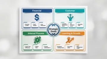
The 4 Categories of KPIs (and What to Track in Each)
The Balanced Scorecard framework, introduced by Dr. Robert S. Kaplan and Dr. David P. Norton in Harvard Business Review's January–February 1992 issue, remains the most widely used structure for organizing KPIs. It divides performance into four perspectives: Financial, Customer, Internal Process, and Learning & Growth.
Organizing KPIs into these categories keeps critical performance dimensions from being overlooked. Relying solely on lagging financial metrics limits long-term growth; integrating forward-looking indicators gives a predictive view of where the business is headed.
Financial KPIs
Financial KPIs measure the economic health and efficiency of the business. Essential examples include:
- Gross Profit Margin — Revenue minus cost of goods sold, expressed as a percentage of revenue
- Operating Expense Ratio — Operating expenses divided by total revenue, indicating cost efficiency
- Revenue per FTE — Total revenue divided by full-time equivalent employees, measuring workforce productivity
- Budget Variance — Difference between budgeted and actual figures, tracking financial discipline
- Cash Conversion Cycle — Days between paying suppliers and collecting customer payments, measuring liquidity efficiency
Customer KPIs
Customer KPIs reveal how well the business delivers value externally. Key indicators include:
- Net Promoter Score (NPS) — Percentage of promoters minus detractors, measuring customer loyalty and likelihood to recommend
- Customer Acquisition Cost (CAC) — Total sales and marketing spend divided by new customers acquired
- Customer Lifetime Value (CLV) — Total revenue expected from a customer over the entire relationship
- Customer Satisfaction Score (CSAT) — Average satisfaction rating from post-interaction surveys
- Customer Retention Rate — Percentage of customers retained over a specific period, indicating loyalty and product-market fit
Internal Process KPIs
Internal Process KPIs measure efficiency of the core workflows that deliver the product or service:
- On-Time Delivery Rate — Percentage of orders delivered by the promised date
- First Contact Resolution Rate — Percentage of customer issues resolved in the first interaction
- Average Response Time — Mean time to respond to customer inquiries or support tickets
- Order Fulfillment Cycle Time — Total time from order placement to delivery completion
- Ticket Resolution Time — Average time to fully resolve support tickets or service requests
Learning & Growth KPIs
Learning & Growth KPIs measure the organization's capacity to adapt, improve, and sustain performance over time:
- Employee Satisfaction Rating — Average engagement score from employee surveys
- Training ROI — Financial return generated from training investments
- Employee Turnover Rate — Percentage of employees who leave within a given period
- Time-to-Fill — Average days to fill open positions from requisition to acceptance
- Internal Mobility Rate — Percentage of roles filled by internal candidates, indicating career development opportunities
How to Build an Effective KPI Board
Step 1: Start with Strategy, Not Data
The biggest mistake teams make is starting by pulling available data instead of asking: "What decisions does this board need to support?" Work backwards from strategic goals to identify which KPIs belong on the board.
If your goal is to increase customer retention by 15%, relevant KPIs include Customer Retention Rate, Customer Satisfaction Score, and Customer Support Resolution Time — not total website visitors or social media followers.
Filter ruthlessly: just because a metric is measurable doesn't mean it's strategic. Ask "If this number changes, do we know what action to take?" If the answer is no, leave it off the board.
Step 2: Identify Your Audience and Their Context
A board for an executive team should look very different from one built for a frontline operations team. Define the audience, their decision frequency, and the level of granularity they need before selecting metrics:
- Executives — High-level outcome indicators reviewed monthly or quarterly (revenue growth, NPS, employee turnover)
- Operations managers — Daily or weekly process metrics (defect rates, cycle time, ticket backlog)
- Sales reps — Real-time activity and pipeline metrics (calls made, demos scheduled, deals closing this week)
Match update frequency and detail level to how your audience makes decisions.
Step 3: Apply the SMART KPI Test
The SMART framework (Specific, Measurable, Attainable, Realistic, Time-bound), authored by George T. Doran in 1981, ensures KPIs drive accountability. Apply it to candidate KPIs before adding them to your board.
Weak KPI example: "Improve customer satisfaction"
SMART KPI example: "Increase CSAT score from 72 to 80 by Q3 2025"
The SMART version specifies the metric (CSAT), the baseline (72), the target (80), and the deadline (Q3 2025). This clarity enables teams to track progress and know exactly when they've succeeded.
Step 4: Choose the Right Visualization for Each Metric
How a metric is displayed affects how quickly it can be acted on. Stephen Few's research on dashboard design demonstrates that humans struggle to accurately compare two-dimensional areas (pie charts) or interpret 3D graphics. Use these guidelines:
| Data Scenario | Use This | Avoid This |
|---|---|---|
| Headline KPIs | Single-number tiles with % change | Complex multi-axis charts |
| Target tracking | Bullet graphs or bar charts | Circular gauges (waste space, lack context) |
| Time-series data | Simple trend lines or bar graphs | 3D bar charts (distort values) |
| Part-to-whole | Horizontal bar graphs | Pie charts (hard to compare angles) |
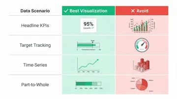
Emphasize clarity over decoration. Every element should support faster comprehension, not visual flair.
Step 5: Build in Review and Iteration Cadence
A KPI board is not a one-time setup. Schedule regular reviews to retire irrelevant KPIs, add emerging ones, and validate that metrics still reflect current strategic priorities. The Balanced Scorecard Institute recommends a tiered governance cadence:
- Monthly operational reviews: Focus on driver metrics, initiative progress, and clearing execution obstacles
- Quarterly strategy reviews: Reassess targets, validate causal links between metrics, and retire or add strategic initiatives
- Annual refresh: Update the strategy map and scorecard as market conditions shift
Platforms like Sylus support this cadence directly — teams can request metric verification, track review status, and leave comments before a dashboard goes live, so decisions are grounded in data everyone has signed off on.
Common KPI Board Mistakes to Avoid
Mistake 1: Metric Overload
Displaying too many KPIs dilutes attention and makes it harder to identify what needs action. Analysis of over 20,000 strategic plans reveals the optimal range is 9 to 11 measures per strategic plan, averaging about 2 measures per strategic goal. For executive dashboards, stick strictly between 3 and 10 critical KPIs.
Apply the ruthless archiving rule: aggressively remove any measure that shows "Not Started" or goes un-updated for two consecutive quarters to prevent dashboard clutter and the illusion of accountability.
Mistake 2: Tracking Vanity Metrics Instead of Actionable Ones
Vanity metrics, coined by Eric Ries in The Lean Startup, are numbers that look impressive but don't inform future business decisions — total website visitors without conversion context, gross registered users without engagement rates, or social media followers without interaction data.
Test a metric's actionability with one question: "If this number changes, do we know what to do next?" If the answer is no, it's a vanity metric.
Actionable metrics show clear cause-and-effect, letting teams learn from customer behavior and make informed decisions. Replace weak vanity metrics with specific, decision-ready ones:
- Swap "total page views" for conversion rate by traffic source
- Replace "registered users" with active users by engagement tier
- Trade "social media followers" for interaction rate per post
Mistake 3: Static Boards with Stale Data
When dashboards fail to provide current data, users abandon them. A 2025 survey found that 72% of users bypass dashboards to export data to spreadsheets for deeper analysis, while 37% report that dashboard data isn't clear or actionable. When leaders act on outdated numbers, the cost shows up in decisions — not data.
Real-time or scheduled automated updates fix this directly. Modern platforms continuously sync data from connected systems, eliminating manual exports so every insight reflects what's actually happening now.
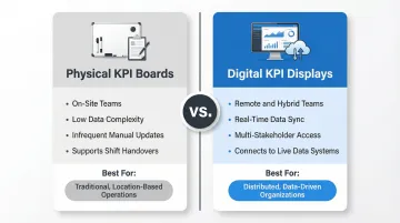
Physical vs. Digital KPI Displays: Which Is Right for Your Team?
Physical KPI Boards
Physical KPI boards—whiteboards, magnetic status boards, printed displays—remain foundational in Lean manufacturing and the Toyota Production System. Visual management tools like Andon signals notify teams of production problems immediately, allowing corrective action. Huddle boards and Obeya (visual management centres) support daily stand-ups and shift handovers, weaving together strategy cascades and information flows on manufacturing floors and in warehouses.
Physical boards work best for high-visibility, low-data-complexity environments where teams gather in person and updates are manual but infrequent.
Digital KPI Displays
Digital KPI displays offer clear advantages for remote and hybrid teams, data teams working with live sources, and organizations sharing KPI boards across departments or embedding them in internal tools and products.
Gartner predicts that by 2027, 75% of new analytics content will be contextualized through Generative AI, moving dashboards from static displays to adaptive decision tools.
Modern platforms like Sylus can generate complete, shareable KPI dashboards from plain-English questions asked directly of your data sources, eliminating the need for manual chart-building.
Ask "Build a KPI dashboard for the last 12 months" and receive dashboards displaying total revenue, average order value, monthly trends, and other key metrics — automatically generated and shareable via link, email invitation, or embedded directly into websites and products.
A Deloitte survey revealed that 72% of organizations are integrating KPIs tailored specifically for hybrid work environments, and remote teams using collaborative digital tools show a 24% increase in overall performance compared to those that do not.
Decision Framework
The right choice depends on your team's structure, data complexity, and how often metrics change. Use this as a starting point:
Choose physical boards when:
- Teams work on-site and gather in person daily
- Data complexity is low and updates are infrequent
- Visual presence supports shift handovers and stand-ups
Choose digital displays when:
- Data changes frequently and requires real-time updates
- Multiple stakeholders need access across locations
- The board needs to connect to live data systems
- Teams are remote or hybrid
Frequently Asked Questions
What is a KPI board?
A KPI board is a visual display of an organization's Key Performance Indicators: the metrics that measure progress toward strategic goals. It gives teams a shared, real-time view of performance to support faster, more informed decisions.
What do KPIs stand for?
KPI stands for Key Performance Indicator — a quantifiable measure used to evaluate how effectively a team or organization is achieving its core objectives over a set time period.
What are 5 examples of KPIs?
Five concrete examples spanning different categories: Net Profit Margin (financial), Customer Retention Rate (customer), On-Time Delivery Rate (process), Employee Turnover Rate (people), and Net Promoter Score (customer experience).
What are the 4 categories of KPIs?
The Balanced Scorecard framework defines four categories: Financial, Customer, Internal Process, and Learning & Growth. Together, they cover both current results and the capabilities that drive future performance.
What is the difference between a KPI board and a dashboard?
A KPI board is purpose-built around a specific set of strategic objectives and is typically role-specific, while a dashboard is a broader term for any visual data display — which may include operational metrics, reports, and analytics that go beyond KPIs.
How often should a KPI board be updated?
Update frequency depends on the type of KPI: operational metrics may need daily or real-time updates, while strategic KPIs are often reviewed weekly or monthly. Automated digital KPI boards eliminate the need to refresh data manually.