Introduction
Most teams have more data than they know what to do with — and still waste hours building reports manually. Spreadsheets stall on scale. BI tools demand SQL expertise or engineering tickets. According to IDC, knowledge workers lose up to 12 hours per week just finding and preparing data, while data teams spend 70% of their time on data prep versus 30% on actual analysis.
Even after the report is built, getting it to the right people is another manual job. Teams re-run and resend the same reports every week, hoping they reach the right inbox at the right time.
Easy reporting tools solve both sides of this problem: creation and distribution. This article explains what "easy reporting" really means in practice, which features separate genuinely easy tools from those that just claim to be simple, and how to pick the right solution for your team's needs and technical capabilities.
TLDR:
- Easy reporting means any team member can pull data, build visuals, and share insights without SQL or IT tickets
- The best tools combine natural language querying, native data connections, auto-generated dashboards, and scheduled delivery
- Focus reports on 2-4 KPIs per goal to prevent cognitive overload and ensure stakeholders actually use them
- Share via embedded analytics, Slack, or email to meet users in their workflow—not another login portal
- Evaluate tools against real internal use cases, not just feature lists or vendor demos
What Is "Easy Reporting" — And Why It's Harder Than It Sounds
Easy reporting means any member of a data or business team can pull the data they need, build a clear visual summary, and share it with stakeholders—without writing code, filing IT tickets, or completing a training course. It's the ability to ask a question in plain English and receive a formatted, shareable answer within seconds.
This sounds straightforward, but it's harder than it appears in practice. Most reporting tools fall into one of two traps: they're either too simple (lacking the depth required for real analysis) or too complex (requiring SQL knowledge, developer setup, or weeks of onboarding). This gap frustrates both technical and non-technical users, leaving data teams overwhelmed with report requests and business users waiting days for answers.
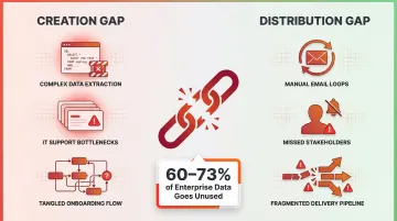
The hidden cost of "hard" reporting is real. Forrester research shows that teams spend 70% of their time on data ingestion and preparation versus just 30% on analysis. Worse, 60-73% of enterprise data goes completely unused for analytics—not because the data doesn't exist, but because extracting insights from it is too difficult.
That unused data problem points to a two-sided gap. Easy reporting requires solving both creation (building the report) and distribution (getting it to stakeholders). Tools that only solve one side still create friction. A platform that generates beautiful dashboards but requires manual email distribution every Monday morning isn't truly easy. Similarly, a tool with great Slack integration but clunky chart builders just shifts the bottleneck.
A simple, well-designed report checks four boxes:
- Focused on a specific audience and question
- Visually clear without requiring interpretation
- Concise rather than exhaustive
- Easy to update or regenerate when data changes
Key Features That Make a Reporting Tool Truly Easy
Natural Language and AI-Powered Querying
The most significant shift in easy reporting is the move from drag-and-drop builders to natural language interfaces. Instead of learning query syntax or navigating complex menus, users type questions in plain English—"show me top customers by revenue this quarter"—and the tool generates the analysis, chart, or dashboard automatically.
Gartner predicts that by the end of 2026, 40% of enterprise applications will integrate task-specific AI agents, up from less than 5% in 2025. Natural Language Query (NLQ) isn't a novelty feature anymore.
Forrester's 2025 BI platform evaluations now treat GenAI architecture, domain specialization, and enterprise data guardrails as mandatory criteria, not optional add-ons.
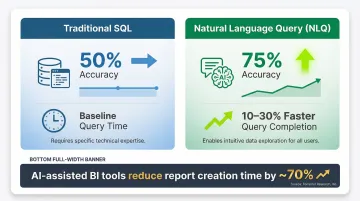
Academic studies validate the speed gains. A 2025 IEEE user study comparing NLQ systems against traditional SQL platforms found that natural language reduced query completion times by 10-30% and improved accuracy from 50% to 75% for non-technical users. Forrester's Total Economic Impact research shows modern AI-assisted BI tools reduce report creation time by nearly 70%.
Seamless Data Source Connectivity
A tool is only as easy as its ability to connect to where your data already lives. Native integrations eliminate manual exports and complex ETL setup. That includes:
- Cloud data warehouses: Snowflake, BigQuery, Databricks, Redshift
- Business applications: Salesforce, HubSpot, and other major SaaS tools
- Databases: Direct connections without intermediary ETL pipelines
Gartner's 2025 evaluations treat native connectivity to cloud platforms and major SaaS tools as a baseline requirement for enterprise BI. Without these integrations, teams fall back into manual spreadsheet workflows that waste 10-12 hours weekly.
Built-In Visualization and Dashboard Generation
Easy reporting tools auto-suggest appropriate chart types based on your data structure. Instead of manually deciding between bar charts, line graphs, and scatter plots, the platform analyzes your dataset and recommends the visualization that communicates your findings most clearly.
Users can also customize charts using plain language rather than code—requesting a "Christmas-themed" color scheme or asking to "show this as a line chart instead" without touching any design settings.
Automated Scheduling and Alerts
The ability to schedule reports (daily, weekly, monthly) and send them automatically to email or Slack removes the manual step of re-running and re-sending reports—a major time sink for teams. Dresner Advisory Services' 2024 study found that "scheduled reports" is the second most critical integration feature, rated important by 92% of enterprise respondents.
Automated alerts for data spikes or anomalies ensure stakeholders learn about critical changes immediately, not days later when someone manually notices.
Together, these features define what a genuinely easy reporting tool looks like in practice. Sylus brings them together in a single AI-native platform—users ask questions in plain English, generate dashboards instantly, and receive scheduled AI-generated summaries via email or Slack. Teams can even query data directly from Slack with commands like "@sylus show me my top customers," getting visualizations without leaving their workflow.
How to Create Reports That People Actually Use
Start with Audience Clarity
The most common reason reports go unread is that they're built for the creator, not the reader. Effective reports start with identifying who will consume the report and what specific decision it should help them make.
A finance executive needs different information than a sales manager. Build targeted reports that answer specific questions for specific audiences. A one-size-fits-all report rarely serves anyone well.
Keep Reports Focused and Short
Research analyzing over 20,000 strategic plans found that the optimal dashboard contains 9-11 measures total, averaging 2 metrics per strategic goal. Information overload is a primary barrier to BI adoption—when users see 30 KPIs on a dashboard, they can't identify what actually matters.
A focused one-pager with 3-5 KPIs is more actionable than a 30-page document. Resist the urge to include every available metric. Surface only the measures most relevant to the audience's decision.
Use Templates and Reusable Structures
Starting from a template rather than building from scratch speeds up report creation and ensures consistency across teams. Good reporting tools provide ready-made templates or let you save and reuse your own structures.
Templates also reduce governance risk by standardizing how metrics are calculated and displayed. When definitions are consistent, conflicting numbers across departments stop being a recurring problem — which matters just as much as the data being accurate in the first place.
Validate Your Metrics Before Sharing
Poor data quality costs organizations an average of $12.9 million annually, according to Gartner. Forrester found that 7% of firms lose over $25 million due to inaccurate metrics.
Before distributing any report, have a team member verify the numbers are accurate. A second set of eyes catches errors that automated checks miss.
For ongoing reliability, look for tools that support:
- Collaborative review — shared workflows so teams can flag and resolve discrepancies before reports go out
- Context grounding — platforms built on dbt documentation tie metrics to documented business logic, so the definitions behind the numbers are never ambiguous
- Reduced manual validation — when transformations are documented and consistent, teams can trust the output without re-checking every cycle

How to Share Reports Effortlessly Across Teams
Three Sharing Modes and When to Use Each
Live link sharing works well for stakeholders who need view-only access without editing permissions. Generate a URL and distribute it via email or Slack—recipients click and view without logging in.
Email invitation provides secure, direct access with granular permission controls. Invite specific users with "view only" or "full access" rights, ensuring sensitive reports remain restricted to authorized personnel.
Embedding in products or internal websites delivers always-on visibility by placing dashboards directly into operational applications or portals. According to a 2025 embedded analytics report by Reveal BI, 81% of analytics users now rely on embedded analytics — precisely because it eliminates the friction of logging into separate BI tools.
Security in Report Sharing
Choosing the right sharing mode also means controlling who can access what. In enterprise or regulated environments, sharing reports without exposing the underlying database or raw data isn't optional — it's a baseline requirement.
Two certifications matter most here:
- SOC 2 Type II provides independent assurance that a vendor maintains consistent security controls over time. Unlike Type I (a point-in-time snapshot), Type II evaluates operational effectiveness over 12 months, covering security, availability, processing integrity, confidentiality, and privacy.
- HIPAA compliance requires SaaS vendors handling electronic protected health information (ePHI) to sign Business Associate Agreements (BAAs). HHS mandates that any cloud provider creating, receiving, maintaining, or transmitting ePHI is legally a "business associate" — even if they never view unencrypted data.
Sylus supports all three sharing modes — link, email invitation, and direct embed — and lets teams schedule AI-generated report summaries delivered straight to email or Slack. Stakeholders stay informed without logging into another tool. The platform is SOC 2 Type II and HIPAA compliant, making it a workable choice for regulated industries.
Choosing the Right Easy Reporting Tool for Your Team
Core Evaluation Criteria
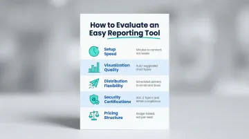
Before shortlisting tools, evaluate each one across five dimensions:
- Setup speed: Connecting to your cloud warehouse or SaaS platforms should take minutes, not an engineering sprint spanning weeks.
- Visualization quality: Look for auto-suggested chart types — users shouldn't need to fight the tool to build clear visuals.
- Distribution flexibility: Scheduled delivery to email and Slack beats manually resending the same report every Monday.
- Security certifications: SOC 2 Type II attestations and BAA signing for HIPAA compliance are non-negotiable for regulated industries.
- Pricing structure: Per-seat models punish growth. Prioritize tools that scale on usage rather than headcount.
Pricing and ease of use carry real weight. G2's 2025 Buyer Behavior Report found that 49.5% of enterprise buyers switched vendors specifically for superior AI features, while Dresner's 2024 study showed 81% replaced tools for cost savings and 61% for ease of use.
Different Teams Need Different Things
Those five criteria matter to everyone — but different teams weight them very differently.
Small startups prioritize speed and simplicity. They need tools that connect to data sources in minutes and generate dashboards without formal training.
Enterprise data teams require governance, compliance certifications, and self-hosted deployment for air-gapped environments. Semantic layers that enforce consistent metric definitions across departments aren't optional — they're essential.
Non-technical business users need natural language querying above everything else. If they can't ask questions in plain English and get answers, the tool isn't easy — no matter how capable it is under the hood.
Run a Proof of Concept with Real Data
Don't rely on demos or feature lists alone. Connect to your actual data source and generate a report you'd normally build manually — this exposes what polished demos conceal:
- How complex the connection setup actually is
- Whether query results are accurate without hand-holding
- How usable the visualizations look out of the box
- Whether the tool saves time or just moves the work somewhere else
Frequently Asked Questions
How to make reporting easy?
Easy reporting comes from combining the right tool (one that handles data connection, visualization, and sharing natively) with a focused process. Start with the audience's question, keep the report to 3-5 key metrics, and automate distribution via scheduled delivery to eliminate manual resending.
What is a simple report?
A simple report is a concise, audience-specific document or dashboard that surfaces a small number of key metrics relevant to a specific decision — not a comprehensive data dump of everything available. It answers one question clearly.
What are the two types of reporting?
Operational reporting tracks day-to-day or week-to-week performance metrics on a regular, recurring basis. Analytical reporting explores trends, patterns, or answers to specific business questions through deeper, less frequent analysis of historical data.
What features should I look for in an easy reporting tool?
The most impactful features to prioritize:
- Natural language querying so users can ask questions in plain English
- Native data source integrations to eliminate manual exports
- Built-in visualization with auto-suggested chart types
- Automated scheduling and delivery to email or Slack
- Secure sharing options that don't expose underlying databases
Can I share reports without giving access to my database?
Yes, modern reporting tools generate shareable views or embedded outputs completely separate from the underlying data source. Stakeholders can view results, charts, and dashboards without any database credentials or direct access to raw data.
How do I automate report sharing with my team?
Most easy reporting tools support scheduling — set reports to regenerate and deliver automatically to a distribution list via email or Slack on a defined cadence (daily, weekly, or monthly).