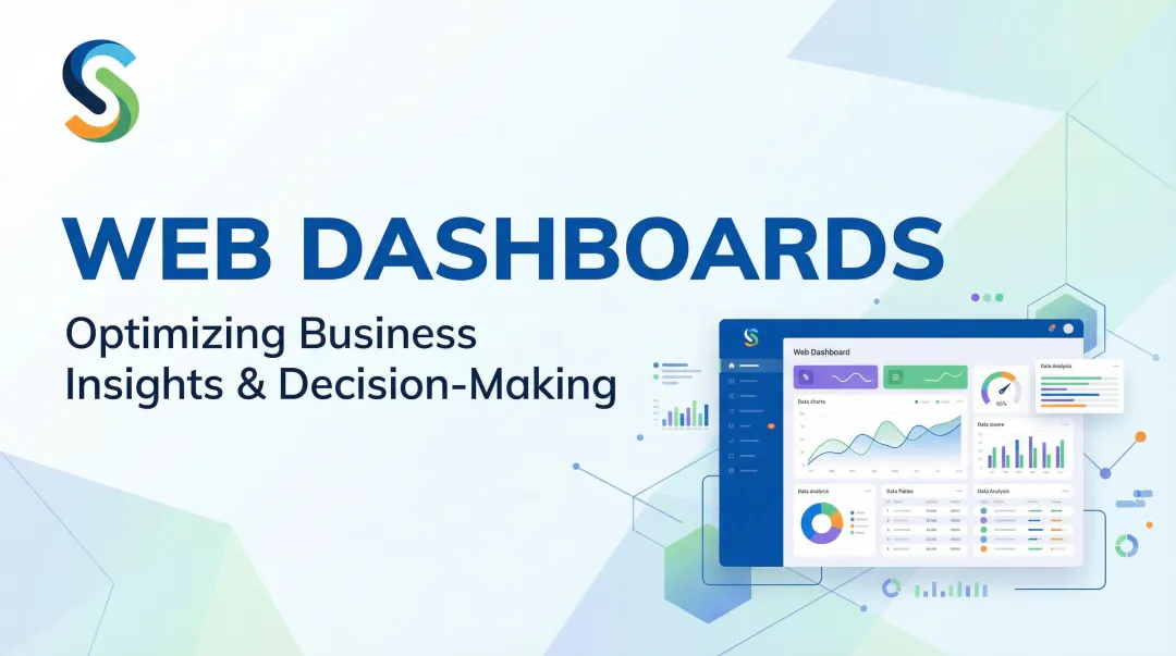
Introduction
Weeks of dashboard development can collapse in a single stakeholder review — because the layout, data hierarchy, or chart choices missed the mark. According to the IBM Systems Sciences Institute, fixing errors after product release costs 100 times more than addressing them during the design phase.
Dashboard mockup tools short-circuit that cycle. They let product managers, designers, and data teams align on layout and requirements before a single line of code is written.
This post covers the best dashboard mockup tools available, what separates them, and how to choose the right one based on your team's workflow and technical skill level.
Key Takeaways
- Dashboard mockups validate design requirements before development, preventing costly late-stage changes
- Designers lean toward Figma, non-technical users prefer Balsamiq or Moqups, and BI teams benefit from dashboard-specific tools like Mokkup.ai
- AI-powered platforms like Sylus skip the mockup-to-build gap, generating shareable, data-connected dashboards directly
- Choose based on ease of use, collaboration features, fidelity level, dashboard-specific components, and pricing
What Is a Dashboard Mockup and Why Do Teams Use One?
A dashboard mockup is a prototype or visual representation of an analytics dashboard using placeholder or sample data. Unlike live dashboards that connect to real data sources, mockups help teams align on layout, metrics, and UX before development begins.
The Business Case for Mockups
The numbers make a strong case for not skipping this step. The Standish Group's CHAOS Report (2020) found that only 31% of software projects succeed outright, while 50% are challenged and 19% fail entirely. 80% of those failures trace back to requirement issues — exactly what mockups are designed to surface early.
Even when dashboards do launch, adoption is a separate battle. Forrester reports that 60-73% of enterprise data goes unused for analytics. The 2025 State of Dashboards Report found that 72% of users regularly abandon dashboards for spreadsheets, leaving behind "dashboard graveyards" of unused deliverables.
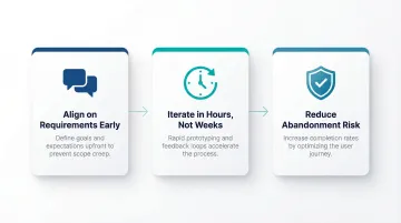
Three Main Reasons Teams Use Mockups
- Align on requirements early — Mockups force conversations about which metrics actually matter before any engineering investment begins, preventing costly misaligned expectations.
- Iterate in hours, not weeks — Teams can test multiple layout approaches quickly, gathering feedback when changes cost almost nothing rather than requiring dev cycles.
- Reduce abandonment risk — Validating concepts with end users before build reduces the likelihood of shipping something that lands straight in a dashboard graveyard.
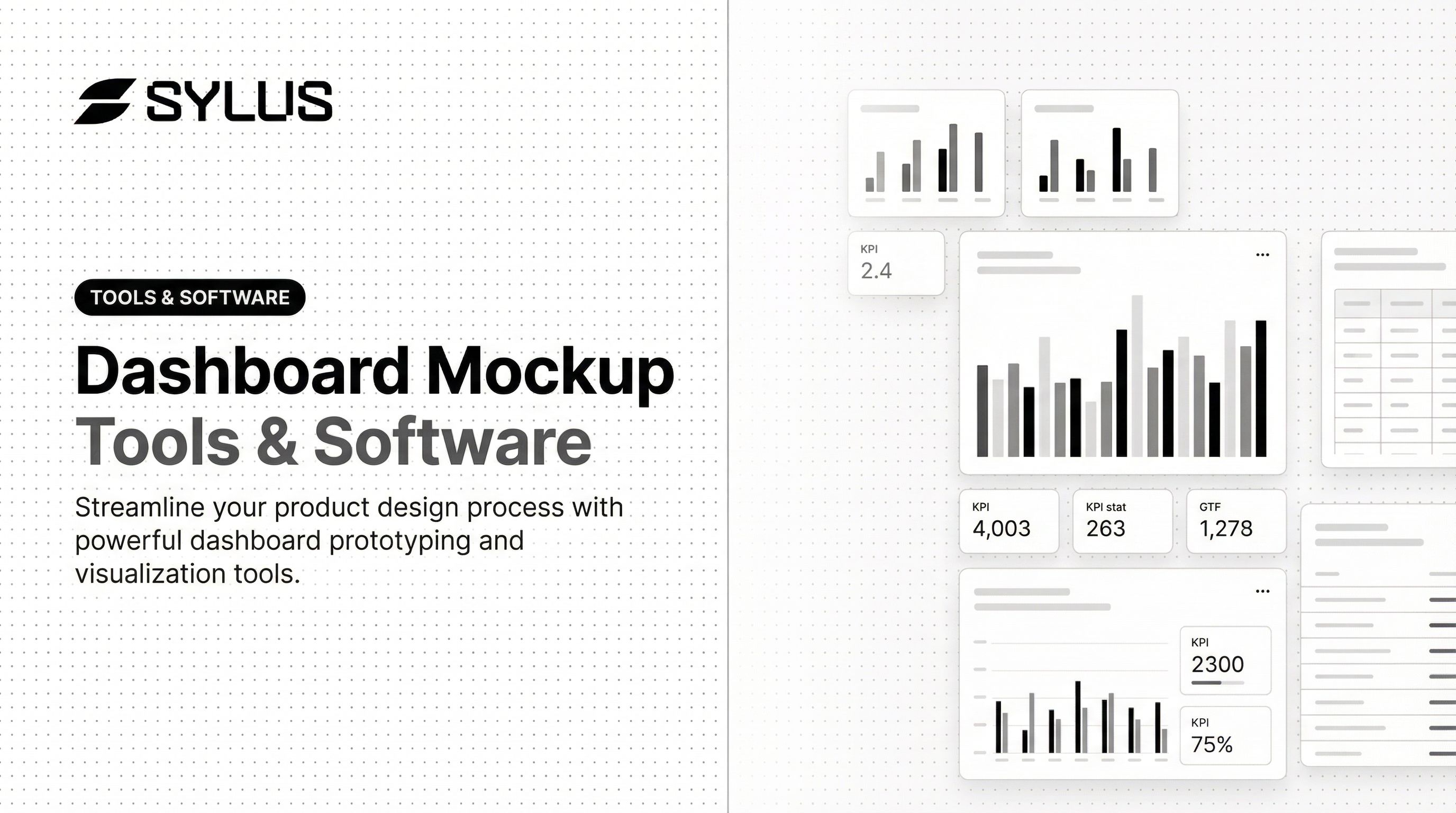
Best Dashboard Mockup Tools & Software
These tools were selected based on:
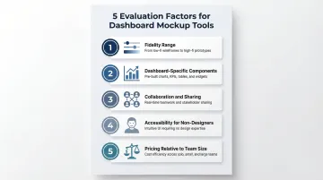
- Fidelity range — from rough wireframes to near-production layouts
- Dashboard-specific functionality — native chart and widget support
- Collaboration capabilities — real-time editing, commenting, sharing
- Learning curve — accessible to non-designers and power users alike
- Pricing — free tiers through enterprise plans
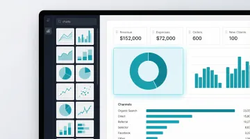
Figma
Figma is a browser-based collaborative design tool widely adopted by product and UX teams. Its relevance for dashboard mockups comes from component libraries, reusable chart assets, and real-time multiplayer editing.
Dashboard UI kits and community-built component libraries allow teams to construct high-fidelity prototypes quickly. The 2024 UX Tools Design Tools Survey shows Figma holds an 82.3% market share for UI design. Non-designers may face a steeper learning curve, but the collaboration features make it a strong choice for cross-functional teams.
| Key Features | Drag-and-drop canvas, reusable components, real-time collaboration, prototyping and commenting, community dashboard UI kits |
|---|---|
| Pricing | Starter (Free), Professional ($12/month billed annually), Organization ($55/month billed annually), Enterprise ($90/month billed annually) |
| Best For | Product designers and UX teams building high-fidelity dashboard prototypes for stakeholder review |
The Starter plan includes unlimited drafts and 150 AI credits per day, making it accessible for small teams testing the platform.
Balsamiq
Balsamiq is a dedicated wireframing tool known for its intentionally low-fidelity, sketch-style interface. It's popular among product managers and business analysts who need to communicate layout ideas quickly without design expertise.
The deliberately rough visual style keeps stakeholder focus on structure and content rather than aesthetics, reducing scope creep during feedback phases. Despite holding just 0.04% market share, Balsamiq achieves a perfect 5.0/5 user satisfaction rating. Its pre-built UI library includes dashboard elements like pie charts, line charts, bar charts, and five styles of data tables.
| Key Features | Low-fidelity sketch components, pre-built UI library (charts, tables, KPI cards), drag-and-drop, cloud and desktop versions |
|---|---|
| Pricing | Business (2 Projects): $12/month or $144/year; with SSO: $18/month ($216/year); Desktop: one-time purchase (maintenance mode until Dec 2026) |
| Best For | Non-designers and product managers needing fast, low-fidelity wireframes to align stakeholders on dashboard structure |
Balsamiq offers a fully functional 14-day free trial with no credit card required.
Mokkup.ai
Mokkup.ai is a purpose-built dashboard wireframing tool—not a general design tool—built specifically for creating analytics and BI dashboard mockups with ready-made chart and widget components.
Because it's dashboard-specific, it ships with chart types (bar, line, donut, KPI widgets) natively rather than requiring users to assemble these from generic shape libraries. This cuts setup time for data and analytics teams. The platform supports direct export to Power BI and Tableau via .pbit files, connecting the mockup directly to the implementation step.
| Key Features | Dashboard-specific component library (charts, widgets, tables), pre-built templates, drag-and-drop interface, Power BI & Tableau export |
|---|---|
| Pricing | Free Forever (3 projects, 3 screens/project, 4 AI coins); Mokkup Pro ($10/month billed annually) |
| Best For | Data analysts and BI teams who want a fast, no-design-experience-required tool for dashboard wireframes |
The free plan requires no credit card and includes export-to-BI credits, making it accessible for teams evaluating the tool.
Moqups
Moqups is a browser-based diagramming and wireframing tool that covers wireframes, flowcharts, and UI prototypes in one workspace. It's an accessible all-in-one option for teams that don't want to manage separate tools for each task.
Real-time collaboration, a broad stencil library, and the ability to combine flowcharts and wireframes in a single project make it practical for teams mapping both data workflows and dashboard layouts at once. Live cursors let teams brainstorm, edit, and annotate together without switching tools.
| Key Features | Browser-based, stencil library, flowcharts + wireframes in one tool, real-time collaboration, commenting, 150+ free templates |
|---|---|
| Pricing | Free ($0), Starter ($7/month billed annually), Business ($30/month for 3 seats billed annually), Unlimited ($103/month for unlimited seats billed annually) |
| Best For | Teams that need to wireframe both user flows and dashboard layouts in one collaborative workspace |
The free tier supports 2 projects and up to 400 objects per project, suitable for small-scale prototyping.
Sylus
Sylus is an AI-powered analytics platform where teams connect live data sources and generate complete, shareable dashboards using plain English queries—rather than building static wireframes. The platform is SOC 2 Type II and HIPAA compliant.
The core distinction from other tools on this list: Sylus skips the wireframe stage entirely. Teams work directly with their data to generate, customize, and share dashboards—no design-to-engineering handoff required. Key capabilities include:
- AI-generated dashboards from natural language queries
- Direct data source connectivity (500+ pre-built integrations)
- Governed context built on dbt models for validated analysis
- Slack integration for querying data and receiving alerts
- Scheduled reports with AI-generated summaries
- Unlimited seats with usage-based pricing
| Key Features | AI-generated dashboards from plain English, connect data sources directly, customizable charts, shareable via link or embed, team collaboration, Slack integration, scheduled reports, unlimited seats |
|---|---|
| Pricing | Usage-based pricing with unlimited seats; contact Sylus for enterprise plans |
| Best For | Data teams and business users at fast-growing startups and enterprises who want to skip the mockup-to-build gap and generate real dashboards directly from their data |
Teams using Sylus validate their analysis and publish dashboards in the same workflow, with no separate build phase needed.
How We Chose These Dashboard Mockup Tools
Tools were evaluated on five factors:
- Fidelity range — Low-fidelity wireframes vs. high-fidelity prototypes
- Dashboard-specific component availability — Native chart types, KPI cards, and data tables
- Collaboration and sharing features — Real-time editing, commenting, and stakeholder review
- Accessibility for non-designers — Learning curve and pre-built templates
- Pricing relative to team size — Free tiers, per-project vs. per-seat models
The most common mistake teams make is choosing a general design tool when a dashboard-specific tool would cut setup time considerably. A product designer validating a new analytics feature has different needs than a data analyst aligning a BI stakeholder on report layout. Matching the tool to the use case reduces rework and shortens the path from concept to production.
AI-powered generation tools are compressing the traditional mockup workflow (design → review → rebuild in BI tool). Before committing to a tool, teams should decide whether they need a mockup tool or one that generates the final deliverable directly.
Conclusion
Choosing the right dashboard mockup tool comes down to your team's role, the fidelity required for stakeholder alignment, and how quickly you need to move from concept to production. Consider the full workflow, not just the design stage. The best tool either integrates cleanly with your BI environment or — like Sylus — skips the handoff entirely by generating shareable, live dashboards directly from your actual data.
For teams that need to move faster than the traditional mockup-to-dashboard cycle allows, Sylus is worth a look. It connects to your data sources, generates polished dashboards in seconds, and lets teams validate and ship in a single step.
Frequently Asked Questions
What is the difference between a dashboard mockup and a wireframe?
Wireframes are the earliest, most skeletal representation of layout—often boxes and labels showing structure. Mockups are more refined prototypes that include visual detail like chart types, color, and data labels. Both align stakeholders before development, just at different stages of fidelity.
Do I need design experience to create a dashboard mockup?
No. Tools like Balsamiq and Mokkup.ai are designed for non-designers with pre-built components. AI tools like Sylus skip the design step altogether — connect your data, describe what you need in plain English, and get a working dashboard without touching a design canvas.
What should a dashboard mockup include?
A dashboard mockup should cover:
- Layout structure and chart placement
- KPI cards or summary metrics
- Filters and navigation elements
- Annotations explaining data sources or logic
The goal is to communicate intent clearly enough for stakeholders to give actionable feedback.
How long does it take to build a dashboard mockup?
A low-fidelity wireframe can be done in under an hour using tools like Balsamiq or Moqups. A high-fidelity mockup in Figma may take several days depending on complexity. AI tools like Sylus can generate a working dashboard prototype in minutes by connecting directly to your data.
Can a dashboard mockup be turned into a live dashboard?
Traditional mockup tools (Figma, Balsamiq) produce static designs that must be rebuilt in a BI or analytics platform. Sylus generates production-ready dashboards directly from your data, skipping the rebuild entirely — so there's no handoff gap between mockup and live output.
Which dashboard mockup tool is best for data teams specifically?
Dashboard-specific tools like Mokkup.ai are built for data workflows with pre-loaded chart components and BI export capabilities. Sylus is purpose-built for data teams that want to connect real data sources and publish shareable dashboards without a separate design-to-build handoff.